
Most QA scorecard dashboards fail to drive training or operations improvements because they surface composite scores rather than actionable patterns. A dashboard showing "average QA score: 72%" tells a contact center manager nothing about what to fix, who to coach, or whether last month's training worked. This guide covers what to track, how to configure your dashboard to surface the right KPIs, and what thresholds indicate the data is reliable enough to act on.
Insight7's QA platform scores 100% of calls automatically, producing dashboard data at the population level rather than the 3 to 10% sample that manual review teams typically cover. That coverage difference matters: dashboards built on sampled data represent the sample, not the operation.
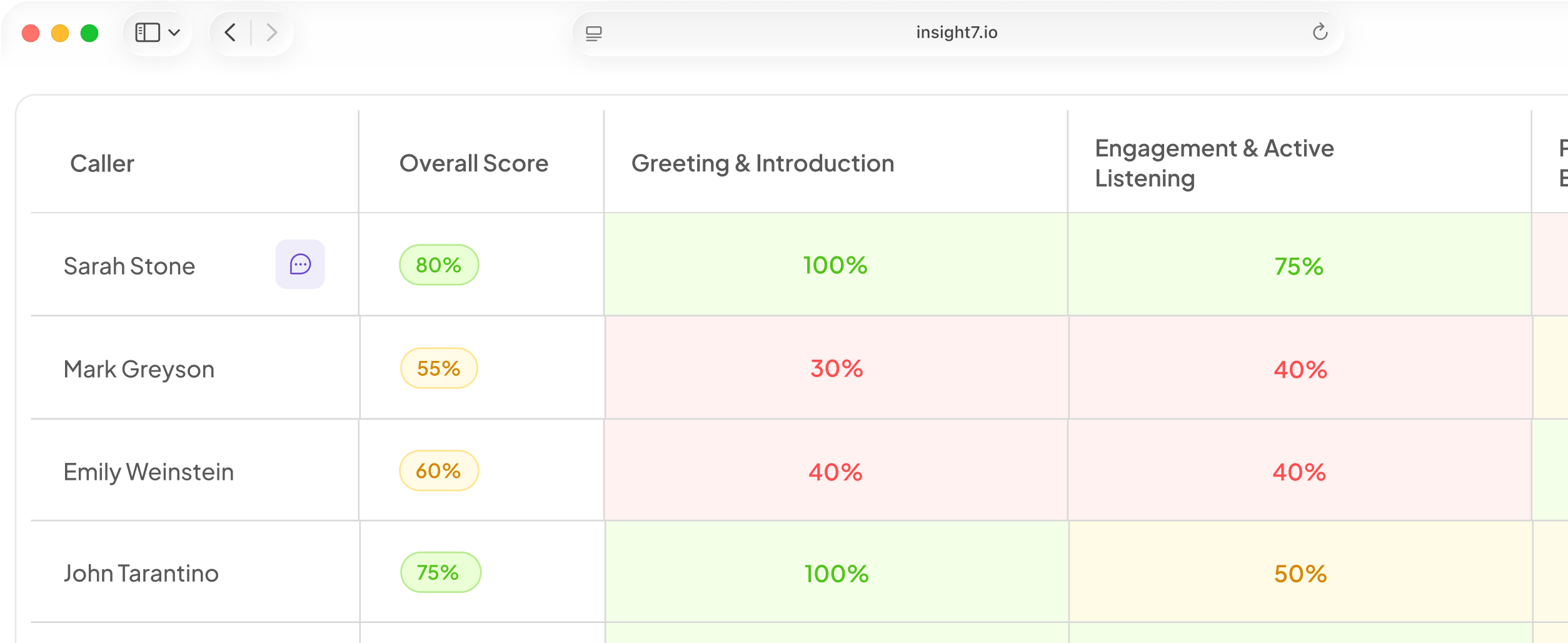
What QA Scorecard Dashboards Actually Need to Show
The standard contact center dashboard tracks volume metrics: calls handled, average handle time, first call resolution. These metrics tell you what happened but not why, and they provide no signal about agent behavior at the conversation level.
A QA scorecard dashboard adds the behavioral layer. It shows which criteria fail most frequently, which agents are improving or declining, and whether coaching interventions are producing score movement. The key distinction is criterion-level reporting rather than composite scores.
Five KPIs that belong on every QA scorecard dashboard:
1. Criterion failure rate by team. Which specific QA criteria are failing across the team, expressed as a percentage of scored calls. This drives training prioritization: the criterion with the highest failure rate gets the next coaching cycle.
2. Agent score trend over time. Individual criterion scores over 30, 60, and 90-day windows. Score movement after a coaching cycle is the primary indicator of training effectiveness.
3. Coaching cycle impact. Criterion scores for coached reps before and after a training intervention, compared against non-coached reps on the same criterion. A 3-percentage-point improvement on the coached criterion over 4 weeks is the minimum threshold for a successful intervention.
4. Compliance alert frequency. Count of compliance-triggering events by agent, team, and time period. Compliance criteria with zero tolerance thresholds need separate tracking from behavioral criteria with graduated scoring.
5. Score distribution by call type. QA criteria that apply to sales calls often differ from those for support or onboarding calls. Dashboards that aggregate across call types obscure performance patterns within each type.
How to measure training KPIs?
Training KPIs for contact centers are best measured through criterion-level score movement on QA scorecards before and after each coaching cycle. Completion rates and quiz scores measure participation, not behavior change. The metric that matters is whether the criterion being coached shows score improvement on live calls within 4 to 6 weeks of the training intervention.
Configuring Your QA Dashboard for Actionable Insights
The configuration mistake that makes dashboards useless: treating all criteria as equal. A QA scorecard with empathy, compliance, resolution quality, and process adherence needs weighted criteria to surface what actually drives outcomes.
Standard weighting framework for contact center QA dashboards:
- Compliance criteria: 30 to 40% (non-negotiable, zero-tolerance for violation)
- Resolution quality: 25 to 30% (directly correlates with first call resolution and customer satisfaction)
- Empathy and communication: 20 to 25% (behavioral, coaches well with practice scenarios)
- Process adherence: 10 to 20% (operational, often workflow-fixable rather than training-fixable)
Insight7 supports configurable weighted criteria with sub-criteria, and lets teams define what "good" and "poor" look like for each criterion at the description level. This prevents the most common dashboard calibration failure: raters interpreting the same criterion differently because the definition lives in a manager's head rather than the scoring system.
Which tool is commonly used for KPI dashboards?
Contact center KPI dashboards are most commonly built in the quality assurance platform itself, with secondary reporting in Excel or business intelligence tools like Tableau or Power BI for cross-functional reporting. Purpose-built QA platforms provide criterion-level data that generic BI tools cannot generate without a structured data source. The practical choice for teams under 200 agents is a QA platform with built-in dashboard reporting rather than a custom BI layer.
If/Then Decision Framework
- If your dashboard shows composite QA scores but not criterion-level failure rates, reconfigure to criterion-level reporting before drawing any training conclusions.
- If you cannot tell whether last quarter's training moved any QA scores, implement a coaching cycle impact metric comparing coached versus non-coached reps on the targeted criterion.
- If compliance events are buried in the same average as communication scores, create separate tracking for compliance criteria with zero-tolerance thresholds.
- If your dashboard is built on fewer than 20% of calls, the KPIs it shows are a function of which calls were sampled, not your operation. Expand coverage before trusting trend data.
- If score trends show no movement after 6 weeks of coaching, check whether the criterion definition is specific enough to coach to. Vague criteria produce coaching that cannot connect to scoring.
- If your QA data and training assignments live in separate systems, the feedback loop is broken. Every handoff between them loses specificity.
FAQ
What are KPI tracking dashboards?
KPI tracking dashboards in contact centers aggregate performance metrics across agents, teams, and time periods to surface what is improving, declining, or outside threshold. A QA scorecard dashboard specifically tracks conversation-level behaviors against a defined rubric, producing criterion-level data that volume metrics cannot capture. The actionable version shows failure rates by criterion, score trends by agent, and coaching cycle impact, not just aggregate averages.
What are the 4 P's of KPI?
The 4 P's of KPI frameworks in contact centers typically refer to People (agent-level performance), Process (workflow adherence), Product (resolution quality), and Productivity (efficiency metrics). QA scorecard dashboards primarily track People and Process, while operational dashboards track Productivity. Product quality is surfaced through first call resolution data combined with QA criteria scores on resolution quality. Teams that track all four in one view can identify whether a performance issue is agent-specific, workflow-specific, or systemic.
Contact center managers who want to connect QA scorecard data to actionable training outcomes: Insight7 builds criterion-level dashboards from 100% call coverage. See it in practice at insight7.io/improve-quality-assurance/.