How to generate visualizations from consumer interviews
-
Bella Williams
- 10 min read
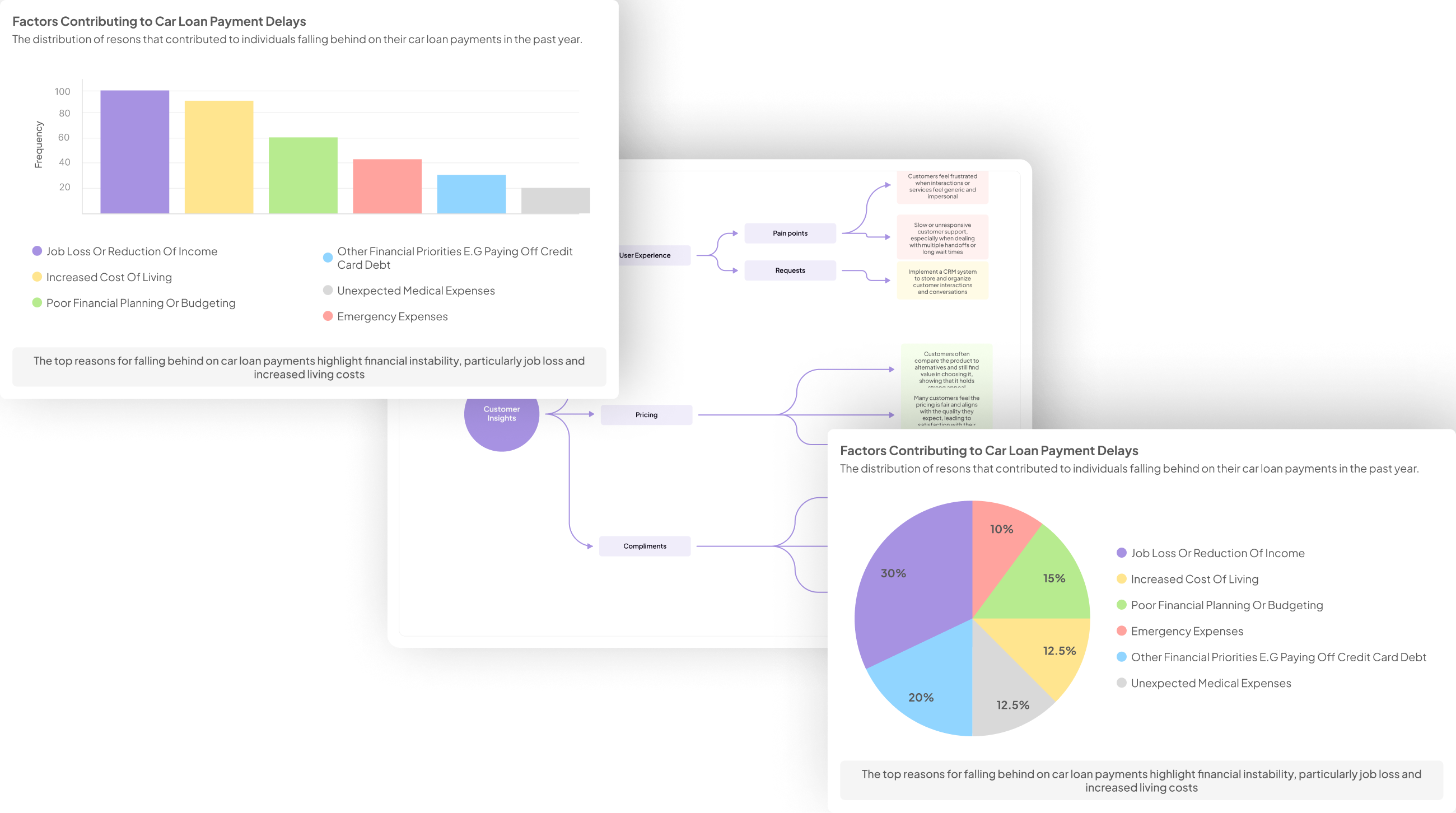
Interview Data Visualization plays a crucial role in transforming raw consumer insights into meaningful narratives. By visualizing data gleaned from consumer interviews, organizations can uncover patterns, trends, and sentiments that drive strategic decisions. Great visuals not only aid in understanding complex information but also make it more accessible for stakeholders who need to grasp insights quickly.
Creating impactful visualizations requires a deep dive into the interview data. Key themes and sentiments must be identified first to ensure that visuals represent the core consumer perspectives. Once the data is organized and cleaned, the right visualization techniques can elevate the story and facilitate informed discussions, leading to more effective decision-making based on customer feedback.
Generate visualizations from your qualitative data. At Scale.

Preparing Your Interview Data for Visualization
Preparing your interview data for visualization involves several crucial steps that lay the foundation for effective insights. First, ensure every interview is transcribed accurately. This ensures that no critical information is lost and that you have a clear representation of the participant's thoughts. Moving forward, identify key themes and insights within the data. This process of thematic analysis allows you to pinpoint recurring ideas and sentiments, which are vital for understanding broader trends.
Next, organize the data strategically for analysis. Structure it in a way that facilitates easy access to different segments, whether positive feedback, negative comments, or unique observations. Once your data is cleaned and organized, you can confidently select the right visualization techniques. This will enhance communication of the insights discovered, making it easier for stakeholders to understand your findings. Ultimately, preparing your interview data effectively sets the stage for impactful interview data visualization.
Steps to Clean and Organize Interview Data
To clean and organize your interview data, start with accurate transcription. This initial step ensures that every word is recorded correctly, preserving the essence of the conversation. Utilize transcription tools to convert audio files into text efficiently, allowing for easier management of the data. Once transcribed, carefully review the content for any discrepancies or errors, ensuring your data is reliable for analysis.
Next, identify key themes and insights from your data. This involves looking for recurring topics or sentiments that emerge from the interviews. By categorizing responses into themes, you set the foundation for meaningful analysis and visualization. Afterward, organize the data systematically. Create a structured format for easy access and analysis, whether using spreadsheets or dedicated software. With well-organized data, you can confidently proceed to visualize the insights gathered from your interviews, transforming raw interview data into impactful visual representations.
- Step 1: Transcribe Interviews Accurately
Transcribing interviews accurately is a foundational step in the process of Interview Data Visualization. The accuracy of your transcripts greatly influences the quality of insights you can derive later. Begin by ensuring that every spoken word, pause, and inflection is captured. This attention to detail allows you to identify key themes from the conversations, ultimately shaping your visual representations of data.
Using specialized transcription software can simplify this process. Many tools offer the capability to batch upload recordings, making it easier to transcribe multiple interviews at once. Properly organized transcripts will serve as the basis for further analysis, ensuring that you won’t miss crucial consumer feedback. Once transcription is complete, you can move on to the next step—identifying the core insights from your interviews. This approach not only enhances the accuracy of your visualizations but also enriches the understanding of your target audience.
- Step 2: Identify Key Themes and Insights
In this step, we focus on identifying the key themes and insights derived from your interview data. This process is crucial in transforming raw information into meaningful visuals that effectively communicate findings. Start by analyzing the transcripts of your interviews, looking for repeated phrases, concerns, or suggestions that surfaced consistently across conversations. This systematic approach helps to unveil the patterns and underlying sentiments of your audience, which are essential for creating impactful visualizations.
Next, categorize these insights into relevant themes. For instance, you might group customer feedback into categories like pain points, needs, or preferences. This thematic organization not only aids in clarity but also enhances the storytelling aspect of your data visualization. Ultimately, capturing these key themes will serve as the foundation for creating visual representations that resonate with stakeholders and inform decisions, ensuring that the insights generated from your interviews truly reflect consumer sentiment.
- Step 3: Organize Data for Analysis
Organizing your interview data for analysis is a crucial step in the process of creating meaningful visualizations. Begin by cropping the information into manageable segments, like by month or by interview theme. This not only makes it easier to process but also helps in identifying patterns that might emerge across different conversations. Each segment of data can reveal insights into consumer behavior and preferences, guiding the narrative of your visualizations.
Next, utilize thematic matrices to summarize key findings. For example, you can categorize pain points mentioned during interviews and quantify how many respondents brought up each issue. Creating a visual hierarchy with these themes aids in prioritizing what to present, facilitating a clearer understanding of consumer insights. Ultimately, a well-organized dataset lays the groundwork for effective interview data visualization, enabling you to tell an impactful story with your findings.
Selecting the Right Visualization Techniques
Selecting appropriate visualization techniques is crucial for presenting interview data effectively. When choosing methods for Interview Data Visualization, consider both the data's nature and the audience's needs. Different charts or graphs can highlight various insights, such as trends, patterns, or comparisons. For instance, bar charts are effective for comparing nominal data, while line graphs can showcase trends in continuous data over time.
Understanding your audience enhances the presentation's impact. Tailor your visualizations to match their preferences and level of expertise. Simplified visuals can be more digestible for a general audience, while more complex representations might be suitable for data-savvy stakeholders. Focus on clarity and engagement to convey insights effectively. Using the right visualization techniques not only enhances understanding but also assists in driving actionable conclusions from the rich insights drawn from consumer interviews.
- How to Choose the Right Charts and Graphs
Choosing the right charts and graphs is essential for effective interview data visualization. Different types of visualizations convey different messages, making it vital to align your choice with the insights you wish to highlight. Start by considering the nature of the data collected. For qualitative feedback, such as themes or sentiments from customer interviews, bar charts can effectively represent frequency. If you want to showcase relationships or comparisons, scatter plots or line graphs may be the best choices.
Moreover, understanding your audience is crucial. Each visualization should resonate with the viewers, ensuring clarity and accessibility. Be mindful of color choices and formatting to enhance readability. Ultimately, your goal is to simplify complex data, enabling stakeholders to make informed decisions based on the insights gathered from consumer interviews. Thoughtfully selecting the appropriate charts and graphs invites deeper understanding and discussion.
- Understanding the Audience Perspective
Understanding the audience's perspective is crucial when generating visualizations from consumer interviews. By taking the time to analyze feedback and sentiments expressed during these dialogues, you can gain valuable insights. This understanding aids in crafting visualizations that resonate better with stakeholders. For instance, consider how different segments of your audience might interpret various data points differently. The goal is to create visuals that are not only informative but also engaging.
To achieve effective interview data visualization, keep these pointers in mind:
Know Your Audience: Understand the demographic and psychographic traits of your audience. Tailoring visuals to their preferences enhances understanding.
Select Relevant Data: Choose the insights that matter most to your audience's interests or challenges. Focus on what's key to improve relevance.
Use Simple Visuals: Aim for clarity in designs. Visuals should communicate ideas quickly without overwhelming viewers with complexity.
Test with Real Users: Gather feedback on your visualizations to refine them further. Testing ensures the visuals align with audience expectations.
By mastering these components, you can effectively communicate insights derived from interviews and contribute to informed decision-making.
Evaluate Performance on Customer Calls for Quality Assurance.
Tools for Effective Interview Data Visualization
When engaging in interview data visualization, leveraging the right tools is crucial for clarity and impact. Various tools can enhance how you present findings from consumer interviews, ensuring they resonate with stakeholders. Insight7 stands out with its comprehensive data analysis capabilities, allowing users to extract insights seamlessly from audio and text transcripts. This tool not only supports transcription but also enables users to analyze multiple interviews collectively, turning raw data into actionable insights.
Other noteworthy tools include Tableau, which offers interactive visualizations suitable for complex datasets, and Microsoft Power BI, known for its robust analytics features. Google Data Studio provides an accessible dashboard for data visualization, ideal for real-time collaboration. For those wanting a more hands-on approach, Chart.js offers an easy-to-use JavaScript library for creating dynamic charts. By selecting the appropriate tool, you can effectively communicate your findings and drive informed decision-making from your interview data visualization efforts.
Insight7 and Other Visualization Tools
In the realm of interview data visualization, Insight7 stands out as a powerful tool to transform insights gained from consumer interviews into actionable visuals. This platform provides a straightforward means of analyzing qualitative data, allowing users to categorize and interpret feedback efficiently. By harnessing unique features, Insight7 facilitates the identification of trends and patterns within the conversation data, enhancing understanding of customer sentiments.
Alongside Insight7, various other tools can bolster the process. Tableau offers interactive visualizations that make data storytelling easier. Microsoft Power BI excels in business analytics, providing dashboards that integrate various data sources. Google Data Studio is another option, enabling the creation of customized reports and dashboards. Finally, Chart.js is a user-friendly choice for simple yet impactful charting solutions. Together, these tools enable analysts to present consumer insights effectively, ensuring that valuable feedback translates into strategic decisions.
- Insight7: Comprehensive Data Analysis and Visualization
Comprehensive data analysis and visualization play a pivotal role in transforming raw consumer interview data into actionable insights. With interview data visualization, researchers can depict qualitative findings through various formats, making patterns and trends more accessible and understandable. By employing effective visualization strategies, one can highlight both positive and negative sentiments expressed by consumers during interviews, providing a clearer narrative.
To effectively utilize interview data visualization, consider these points: First, tailor your approach to present findings that resonate with your target audience. Use visual storytelling techniques to illustrate key insights, making them compelling and relatable. Second, choose appropriate tools that facilitate dynamic interactions with the data, allowing users to explore insights deeply. Lastly, always prioritize clarity—ensure that your visualizations communicate your findings effectively, guiding stakeholders in making informed decisions. This structured approach underpins the ability to derive significant value from consumer interviews.
- Tableau: Interactive Data Visualization Software
Tableau is an essential tool for creating interactive data visualizations, especially when dealing with interview data visualization. It allows users to transform complex data sets into engaging, easy-to-understand visual formats. By simply dragging and dropping elements, one can craft insightful dashboards that highlight key themes and sentiments derived from consumer interviews.
When generating visualizations from interview data, Tableau provides the flexibility to analyze various dimensions simultaneously. Users can compare positive and negative feedback, identify recurring themes, and even pull insights across multiple data sources. This interactive aspect not only makes data exploration streamlined but also allows for real-time adjustments based on user queries. As you dive into your consumer insights, utilizing a platform like Tableau can significantly enhance your ability to communicate findings effectively and empower decision-making processes.
- Microsoft Power BI: Business Analytics Tool
Microsoft Power BI stands out as a premier business analytics tool for transforming raw interview data into insightful visualizations. This platform allows users to create interactive dashboards that communicate crucial consumer insights effectively, enhancing data interpretation. By importing your interview data, you can leverage Power BI's capabilities to identify patterns and trends within the responses, fostering a deeper understanding of user sentiments.
Utilizing Power BI for Interview Data Visualization streamlines the analytical process. You can use various elements such as graphs and charts to showcase positive and negative feedback from consumers. This vivid representation not only helps in pinpointing key areas of concern but also uncovers potential opportunities for product improvements. Emphasizing user perspectives through visual data can inspire informed decisions and strategic enhancements in your offerings, ultimately leading to better alignment with market needs.
- Google Data Studio: Data Visualization Dashboard
Google Data Studio serves as an effective tool for creating engaging visualizations, especially when working with interview data. This platform allows users to transform raw consumer insights into meaningful graphics, enabling a clearer understanding of key patterns and trends. With its user-friendly interface, you can seamlessly connect data sources and create interactive dashboards, giving stakeholders a dynamic view of the insights gathered through consumer interviews.
To maximize the impact of your interview data visualization, you can utilize features such as customizable charts and graphs that highlight significant themes. By plotting positive and negative feedback, you can offer a balanced view of customer sentiments. Furthermore, Google Data Studio facilitates comparative analysis, allowing users to explore trends across different datasets, such as varying consumer reactions in multiple demographics. This capability enhances strategic decision-making, making your visualizations not just informative but instrumental in guiding future actions.
- Chart.js: Simple yet Flexible JavaScript Charting
Chart.js offers a simple yet flexible solution for generating effective visualizations from your interview data. As you analyze and interpret insights from consumer interviews, the right visualization can enhance the audience's understanding. This JavaScript library empowers users to create interactive charts, making it ideal for displaying data in engaging and informative ways.
Utilizing Chart.js is straightforward, beginning with its ability to handle various chart types, including line, bar, and pie charts. It seamlessly integrates with web applications, allowing real-time updates based on user interactions or changing data sets. This flexibility plays a crucial role in Interview Data Visualization, as it enables stakeholders to explore findings dynamically. By transforming qualitative insights into quantifiable visuals, you can better highlight significant trends, making your presentations impactful and more accessible to your audience.
Conclusion: Bringing Your Interview Data Visualization to Life
To truly bring your interview data visualization to life, you must consider how to connect the dots between raw insights and presentation. Effective storytelling is key; it transforms numerical data and statistics into engaging visual narratives. By identifying themes and insights from your interviews, you create a framework that guides your audience through the data, highlighting key pain points and needs identified by consumers.
Moreover, selecting appropriate visualization techniques enhances comprehension and retention. As you craft your report, use clear graphs and well-structured layouts to showcase your findings. This approach not only aids understanding but also fosters discussions that can lead to actionable insights from your interview data visualization.


