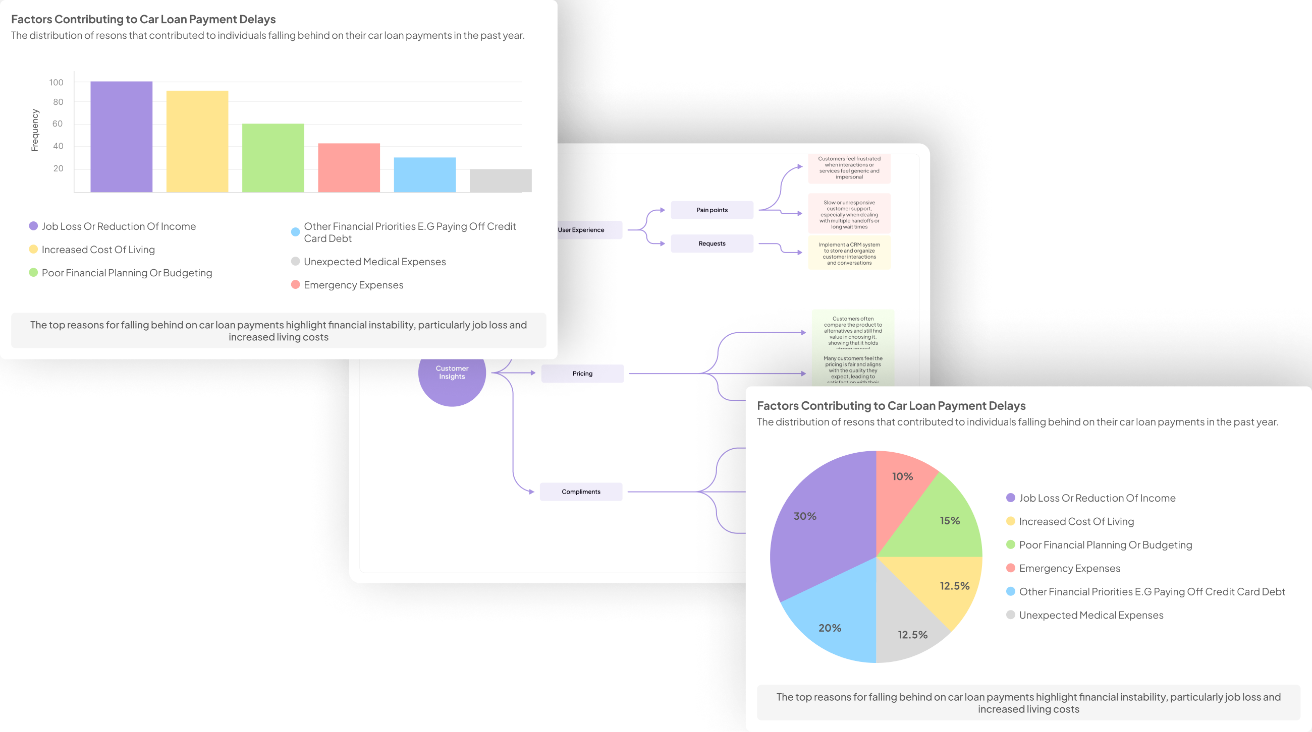
In an era where every customer voice matters, businesses must unlock the potential insights hidden within customer reviews. Review visualization strategies play a crucial role in transforming raw, unstructured feedback into actionable data that informs decision-making. When harnessed correctly, these strategies can provide a clearer understanding of customer sentiments, preferences, and experiences.
Implementing effective review visualization strategies allows organizations to identify patterns, categorize feedback, and uncover underlying trends that might otherwise go unnoticed. By utilizing diverse visualization techniques, businesses can clearly convey insights and foster a customer-centric approach that drives innovations and enhances satisfaction. Whether you are launching a new product or refining existing offerings, mastering these strategies can empower your organization to make informed decisions that resonate with your audience.
Generate visualizations from your qualitative data. At Scale.

Understanding Key Review Visualization Strategies
Understanding Key Review Visualization Strategies entails recognizing the best ways to present customer feedback effectively. By employing various review visualization strategies, you can transform textual data into meaningful insights. You can address both positive and negative sentiments, helping to gauge overall customer perceptions. This not only informs future product development but also enhances customer experience.
When choosing visualization techniques, consider approaches like bar charts, word clouds, and sentiment heatmaps. These methods allow for an immediate grasp of customer opinions straight from the data. Each technique serves a unique purpose, helping you highlight specific aspects of the feedback. For instance, bar charts can clearly display the frequency of certain keywords, while word clouds visualize the most mentioned terms, drawing attention to recurring themes in customer reviews. Overall, understanding key review visualization strategies empowers you to make data-driven decisions that can significantly impact your business.
Text Analysis Techniques for Visualization
Text analysis techniques play a crucial role in transforming customer reviews into meaningful visualizations. Utilizing these techniques enables businesses to derive insights from qualitative feedback effectively. By employing different methodologies, such as natural language processing or keyword extraction, you can systematically analyze vast amounts of review data for visual representation.
One effective strategy is sentiment analysis, which helps categorize reviews based on emotional tone. Additionally, thematic analysis identifies overarching trends within customer feedback. You can visualize these results using graphs or word clouds to highlight key sentiments and common themes. This approach provides visually impactful insights that drive better understanding and decision-making. Ultimately, mastering text analysis techniques enables you to create compelling review visualization strategies that can significantly enhance your business strategies.
Sentiment Analysis Visualization Approaches
Sentiment analysis visualization approaches play a crucial role in interpreting customer reviews. These methods help to distill complex data into understandable visual formats, making it easier to identify positive and negative sentiments. By categorizing comments through graphs, word clouds, and sentiment heat maps, businesses can easily see trends and critical areas that require attention.
There are several strategies to employ for this purpose. First, text mining techniques can be used to extract emotions from reviews, triggering visual representation of positive, negative, and neutral sentiments. Second, utilizing bar charts or pie charts can illustrate the distribution of sentiments across various product features. Lastly, sentiment timelines can track shifts in customer sentiment over time, aiding in monitoring the impact of changes in product offerings. Through these review visualization strategies, organizations can unlock meaningful insights from customer feedback that influence product improvement and customer satisfaction.
Evaluate Performance on Customer Calls for Quality Assurance.
Tools and Techniques for Building Review Visualization Strategies
Building effective review visualization strategies requires using various tools and techniques tailored to your specific needs. To start, it’s crucial to collect and prepare customer review data properly. Clean and structured data serves as a solid foundation for any visualization. Next, selecting the right visualization type is essential. Different types of visualizations, such as bar charts or heat maps, serve distinct purposes and can display customer sentiments clearly.
Once you've chosen the appropriate visualization format, the customization process can elevate the effectiveness of your visuals. This involves adjusting colors, sizes, and labels to enhance readability and engagement. Tools like Tableau and Power BI can facilitate these steps, offering features that make data visually appealing and informative. Whether you need to analyze trends or compare sentiments across locations, these tools empower you to capture insights effectively. By utilizing these strategies, organizations can transform customer feedback into visual narratives that drive actionable insights.
Top Tools for Review Visualization
When considering the top tools for review visualization, it's crucial to identify solutions that bring customer feedback to life through insightful graphics. Utilizing effective visualization strategies can transform raw data into clear narratives, allowing businesses to recognize patterns, sentiments, and actionable insights from customer reviews.
Various tools excel in this area, each with unique capabilities. Tableau offers a user-friendly platform for creating intricate visualizations that can depict trends in positive and negative feedback. Google Data Studio facilitates easy integration with other Google services and allows dynamic reporting, empowering teams to share insights fluidly. Power BI is another robust tool that provides in-depth analysis capabilities, particularly beneficial for enterprises dealing with significant volumes of data. Other options include QlikView, known for its intuitive associative model, and specialized tools like insight7, which cater specifically to customer insights. These tools collectively enhance review visualization strategies, paving the way for informed decision-making and effective marketing strategies.
- insight7
An effective visualization strategy can lead to deeper insights from customer reviews. Our focus here is understanding how to best translate text into engaging visuals. Many companies struggle with analyzing the vast quantities of feedback they receive, making it crucial to implement Review Visualization Strategies that streamline this process. By focusing on customer sentiment and thematic elements, you can uncover valuable insights that influence business decisions.
When developing these strategies, consider several key factors. First, effective data collection is vital; gather reviews from diverse sources to ensure a comprehensive viewpoint. Next, select visualization types that resonate with your audience. Bar charts, word clouds, and trend lines can illustrate different aspects of the data effectively. Lastly, customize these visualizations to suit specific contexts and goals. This tailored approach enhances clarity, making your insights more actionable and readily understood.
- Tableau
Tableau serves as a powerful tool for visualizing customer review data. It allows users to create meaningful representations of insights from textual feedback, helping to identify trends and patterns. By incorporating features like drag-and-drop functionality, Tableau simplifies the creation of various visualization types that can effectively convey customer sentiment. This can be particularly beneficial when analyzing both positive and negative reviews, enabling businesses to make informed decisions based on visualized data.
To maximize the effectiveness of Review Visualization Strategies in Tableau, consider the following approaches. First, utilize sentiment analysis to categorize reviews as positive, negative, or neutral. Next, incorporate filters to break down the data by specific attributes, such as product type or geographical location. Lastly, use color coding to enhance visual appeal and highlight significant insights. Each of these methods can transform raw customer feedback into actionable insights that drive business growth and improve customer satisfaction.
- Google Data Studio
Google Data Studio serves as a powerful tool for visually presenting customer reviews. This platform enables users to transform raw data into compelling visualizations, making analysis accessible and engaging. By utilizing Google Data Studio, businesses can create interactive dashboards that showcase sentiment trends and highlight customer feedback in an intuitive manner.
To effectively implement review visualization strategies in Google Data Studio, start with these key steps. First, gather customer review data from various sources. Next, determine the most suitable visualization types, such as bar graphs or pie charts, to represent positive and negative feedback clearly. Finally, customize your reports to enhance usability and focus on the insights that matter most. This structured approach allows teams to harness rich data insights and ultimately drive improvements in products and services. By mastering Google Data Studio, businesses can ensure that customer voices are not only heard but also acted upon.
- Power BI
Power BI is a powerful tool that can transform customer reviews into insightful visualizations. By leveraging its capabilities, you can create dynamic reports that highlight key patterns and trends in customer feedback. For businesses seeking to enhance their understanding of customer sentiments, Power BI provides an efficient platform to visualize data from reviews, making it easier to identify areas of improvement.
To effectively utilize Power BI for review visualization strategies, start by importing your customer review data. Once the data is in place, utilize visualization options such as bar charts, pie charts, or sentiment maps to represent the insights meaningfully. You can delve deeper into various segments, comparing positive and negative feedback using filters. Additionally, Power BI allows the integration of live data, ensuring your visualizations stay current as new reviews come in. This continuous feedback loop enables organizations to remain agile, adapting their strategies based on real-time customer insights, driving improvement, and satisfaction.
- QlikView
When exploring QlikView for Review Visualization Strategies, users can harness its robust data analytics capabilities to transform customer feedback into insightful visual representations. QlikView offers an intuitive interface where users can create, analyze, and share dashboards, making it easier to track customer sentiment over time. By utilizing its associative data model, one can seamlessly explore complex relationships between various reviews, offering a comprehensive understanding of customer opinions.
To get started, users should focus on importing relevant customer review data. Once the data is in QlikView, powerful visualization tools allow for the representation of sentiment analysis through charts and graphs. Users can create visualizations that highlight positive, negative, and neutral sentiments, as well as identify trends and patterns. This approach enables businesses to quickly react to customer feedback and enhance their offerings. Ultimately, QlikView serves as a valuable tool for generating actionable insights from customer reviews.
Step-by-Step Guide to Creating Effective Visualizations
Creating effective visualizations is essential for making sense of customer reviews. This process transforms raw data into insights, facilitating better decision-making. Before diving into visual design, begin by collecting and preparing your customer review data. Ensure the data is clean and categorized based on sentiment, themes, or keywords. Organizing the information sets the groundwork for meaningful visual output.
Next, selecting the appropriate visualization type is crucial. Depending on your data's nature, you might choose charts, graphs, or word clouds. Each format serves a unique purpose, from highlighting trends to showcasing frequent keywords. Lastly, design and customize your visualization for clarity and aesthetic appeal. Use color coding thoughtfully and ensure the layout is intuitive. The goal is to create a visualization that not only presents data but also conveys the story behind the insights. By following these steps, you can effectively apply Review Visualization Strategies to turn customer reviews into actionable intelligence.
Step 1: Collecting and Preparing Customer Review Data
Gathering and preparing customer review data is essential for effective analysis. It begins with identifying the sources where reviews are available, such as online retailers, social media, and survey platforms. Once the relevant data is collected, it is crucial to clean and organize it to eliminate any discrepancies. This step ensures that the dataset is accurate and ready for analysis.
After data preparation, categorization becomes important. Group reviews by themes like product features, customer service, and pricing. This categorization helps in applying Review Visualization Strategies effectively. With the data structured, analysts can focus on creating visualizations that highlight trends and insights. Proper preparation transforms raw data into a valuable resource, leading to actionable insights and improved customer engagement.
Step 2: Selecting the Right Visualization Type
Selecting the right visualization type is crucial to effectively communicate insights derived from customer reviews. Different visualization tools cater to various analysis objectives, such as showcasing sentiment trends or highlighting specific themes in feedback. For instance, bar charts can effectively display the frequency of positive and negative comments, while word clouds can reveal common phrases in reviews, illustrating customer sentiment.
When evaluating visualization options, consider the specifics of your data and the message you want to convey. Pie charts may be suitable for displaying overall sentiment distribution, whereas line graphs can illustrate trends over time. The goal is to select a format aligning with your analytical objectives, enhancing the clarity and impact of your insights. Ultimately, understanding which visualization type serves your Review Visualization Strategies can significantly influence how stakeholders interpret and act upon customer feedback.
Step 3: Designing and Customizing the Visualization
In Step 3: Designing and Customizing the Visualization, the focus is on transforming raw customer review data into insightful graphics that tell a compelling story. This step is essential for conveying the sentiments expressed in reviews clearly. It requires careful consideration of design elements such as color, layout, and the choice of visual types like bar charts or word clouds.
To effectively customize the visualization, first, choose appropriate formats that suit the nature of your data. For instance, sentiment trends over time can be best represented in line graphs, while categorical data might be illustrated with pie charts. Second, ensure that your visuals are color-coded intuitively, allowing viewers to grasp positive and negative sentiments at a glance. Finally, consider adding interactive elements, enabling users to explore the data further. By implementing these review visualization strategies, you will enhance the understanding of customer feedback and drive actionable insights.
Conclusion: The Impact of Effective Review Visualization Strategies
Effective review visualization strategies play a crucial role in understanding customer feedback. By transforming raw data into digestible visual formats, businesses can quickly identify trends, sentiments, and key insights. This approach not only enhances analysis but also helps teams make informed decisions based on what customers truly think about their products or services.
Moreover, visualization encourages deeper engagement with the data. When stakeholders can visually interpret findings, it becomes easier to communicate critical insights across teams. In essence, embracing effective review visualization strategies amplifies the voice of the customer, driving improvements and fostering a customer-centric culture within the organization.


