


Survey Journey Mapping provides a systematic approach to transform open-ended survey responses into meaningful visualizations. Through carefully analyzing qualitative data, you can identify themes and patterns that reveal user experiences. This step is essential, as it enables you to glean insights that might otherwise remain hidden within raw text.
Once themes are established, the next step is to create user personas. These personas are archetypes based on common attributes found within the responses, allowing you to tailor your journey maps effectively. By doing so, you can clearly illustrate how different users interact with your product or service, identifying pivotal touchpoints in their journey. A well-constructed journey map serves not only as a visualization tool but also as a strategic asset that informs future business decisions and enhances customer experience.
In summary, embracing Survey Journey Mapping equips businesses with the tools needed to visualize customer insights, ultimately leading to more personalized and effective engagement strategies.
Introduction to Survey Journey Mapping: Unveiling User Experiences
In the fast-paced world of user experiences, understanding the path customers take is essential. Survey Journey Mapping serves as a powerful tool that helps reveal insights hidden within open-ended survey responses. By transforming qualitative data into structured visual representations, organizations can better appreciate the interactions and emotions users encounter throughout their journey. This clarity not only identifies potential pain points but also illuminates opportunities for improvement.
Exploring Survey Journey Mapping enables teams to connect with their audience on a deeper level. By following the user's path from initial awareness to final decision-making, companies can craft tailored solutions that address real customer needs. This process builds a clearer understanding of user experiences, ultimately guiding strategic enhancements and fostering meaningful relationships.
From Open-Ended Surveys to Actionable Insights: The Art of Survey Journey Mapping
Survey journey mapping is an essential process for transforming open-ended survey responses into actionable insights. By carefully analyzing these qualitative data, organizations can identify common themes and patterns that reveal user experiences and pain points. This approach connects raw data to the emotional narratives behind customer interactions, providing a clearer understanding of how users navigate their journeys.
Once themes are extracted, organizations can map these insights onto a visual framework. This visualization highlights key touchpoints in the user journey, showcasing interactions from initial research to decision-making. By illustrating these experiences, stakeholders can identify friction points, optimize the customer experience, and make informed decisions that foster meaningful improvements. Understanding the survey journey mapping process empowers organizations to translate user feedback into strategies that enhance products and services effectively. By embracing this practice, businesses can continuously adapt and evolve based on genuine customer insights.
Analyzing Qualitative Data: Extracting Themes and Patterns
To effectively analyze qualitative data from open-ended surveys, practitioners must hone their skills in extracting themes and patterns. Begin by diligently organizing the collected responses to identify recurring ideas and sentiments. Group similar responses together, which allows the emergence of overarching themes. This step is crucial in drawing insights that will guide the journey mapping process.
Once the data is organized, the next step is to extract specific themes that highlight user experiences, pain points, and desires. Use analytical tools or frameworks to uncover patterns across various responses, ensuring no vital information falls through the cracks. Capture these themes in a concise manner for easy reference. This structured analysis not only informs the development of survey journey mapping but also enhances understanding of customer needs. By systematically extracting these insights, you pave the way for informed decision-making and improved user experiences.
Creating Personas: Translating Responses into User Archetypes
Creating user personas is vital for understanding your audience and enhancing the survey journey mapping process. By translating responses from open-ended surveys into user archetypes, you can transform raw data into meaningful insights that drive product strategy. Begin by analyzing the qualitative data gathered from your surveys, seeking out common themes and behavioral patterns that emerge among respondents. This process not only helps identify various user segments but also assists in portraying their distinct motivations and needs.
Next, define clear archetypes that represent these user segments. Consider demographics, preferences, and pain points, which will provide context to your personas. These personas serve as a tangible reference throughout the design and decision-making processes, aiding teams in aligning their strategies with user expectations. Ultimately, by effectively creating personas, you turn abstract survey results into actionable insights that improve customer experiences and facilitate journey mapping. This ensures that your approach resonates with real user experiences and drives the desired outcomes.
Crafting the Visual Journey: Transforming Insights into Maps
Transforming qualitative insights into visual representations is essential in understanding user experiences effectively. Crafting the visual journey encompasses the process of creating journey maps from open-ended survey responses, enabling you to highlight user pain points and motivations visually. This transformation begins with analyzing the qualitative data to ensure clarity and focus on the user’s path.
As you delve deeper into survey journey mapping, it's crucial to identify key touchpoints throughout the customer experience. These touchpoints represent significant interactions where customers express their feelings and experiences. Illustrating the journey effectively, through diagrams or flowcharts, brings these insights to life. A well-executed visual map provides a streamlined approach for stakeholders to understand patterns, align strategies, and enhance user experiences. By bridging the insights from surveys with comprehensive visual frameworks, you can significantly improve how you connect with and serve your audiences.
Step-by-Step Guide to Building Journey Maps from Survey Data
Building journey maps from survey data is a systematic approach to understanding user experiences. First, organize your data by sorting and categorizing responses into distinct themes. This step allows you to identify patterns and sentiments that will shape your journey map. Next, pinpoint key touchpoints where users interact with your product or service. These touchpoints should highlight both positive experiences and potential friction points that need addressing.
Once categorized and mapped, you can illustrate the journey visually. Create a clear framework that details each stage of the user's experience, from initial contact through to decision-making. Ensure your journey map captures essential insights alongside users' emotional reactions. This method of Survey Journey Mapping not only offers clarity but also provides valuable recommendations for enhancements, ultimately improving user satisfaction and engagement.
Step 1: Organize your Data: Sorting and Categorizing Responses
To effectively generate journey maps from open-ended surveys, the first crucial step is to organize your data by sorting and categorizing responses. Begin by grouping similar feedback to identify common themes and patterns. This will help you see the bigger picture of user experiences. For example, responses can be categorized by sentiment, such as positive, negative, or neutral, or by specific topics that emerge from the feedback. This organization is essential for understanding user journeys and their underlying motivations.
Next, consider further delineating responses by demographic factors or location-specific insights. Sorting by these variables can highlight unique user needs and preferences. For example, if feedback varies significantly between regions, this may guide tailored strategies in your journey mapping. The clearer your data organization, the more accurate and actionable your survey journey mapping will be, paving the way for effective visual representations in the later stages.
Step 2: Identify Key Touchpoints: Mapping User Interactions
To effectively engage in Survey Journey Mapping, identifying key touchpoints is crucial. Start by examining the interactions users have with your service or product. This involves analyzing the various stages in the user experience—from initial contact to feedback. By documenting these moments, you can better understand where users feel satisfied or encounter obstacles.
Next, categorize these touchpoints based on their emotional impact on users. Are there critical moments that evoke strong positive or negative feelings? Identifying these interactions allows you to focus on enhancing user satisfaction and streamlining their journey. Pay close attention to common themes that emerge from survey responses, as these insights will be valuable for creating a comprehensive journey map. This approach not only refines the user experience but also fosters a connection between user expectations and your offerings.
Step 3: Illustrate the Journey: Designing the Visual Framework
Creating effective visuals is vital in the process of Survey Journey Mapping. In this step, we focus on designing the visual framework that accurately represents user experiences captured through open-ended surveys. A well-structured visual can highlight key insights, making it easier to understand user pain points and journey touchpoints. Integrating qualitative data into a visual framework can enhance comprehension and foster empathy within your team.
To illustrate the journey effectively, consider the following components:
Flow Diagrams: These depict the sequence of user interactions, capturing the journey's start, middle, and endpoints.
Infographics: Summarize complex information with visuals that emphasize critical messages and data points.
Emotion Maps: Visualize user emotions at different journey stages, illustrating highs and lows that are crucial for improving the overall experience.
Each element serves a unique purpose, enriching your overall survey mapping strategy. By thoughtfully designing these visuals, you create a meaningful narrative that guides stakeholders in understanding and addressing user needs.
Tools for Survey Journey Mapping
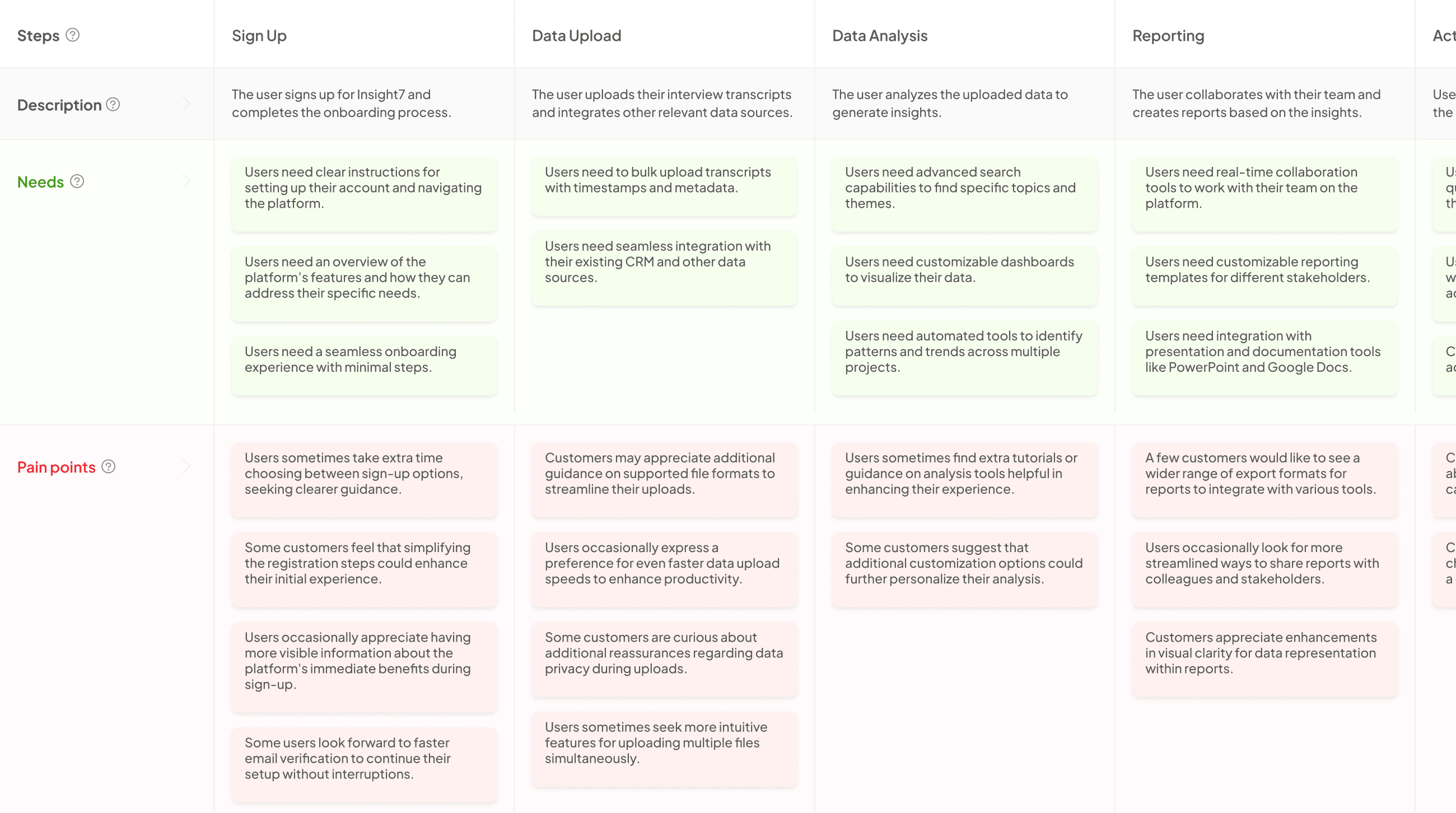
Effective Survey Journey Mapping relies on the right tools to translate user feedback into actionable insights. Several platforms can significantly streamline this process, each catering to specific needs and preferences. First, Insight7 offers a seamless way to analyze qualitative data, making it easier to draw meaningful conclusions from open-ended survey responses. This tool aids in organizing the information, which is crucial for later steps in mapping.
Another valuable resource is Optimal Workshop, which enhances user understanding by providing various tools for analyzing and visualizing user experiences. MURAL takes collaboration to the next level, allowing teams to work together in real-time to create engaging visual maps. Finally, UXPressia excels in offering comprehensive journey analytics, giving you deep insights into user interactions. Using these tools effectively can transform your survey data into a detailed journey map, providing organizations with a clearer understanding of their users' experiences.
Insight7: Streamlining the Process
Streamlining the process of Survey Journey Mapping involves simplifying how we interpret and visualize customer feedback from open-ended surveys. This approach allows for a more organized way of uncovering user experiences, making it easier to focus on critical insights. By establishing a systematic method for sorting and assessing responses, organizations can transition from complex data to coherent maps that outline user journeys.
To enhance efficiency, consider these key steps:
- Data Organization: Start by categorizing responses to identify overarching themes. This will create a clearer framework for analysis.
- Identifying Touchpoints: Highlight important user interactions within the mapped journey. Recognizing these moments can shed light on user behavior and sentiment.
- Visual Framework Design: Craft a straightforward yet informative visual representation of the journey. A well-designed map is intuitive and emphasizes essential touchpoints effectively.
By focusing on these aspects, the process of Survey Journey Mapping becomes more manageable and produces actionable insights that drive business strategies.
Optimal Workshop: Enhancing User Understanding
To enhance user understanding through Optimal Workshop, organizations can effectively utilize Survey Journey Mapping. This tool is invaluable for transforming unstructured data from open-ended surveys into visual representations of user experiences. By extracting insights from qualitative responses, users can identify key patterns and pain points, creating an overview of the customer journey.
The process begins with organizing the survey data, enabling teams to cluster similar responses. Next, key touchpoints across the user journey are pinpointed, marking significant interactions that shape user experiences. Finally, by illustrating the journey visually, stakeholders can better comprehend how customers navigate their offerings. This approach not only clarifies user sentiments but also aids in pinpointing areas for enhancement, fostering a more user-centric strategy. Understanding these aspects is essential for businesses aiming to refine their services and meet user needs effectively.
MURAL: Collaborative Visual Mapping
MURAL serves as an indispensable tool for collaborative visual mapping in the context of survey journey mapping. This platform enables teams to bring their ideas and insights together, transforming qualitative data into a cohesive visual narrative. With MURAL, users can easily gather open-ended survey responses and map user experiences, allowing for a more nuanced understanding of customer journeys.
Utilizing digital sticky notes, diagrams, and charts, participants can brainstorm key touchpoints and highlight emotional responses throughout the journey. This collaborative environment fosters creativity and ensures that diverse perspectives are integrated, enriching the visual map. As teams engage with the visualized journey, they can identify patterns, establish connections, and uncover hidden insights, ultimately driving effective decision-making and strategy development. By embracing MURAL, organizations can elevate their survey journey mapping efforts, creating impactful visual representations that resonate with stakeholders.
UXPressia: Comprehensive Journey Analytics
Comprehensive journey analytics transforms qualitative data into meaningful visual narratives. By using survey journey mapping, organizations can identify and analyze user experiences effectively. This process allows stakeholders to grasp nuanced insights derived from open-ended survey responses. Understanding these insights is crucial for pinpointing user pain points and optimizing customer journeys.
In this context, comprehensive journey analytics empowers brands to visualize user pathways clearly. Stakeholders can track user interactions, identify friction points, and develop targeted strategies for improvement. By aligning real user experiences with journey mapping, organizations can create user-centric solutions. Visual representations not only enhance communication within teams but also inform strategic decisions that lead to improved customer satisfaction. This approach makes it easier to translate complex data into actionable strategies for enhancing overall user experience.
Conclusion: The Power of Survey Journey Mapping
Survey Journey Mapping serves as a catalyst for understanding user experiences through the lens of open-ended surveys. By transforming qualitative responses into visual maps, organizations can unveil critical insights regarding customer pain points and needs. This technique enables businesses to identify and analyze the complex interactions users have with their products or services, thus enabling better decision-making.
The process doesn’t just illuminate user frustrations but also guides teams toward actionable recommendations. In embracing Survey Journey Mapping, brands can foster a deeper connection with their audience by continuously refining and enhancing the overall customer experience. Ultimately, the power of this mapping lies in its ability to drive engagement and loyalty, leading to lasting success.
### Crafting the Visual Journey: Transforming Insights into Maps

Survey journey mapping plays a vital role in visualizing user experiences gleaned from open-ended surveys. This process transforms qualitative insights into a tangible visual format, allowing organizations to easily interpret and strategize around customer journeys. By examining the feedback collected, organizations can identify key user interactions and translate these into clear, visual maps that illustrate the overall experience.

To create an effective journey map, start by organizing your collected data into meaningful categories. Focus on identifying key touchpoints where users engage with your product or service. This will help illuminate crucial moments, both positive and negative, in the customer experience. Finally, design your visual framework to represent these insights clearly, ensuring that all stakeholders can understand and utilize the journey maps for strategic decision-making and improvement efforts.


