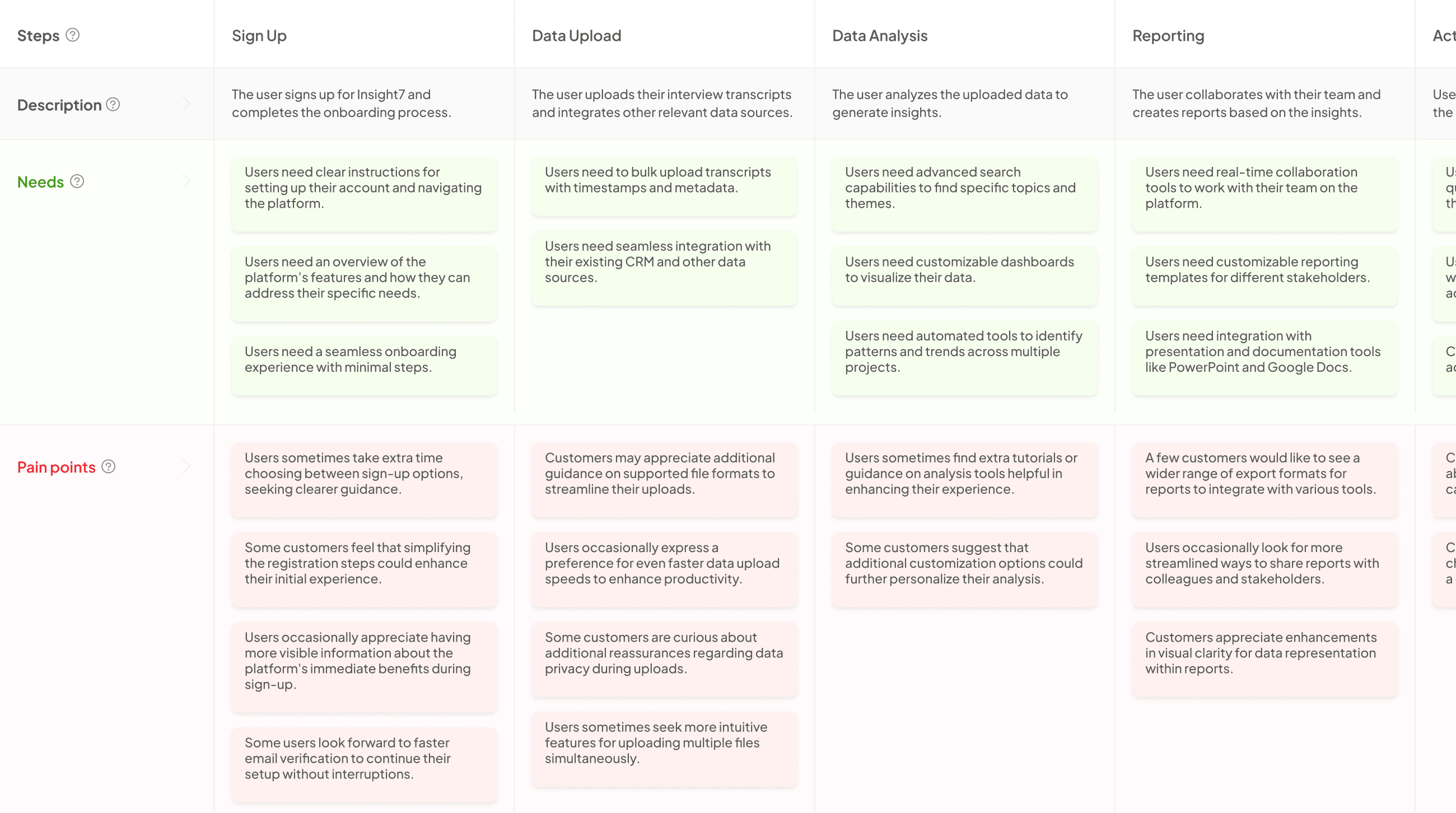
User Journey Format: How to Present Data Clearly
-
Bella Williams
- 10 min read
Clear data presentation is essential for understanding user journeys effectively. By visualizing each step a customer takes with your brand, you create a map that distinguishes their feelings, behaviors, and interactions. This insight transforms complex data into an accessible format that helps identify pain points and engagement opportunities, making it clearer for all stakeholders involved.
The importance of clear data presentation lies in the ability to foster alignment among teams. A well-constructed visualization not only reveals key touchpoints but also guides strategies for enhancing user experience. By refining communication and addressing friction points, organizations can ensure that customer interactions are meaningful and impactful, ultimately driving satisfaction and loyalty.
Extract insights from Customer & Employee Interviews. At Scale.

The Importance of User Journey Mapping
User journey mapping is vital for understanding how customers interact with your brand. By visualizing each step of their experience, businesses can identify pain points and opportunities for improvement. This process helps create a clear narrative about customer behavior, allowing teams to make informed decisions rooted in real insights.
Mapping the user journey significantly enhances clear data presentation. This mapping translates complex data into relatable stories that resonate with stakeholders. Furthermore, engaging with user persona research, particularly through qualitative methods, can refine these mappings. When marketers delve into customer psychology, the resulting journey maps become more accurate and actionable. Ultimately, a well-crafted user journey serves as a strategic tool, driving focused marketing efforts and fostering customer loyalty.
Aligning Business Goals with Customer Needs
Aligning business goals with customer needs requires a deep understanding of the customer journey, ensuring all interactions resonate with users. To achieve this alignment, businesses must identify key touchpoints throughout the customer experience. Clear data presentation can simplify complex customer insights, helping organizations to adapt their strategies effectively.
First, analyze the customer’s journey to pinpoint moments that matter most. By understanding when and how customers engage, businesses can tailor their offerings to meet these needs. Establish measurable goals that reflect both user satisfaction and business objectives. Discussing and sharing insights openly within teams fosters collaboration and innovation, allowing for better-informed decisions. Lastly, continually monitor and adjust strategies to stay in sync with evolving customer preferences. This ongoing process not only enhances the customer experience but also drives business success.
Identifying Key Touchpoints and Pain Points
Identifying key touchpoints and pain points in the user journey is essential for clearer data presentation. Start by mapping out the customer journey, from awareness through to post-purchase. It is crucial to outline the specific interactions users have at each stage. These interactions serve as key touchpoints, where customers engage with your brand and form impressions.
Next, recognize the pain points that may hinder a positive experience. These could range from difficulties in navigation on your website to insufficient product information. Gathering data through KPIs can validate these touchpoints and pain points. For instance, observe metrics such as bounce rates or cart abandonment rates to correlate user behavior with your identified touchpoints. Each touchpoint should be aligned with measurable goals, allowing for continuous improvement in the user experience. Therefore, if you aim for clear data presentation, focus on how each touchpoint and pain point can be demonstrated through relevant metrics.
Generate Journey maps, Mind maps, Bar charts and more from your data in Minutes
Techniques for Clear Data Presentation in User Journeys
Clear data presentation is crucial when illustrating user journeys, as it transforms complex information into easily digestible visuals. By employing techniques like mapping, storytelling, and segmentation, you can create meaningful representations. Visualization helps identify key touchpoints and emotional responses, enabling teams to address friction points effectively.
To enhance your data presentation, consider these techniques:
- Use Visual Mapping: Create diagrams that outline each step in the customer journey, highlighting interactions and experiences. This visual format makes it easier to follow the narrative.
- Incorporate Storytelling: Frame data within a story to engage your audience. This technique fosters emotional connections, making the information more relatable and memorable.
- Segment Data Appropriately: Break down data into categories based on user behavior or demographics. This targeted approach allows you to identify patterns and tailor experiences accordingly.
By deploying these strategies, you can ensure your data presentation is clear, engaging, and actionable.
Simplifying Complex Data for User Understanding
Clear data presentation is essential for simplifying complex information. It transforms intricate data sets into narratives that users can easily understand and engage with. For instance, presenting customer insights in organized summaries allows users to grasp feedback trends quickly. Instead of overwhelming users with raw data, a well-structured approach highlights key findings, enabling informed decision-making.
To enhance clarity, consider these strategies. First, utilize visuals like charts and graphs to represent data trends effectively. This helps to illustrate relationships and makes patterns more discernible at a glance. Second, break down information into manageable segments. Instead of presenting an influx of details all at once, focus on one aspect at a time to facilitate comprehension. Lastly, ensure consistency in terminology; using the same language throughout your presentation aids user understanding and keeps the narrative coherent. These techniques collectively underscore the importance of clear data presentation in enhancing user insight and interaction.
Visualizing the Data Effectively
Effective data visualization transforms complex customer journey information into clear data presentation. By mapping each interaction and experience, you create a straightforward visual representation that highlights key touchpoints and emotions. This clarity ensures that stakeholders can easily grasp customer needs, making it easier for teams to address friction points and enhance satisfaction.
To visualize data effectively, consider these essential strategies: graphical formats, storytelling elements, and audience engagement. First, select appropriate graphical formats such as flowcharts or infographics that visually summarize user interactions. Next, integrate storytelling elements to provide context and emotion, helping your audience connect with the data on a personal level. Finally, focus on engaging your audience by using interactive elements, enabling them to explore the journey at their own pace. These steps will ensure your data presentation resonates and impacts decision-making significantly.
Conclusion: Mastering Clear Data Presentation in User Journey Mapping
Mastering Clear Data Presentation in user journey mapping is essential for transforming complex information into actionable insights. By effectively visualizing customer interactions, you not only highlight key touchpoints but also reveal emotions and behaviors throughout their journey. This clarity enables teams to quickly identify pain points and opportunities for improvement, fostering a more cohesive approach to customer experience.
Extract insights from Customer & Employee Interviews. At Scale.

Presenting data clearly empowers organizations to create targeted strategies, enhancing overall satisfaction and engagement. Ultimately, a well-structured user journey map acts as a navigational tool, guiding teams toward meaningful outcomes. Emphasizing clarity in data presentation ensures that every stakeholder understands the significance of customer interactions and supports informed decision-making for future growth.


