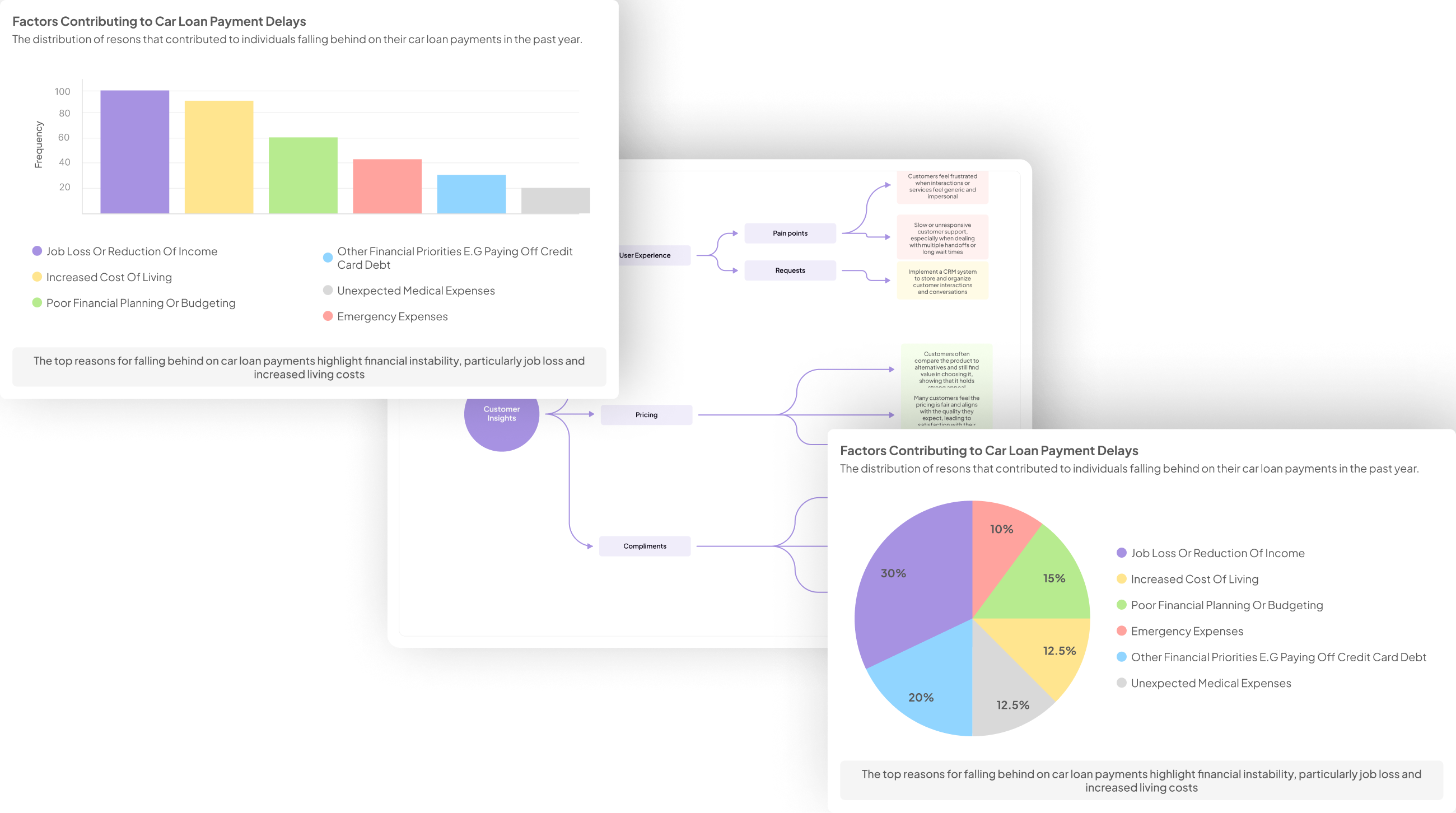
Focus Group Insights are pivotal in translating participant discussions into visual representations that facilitate understanding and decision-making. Engaging with focus groups offers a treasure trove of perspectives, emotions, and ideas, ripe for analysis. The challenge lies in effectively transforming these discussions into visuals that highlight key themes and narratives, making the data accessible and actionable for stakeholders.
Visualizing insights from focus group discussions not only aids clarity but also ensures that the sentiments expressed resonate with your audience. By employing thoughtful visualization techniques, you can capture the essence of qualitative feedback, guiding strategic initiatives and product development. This section will explore various methods for extracting and presenting meaningful insights, ultimately enhancing your understanding of participant experiences and opinions.
Generate visualizations from your qualitative data. At Scale.

Understanding Focus Group Insights
Understanding Focus Group Insights involves analyzing qualitative data to gain a deeper perspective on participant experiences and opinions. Focus groups offer rich feedback that can inform product development and marketing strategies. By interpreting and organizing this data, you can identify recurring themes and sentiments that emerge within discussions.
To effectively harness these insights, begin by categorizing the feedback into positive, negative, and neutral comments. This helps in visualizing overarching trends and areas needing attention. Next, it's essential to delve into the data to extract key themes that can guide decision-making. By focusing on both positive and unique perspectives, you will create a comprehensive understanding of participant sentiments. This narrative approach not only highlights the collective voice of participants but also allows for targeted responses to their needs and preferences. Overall, translating focus group insights into actionable strategies can significantly enhance the effectiveness of your initiatives.
Analyzing Qualitative Data
Analyzing qualitative data involves a thorough examination of the insights derived from focus group discussions. By engaging with the participants' narratives, researchers can uncover underlying themes and emotions that may not be immediately evident. This process is crucial to understanding the broader context of the feedback provided, as it identifies patterns that shape user experiences and preferences.
A systematic approach can enhance the reliability of focus group insights. Start by categorizing responses into positive and negative comments to highlight key sentiments. This organization allows for easier visualization of trends over time or across different demographics. Additionally, applying analytical tools can aid in mining the data for unique opinions or themes that emerge during discussions. As you dissect the insights, remain open to discovering unexpected perspectives that could further inform your project's direction.
Extracting Key Themes
To effectively leverage focus group insights, the process of extracting key themes becomes essential. Start by compiling the data collected from focus group discussions. This allows for a comprehensive understanding of the conversations and experiences shared by participants. By systematically analyzing this information, you can identify recurring patterns and sentiments that emerge throughout the discussions.
Once the data is organized, focus on categorizing themes based on common topics or concerns expressed by participants. This may include pain points, suggestions, or favorable experiences. Engaging with qualitative data, you can quantify the frequency of these themes, ensuring clarity in your analysis. Ultimately, this summarization provides actionable insights that can guide decision-making and inform future strategies. Exploring various visualization tools can further enhance the presentation of these themes, making it easier for stakeholders to digest the findings.
Evaluate Performance on Customer Calls for Quality Assurance.
Visualizing Focus Group Insights
Visualizing Focus Group Insights is essential for translating qualitative data into actionable information. This process helps teams identify and emphasize key themes emerging from discussions. Using a systematic approach to visualize insights not only enhances understanding but also supports decision-making. Visual representations can clarify complex data, showing both strengths and weaknesses highlighted by participants.
To effectively visualize Focus Group Insights, start by compiling and organizing your data. Gather all relevant feedback and categorize it to identify recognizable patterns. Next, select the appropriate visualization tools to convey your findings clearly. Using tools that allow for comparison, such as bar charts or sentiment maps, can provide deeper insights. Consider platforms like NVivo and Atlas.ti for their robust analytical features. By creating visual representations of the data, stakeholders can make informed decisions and strategize effectively based on the focal points revealed in the focus groups.
Step-by-Step Guide to Visualization
To effectively visualize themes from focus group discussions, follow this structured approach. Begin by compiling and organizing data gathered from the sessions. Gather all transcripts, notes, and recordings, and categorize the data based on different themes or questions raised during discussions. This preliminary step ensures that you have a clear overview of what insights can be highlighted.
Next, select the right visualization tools that best suit your data type and intended presentation style. Tools such as NVivo and Atlas.ti can help extract meaningful patterns and themes from the raw data. Experimenting with various charts, graphs, or word clouds can effectively showcase these Focus Group Insights, enabling stakeholders to grasp complex information quickly. Tailoring the visualization to your audience’s needs will ensure maximum engagement and understanding, allowing the insights to lead to actionable strategies.
- Step 1: Compile and Organize Data
Compiling and organizing data from focus group insights is a critical first step in the visualization process. Begin by gathering all relevant transcripts, audio recordings, and notes from the discussions. It’s essential to keep everything in order to ensure no valuable information is overlooked. Create a dedicated project for this data that allows for easy access and management. Upload all necessary files into this centralized space, allowing for efficient retrieval and organization.
After collecting the data, categorize it by themes, topics, or questions that emerged during the discussions. This structure will enable you to identify patterns and trends more effectively. By organizing the data in this manner, you pave the way for insightful analyses that can inform decision-making. This foundational step sets the stage for creating visual representations that communicate the key insights from your focus groups clearly and effectively.
- Step 2: Select the Right Visualization Tools
Selecting the right visualization tools is crucial for effectively showcasing focus group insights. The ideal tools can help distill complex qualitative data into easily digestible formats, making it simpler to identify patterns and draw conclusions. Various options are available, from basic charting software to specialized platforms designed for qualitative analysis. Understanding the unique capabilities of these tools can enhance your ability to represent themes and insights accurately.
When choosing visualization tools, consider the following factors: ease of use, compatibility with your data formats, and the ability to customize visual outputs. Tools like NVivo and Atlas.ti offer advanced features specifically for qualitative data, while simpler options, such as Google Charts, can still be effective for creating quick visual aids. By leveraging the right platforms, you can amplify the impact of your focus group insights, ultimately leading to more informed decisions and action steps.
Top Tools for Visualization
In the realm of visualizing focus group insights, choosing the right tools can significantly enhance your analysis and presentation. Various tools are available, each with unique features designed to aid in extracting meaningful themes from discussions. Among the top options, insight7 stands out for its user-friendly interface, which allows effortless data manipulation. Tools like NVivo and Atlas.ti are excellent for qualitative data analysis, offering capabilities to code and categorize responses efficiently.
MAXQDA provides excellent data visualization options, enabling users to create visual maps of themes and insights effortlessly. Dedoose is particularly useful for mixed methods research, making it easy to combine quantitative and qualitative data visually. Ultimately, the choice of tools depends on your specific needs and the complexity of the insights you wish to convey, ensuring that the presentation of focus group insights is both clear and impactful.
- insight7
Focus group discussions often yield a wealth of information, but extracting meaningful insights can be daunting. Insight7 emphasizes the importance of analyzing Focus Group Insights effectively. This process begins with compiling and organizing the collected data systematically. By doing so, you can identify patterns and themes that emerge from participant conversations. Organizing this data not only streamlines the analysis but also sets a strong foundation for visualization.
Once the data is systematically arranged, selecting the appropriate visualization tools is crucial. These tools can transform raw data into engaging charts, graphs, or infographics, making the insights clearer. Ultimately, effective visualization allows stakeholders to grasp themes quickly, fostering better decision-making. Ensuring that these insights are visually represented facilitates collaboration and enhances understanding among team members, ultimately leading to more informed strategies and actions.
- NVivo
The application NVivo plays a pivotal role in visualizing themes derived from focus group insights. By providing a user-friendly interface, NVivo allows researchers to easily organize and analyze qualitative data. With its project-based approach, users can compile transcripts, audio files, and other related documents into a manageable workspace. This empowers teams to identify patterns and trends quickly across vast amounts of conversation data, streamlining the research process.
Moreover, NVivo's matrix analysis feature enables users to formulate targeted questions about the data. Researchers can extract valuable insights on specific topics, which is particularly beneficial for evaluating customer feedback or understanding responses related to particular products. By summarizing findings in an intuitive layout, NVivo transforms complex discussions into clear visual representations. This analytical approach fosters informed decision-making and enhances the overall understanding of focus group insights, ultimately driving strategic action based on user responses.
- Atlas.ti
Atlas.ti plays a crucial role in visualizing themes extracted from focus group insights. This software facilitates a seamless process of gathering and analyzing qualitative data, making it easier to identify recurring subjects and sentiments. Users can create projects that allow for the organization of various transcripts and audio recordings, which is essential for synthesizing participant feedback efficiently. As themes begin to emerge, the ability to visualize and compare these insights becomes invaluable for researchers and analysts alike.
The platform offers diverse methods to analyze and display data, such as matrix queries for trend identification. This feature empowers users to generate tailored visual outputs, showcasing customer sentiments or product perceptions. Additionally, Atlas.ti supports various data import options, ensuring a user-friendly experience. Implementing this tool enhances the capacity to derive actionable insights from focus group discussions, ultimately leading to more informed decision-making.
- MAXQDA
MAXQDA serves as a vital tool in visualizing themes derived from focus group discussions, making the insights more accessible and actionable. It allows researchers to organize, analyze, and visualize qualitative data effortlessly. With its user-friendly interface, you can create projects that compile all relevant focus group data easily. This functionality is essential in deriving meaningful conclusions from the discussions.
Once the data is imported, MAXQDA enables the analysis of the focus group insights through various visual representations such as charts and matrices. These tools help in identifying patterns and trends, making it simpler to respond to specific research questions. By summarizing information effectively, researchers can present their findings in a more engaging and informative manner, thus enhancing the overall impact of their work. Ultimately, the integration of MAXQDA into your research process streamlines the visualization of insights, ensuring that your findings are both compelling and clear.
- Dedoose
Dedoose offers a robust platform tailored for analyzing qualitative data, which makes it particularly useful for uncovering focus group insights. This tool allows researchers to efficiently manage, analyze, and visualize data from focus group discussions. Users can tag and code responses, enabling the identification of emerging themes in a streamlined manner. The ability to create visual representations of data makes it easier to share findings with stakeholders.
Moreover, Dedoose supports collaboration, allowing multiple users to work simultaneously on projects. This feature enhances the collective understanding of insights derived from discussions. Utilizing Dedoose can significantly improve the clarity of focus group insights, making complex data more accessible. The platform’s versatility in generating customized reports helps to effectively communicate the themes and patterns gleaned from focus group discussions. This way, researchers can efficiently inform decision-making processes based on the insights collected.
Conclusion on Visualizing Focus Group Insights
Visualizing Focus Group Insights enhances the understanding of collective sentiments and perspectives. This process allows researchers to transform complex discussions into clear, actionable data representations. By employing visualization techniques, themes from the focus group discussions become readily accessible, enabling stakeholders to digest insights quickly and effectively.
The essence of this visualization lies in its ability to bring underlying emotions and reactions to the forefront, helping teams identify patterns and discrepancies. Ultimately, effective visualization not only informs decision-makers but also drives future strategies based on genuine user feedback. Utilizing appropriate tools is essential to ensure that these insights are communicated with clarity and impact.


