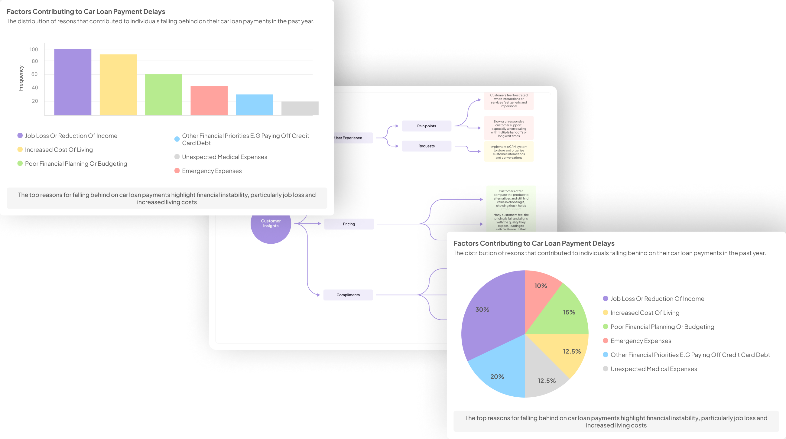
How to generate visualizations from employee interviews
-
Bella Williams
- 10 min read
Interview Data Visualization serves as a powerful tool to transform qualitative insights from employee interviews into engaging and informative visuals. By translating words into images, organizations can better grasp themes and trends that emerge from interviews, helping them make informed decisions. This process not only highlights critical feedback but also reveals patterns that might be overlooked in traditional data analysis.
Utilizing various visualization techniques allows companies to dissect complex datasets, such as customer opinions and experiences. By employing graphs, charts, and dashboards, stakeholders can quickly identify both positive and negative sentiments expressed by employees. As we explore the methods and tools for creating impactful visualizations, you will discover how these insights can inform strategies and enhance organizational effectiveness.
Generate visualizations from your qualitative data. At Scale.

Key Steps in Interview Data Visualization
To create effective Interview Data Visualization, it’s essential to follow critical steps that enhance clarity and insight. The first step involves collecting and processing data from employee interviews. You can aggregate transcripts and categorize them based on common themes or issues. This preparation phase allows for a more straightforward analysis of trends and patterns that emerge from the conversations. It’s important to organize the data systematically to facilitate easy reference during the visualization stage.
Next, selecting the right visualization techniques is crucial for presenting the findings comprehensibly. Different methods, such as charts, graphs, or dashboards, can illustrate various aspects of the data. For example, a bar chart may effectively showcase the frequency of mentioned pain points, while a dashboard can provide a holistic view of employee sentiments. By clearly representing the insights gained from employee interviews, organizations can make informed decisions based on visual data interpretation.
Step 1: Collecting and Processing Data
Collecting and processing data is the foundational step in generating effective visualizations from employee interviews. Begin by conducting interviews methodically, ensuring that you ask open-ended questions to capture diverse responses. Gathering qualitative data in this way allows for richer insights, complementing quantitative metrics if available. It's essential to record these conversations accurately, using audio or video recording tools, which will provide you with precise content for later analysis.
Once you have collected your interview data, it's time to process it. This involves transcribing recordings and identifying key themes or sentiments expressed by the interviewees. Organizing your data into categories, such as positive and negative feedback, can help clarify findings. Use text analysis tools to extract insights, making it easier to convert them into impactful visualizations. This careful attention to detail in data collection and processing sets the stage for compelling interview data visualization that effectively communicates the core messages from your interviews.
Step 2: Choosing the Right Visualization Techniques
Selecting the right visualization techniques is crucial for effectively conveying insights gathered from employee interviews. Each visualization method can dramatically alter the narrative of your data, emphasizing different aspects and patterns. When choosing techniques, it's essential to consider the audience's needs and the message you wish to convey. For instance, bar graphs can simplify comparisons, while heat maps can reveal trends across various responses.
Moreover, clarity is paramount. Complex charts may confuse viewers rather than inform them. Strive for readability, ensuring that your audience can quickly grasp the key insights. Common techniques like pie charts, scatter plots, and timelines also serve distinct purposes, such as displaying compositions or relationships over time. By thoughtfully selecting your visualization methods, you can create a more impactful story from the interview data, ultimately driving informed decision-making and deeper understanding within your organization.
Top Tools for Interview Data Visualization
To effectively engage with Interview Data Visualization, a variety of tools are essential in transforming raw data into meaningful graphics. These tools help highlight key insights from employee interviews, enabling better understanding and decision-making. They empower users to discover trends and patterns across diverse datasets, ultimately enriching the narrative of employee feedback.
Here are some top tools for creating powerful visualizations:
Insight7: This tool provides advanced analysis features that allow you to dissect interview data easily. It automatically highlights themes and key insights, helping streamline the reporting process.
Tableau: Renowned for its interactive visualizations, Tableau allows users to create dashboards to illustrate interview findings dynamically. Its user interface makes it accessible for users with varying levels of technical expertise.
Microsoft Power BI: This widely-used tool integrates well with other Microsoft products, making data manipulation efficient. It offers robust data visualization options that can effectively represent employee insights.
Google Data Studio: An excellent choice for collaborative projects, Google Data Studio allows teams to share and build on visualizations in real time, enhancing teamwork in data analysis.
D3.js: For those who have coding experience, D3.js offers unparalleled flexibility in creating custom visualizations tailored to specific interview data needs.
Using these tools, organizations can transform interviews into compelling data stories.
Generate Journey maps, Mind maps, Bar charts and more from your data in Minutes
insight7
Visualizing interview data effectively is essential for transforming raw insights into compelling narratives. Insight7 emphasizes the need to identify common themes and patterns within employee interviews. By synthesizing this information, organizations can create visuals that communicate findings in a more digestible format. Such visual representations enhance understanding, making it easier to present to stakeholders who may not be familiar with the data.
To generate impactful visuals from interview data, consider the following approaches. First, categorize insights into key themes. This helps to streamline the information, enabling clarity in what the data reveals. Second, select appropriate visualization tools to portray these insights visually. Whether using bar graphs or word clouds, the goal is to illustrate concepts that resonate with the audience. Finally, iterate your visualizations based on feedback. Improving and refining your visuals can enhance their effectiveness, ensuring that the narrative behind the interview data is clear and compelling.
Tableau
Tableau serves as a powerful tool for transforming interview data into insightful visualizations. It allows users to import and process data easily, enabling a streamlined analysis of employee interviews. Once the data is entered, Tableau provides various chart and graph options, making trends and themes easier to spot. This visual clarity helps stakeholders understand employee sentiments and experiences more effectively.
Through its interactive features, Tableau further enhances the interview data visualization experience. Users can create dashboards that showcase multiple insights simultaneously, facilitating a comprehensive understanding of the information. The ability to filter and drill down into specifics ensures that every detail can be explored, allowing for nuanced analysis. By integrating Tableau into your data analysis process, you can turn raw interview data into valuable insights that guide decision-making and improve overall employee engagement.
Microsoft Power BI
Microsoft Power BI serves as a powerful tool for transforming interview data into compelling visualizations. By leveraging its capabilities, users can easily create interactive dashboards that highlight key insights gathered from employee interviews. The platform supports various data sources and offers a wide range of visualization options, making it an ideal choice for effectively presenting findings.
To get started with Microsoft Power BI for interview data visualization, first, import your collected data into the software. Next, utilize its user-friendly interface to customize visual elements, such as charts and graphs. This customization process helps to simplify complex data and enhances audience understanding. Furthermore, Power BI provides analytical capabilities that enable users to track trends and interactions within the interview data over time, ensuring that important insights are readily accessible and actionable.
In summary, Microsoft Power BI streamlines the process of visualizing interview data, turning qualitative feedback into engaging, visual narratives. This ability not only drives deeper understanding but also facilitates decision-making based on employee insights.
Google Data Studio
Google Data Studio is a powerful tool for creating Interview Data Visualization. It allows users to connect various data sources and present insights through customizable reports and dashboards. By utilizing this platform, organizations can transform raw interview data into visually appealing representations that are easily digestible for all stakeholders.
To get started with Google Data Studio, first, link your data sources, such as CSV files or Google Sheets, containing interview insights. Next, select various visualization options like bar charts, pie charts, or tables to present the information effectively. Finally, customize your dashboard with filters and date ranges to allow viewers to dissect the data further. This capability not only aids in comprehending patterns and trends but also facilitates collaborative discussions around employee feedback, ultimately guiding decision-making processes and action plans.
D3.js
D3.js, a powerful JavaScript library, plays a crucial role in creating dynamic data visualizations from interview data. This tool enables users to bind data to HTML elements and apply data-driven transformations to those elements. By using D3.js, one can create interactive charts, graphs, and other visualizations that effectively communicate insights derived from employee interviews.
To leverage D3.js for interview data visualization, a few key steps are essential. First, familiarize yourself with the D3.js documentation and resources, which provide invaluable guidance and examples. Second, ensure your data is appropriately formatted, typically as structured JSON or CSV files, which will make it easier to bind to visual elements. Third, explore various visualization types, such as bar charts or pie charts, to determine which best represents your findings. By following these steps, you can transform raw interview data into compelling visual stories that enhance understanding and facilitate data-driven decisions.
Conclusion: Enhancing Insights through Interview Data Visualization
Effective Interview Data Visualization transforms raw insights into compelling narratives. By employing various visualization techniques, organizations can easily identify themes and sentiments from employee interviews. This analysis not only uncovers valuable employee perspectives but also aids in strategic decision-making processes.
Furthermore, utilizing visual tools to represent feedback, such as positive and negative comments, enhances clarity. Through these visualizations, patterns emerge, enabling teams to address concerns efficiently and grasp opportunities for improvement. Ultimately, a thoughtful approach to Interview Data Visualization amplifies understanding, fostering a culture of transparency and continuous growth within the organization.
Generate visualizations from your qualitative data. At Scale.

💬 Need Help? Chat with Support
Our team typically responds within minutes


