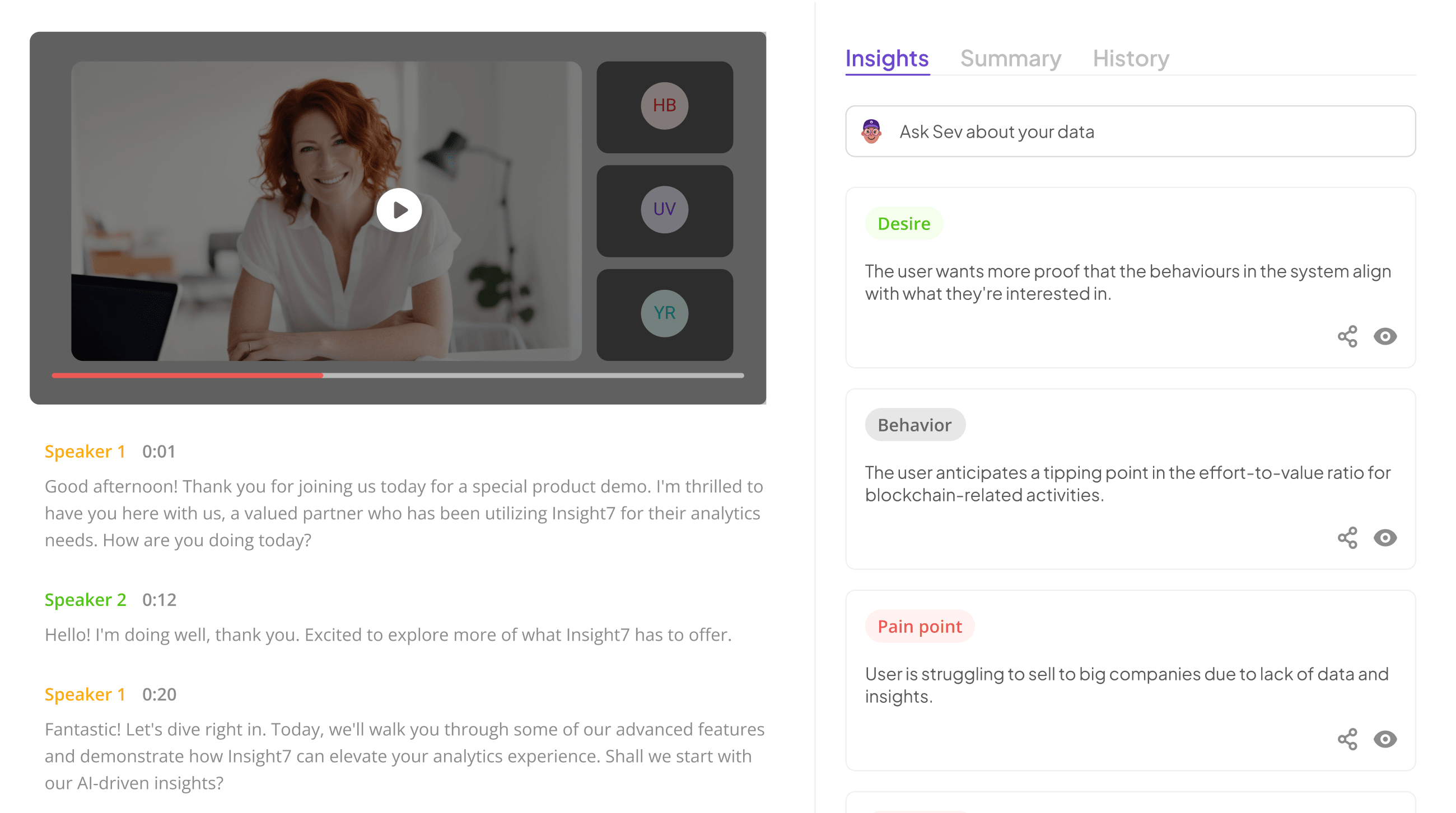
Accessible QA Reporting begins with understanding the critical need for clarity in quality assurance outcomes. In today’s fast-paced environment, stakeholders often struggle to decipher complex data. This makes it essential for QA reports to be straightforward and user-friendly, ensuring that insights are easily accessible to all relevant parties.
Enhancing the accessibility of QA reporting fosters effective communication and informed decision-making. By employing various reporting formats tailored to specific audiences, organizations can bridge gaps in understanding. This section aims to explore innovative approaches that make QA results not only available but also actionable, ultimately empowering teams to drive improvements based on clear and comprehensible data.
Analyze & Evaluate Calls. At Scale.

Understanding the Importance of Accessible QA Reporting
Accessible QA Reporting plays a critical role in ensuring that quality assurance results are meaningful and actionable for a wide audience. When QA reports are designed with accessibility in mind, they promote understanding among diverse stakeholders, including team members, management, and clients. Accessible reporting helps eliminate misunderstandings and fosters collaboration, ultimately supporting better decision-making processes.
Moreover, the importance of accessibility lies in the elimination of barriers that can arise from complex data and jargon. Stakeholders need clear and concise information to quickly grasp the insights and implications of QA findings. This leads to informed discussions and strategies for improvement. By implementing various reporting formats, QA teams can effectively present their findings, ensuring that insights are not just numbers on a page but valuable information that drives organizational success.
Why Accessibility Matters in QA
Accessibility in QA is crucial for ensuring that all stakeholders can understand the outcomes and insights generated from quality assurance processes. When QA reports are accessible, they foster transparency, allowing teams to identify issues and improve products collaboratively. This open communication leads to quicker resolutions and more informed decisions, ultimately enhancing the quality of the product.
Accessible QA reporting enables everyone involved, including non-technical stakeholders, to grasp complex information and data clearly. Utilizing various formats increases understanding and engagement, while also making it easier for organizations to comply with regulatory standards. As a result, creating inclusive reporting formats is not just beneficial but essential. By prioritizing accessibility, teams can optimize their workflows and ensure that quality assurance practices positively impact overall business success.
Common Barriers in Traditional QA Reporting
Traditional QA reporting often faces several common barriers that hinder the accessibility of information. One major issue is the reliance on complex language and jargon that leave stakeholders confused. This lack of clarity can create a gap between the data presented and the actual insights needed for decision-making. Furthermore, static reports that do not allow for real-time updates may become outdated quickly, limiting their usefulness in a fast-paced environment.
Another significant barrier is the inadequate visualization of data, which can turn straightforward insights into overwhelming quantities of information. Without effective visual aids, stakeholders may struggle to interpret the data correctly. Lastly, traditional reporting methods may not consider the diverse needs of various audiences, further complicating accessibility. Addressing these common barriers is essential for streamlining QA processes and ensuring that accessible QA reporting becomes a reality. By focusing on clearer communication and engaging visual formats, organizations can bridge the gap and enable better data-driven decisions.
Extract insights from interviews, calls, surveys and reviews for insights in minutes
Seven Effective Formats for Accessible QA Reporting
Accessible QA Reporting serves as a bridge between data and understanding. By employing effective formats, organizations can transform complex quality assessments into insights that everyone can grasp. The first format involves utilizing data visualization tools, which allow stakeholders to view quality metrics in visually appealing and easily interpretable charts. Tools like Tableau, for instance, create interactive reports that engage users while presenting vital information clearly.
Another effective approach is to customize reports based on the specific needs of different stakeholders. This personalization ensures that everyone—from managers to front-line employees—can access relevant insights. Additionally, incorporating infographics and dashboards can enhance accessibility by summarizing key findings in a digestible manner. By exploring these formats, organizations do not just report data; they convey stories that facilitate informed decision-making and continuous improvement. Further, by assessing user feedback and iterating on reporting methods, you can ensure that your QA results remain clear and actionable over time.
Utilizing Data Visualization Tools
Data visualization tools play a vital role in making QA reporting more accessible. By transforming raw data into visual formats, stakeholders can quickly grasp important insights and trends. Often, complex data sets can overwhelm or confuse users, but visuals like charts and graphs can simplify these insights, allowing for faster decision-making.
One effective approach is to utilize platforms such as Tableau or Power BI, which allow users to create interactive dashboards. Additionally, tools like Google Data Studio provide seamless integration with other services, enhancing reporting accessibility. These platforms enable teams to customize reports based on the audience's specific needs, ensuring that everyone—from technical experts to non-technical stakeholders—can understand the information. Ultimately, prioritizing data visualization fosters a clearer, more actionable understanding of QA metrics, contributing to the overall goal of accessible QA reporting.
- insight7: A Leader in Enhancing Accessibility
Accessibility in QA reporting holds immense significance for organizations aiming to remain competitive and efficient. As such, innovative solutions that enhance accessibility, like Accessible QA Reporting, have emerged to bridge the gap between data complexity and user understanding. These advancements help teams disseminate results effectively, ensuring that everyone involved can engage with the findings, regardless of their technical expertise.
A hallmark of effective accessibility is the ability to translate insights into actionable strategies swiftly. By adopting user-friendly reporting formats, teams can minimize the time spent on data analysis and foster better collaboration among stakeholders. Traditional methods often create bottlenecks by scattering insights across multiple files, but modern approaches consolidate information, making it easier to access and utilize. Such enhancements empower organizations to harness insights in real-time, significantly improving decision-making processes and overall productivity.
- DataWrapper: Visualize Data with Ease
Data visualization plays a pivotal role in simplifying complex data analysis and presentation. DataWrapper is designed specifically to visualize data easily and effectively, making the process more accessible for everyone involved in quality assurance reporting. This tool empowers users to create charts, maps, and graphs effortlessly, transforming raw data into visual insights that are clear and actionable.
By leveraging DataWrapper, teams can present QA results in a format that resonates with diverse audiences, from stakeholders to team members. Accessibility in QA reporting means that insights are not locked away in documents but are displayed in engaging formats that facilitate understanding. This shift encourages collaboration and informed decision-making, allowing teams to act swiftly based on data. Ultimately, DataWrapper exemplifies the importance of visualizing QA data in a way that enhances accessibility and drives organizational success.
- Tableau: Interactive and Shareable Reports
Tableau enables teams to create interactive and shareable reports, making quality assurance (QA) results more accessible. By transforming complex data into visual formats, Tableau allows users to quickly grasp insights without requiring extensive technical knowledge. With its intuitive interface, anyone in the organization can dive into data to identify trends, anomalies, and areas needing attention.
Utilizing Tableau for interactive reports fosters collaboration by allowing teams to share findings easily. Users can click through various visualizations, drill down into details, and customize dashboards according to their needs. This accessibility not only enhances understanding among stakeholders but also improves decision-making processes by ensuring everyone has the relevant information readily available. Ultimately, incorporating Tableau into your QA reporting approach can significantly enhance the clarity and impact of your findings, making quality assurance more transparent and actionable.
- Google Data Studio: Integration with Google Services
Google Data Studio serves as a powerful platform that seamlessly integrates with various Google Services, enhancing the overall accessibility of QA reporting. By utilizing its capabilities, teams can easily connect data from Google Sheets, Google Ads, and other sources in real-time, creating dynamic and interactive reports. This integration allows for a smoother user experience and ensures that stakeholders can access relevant QA insights without technical hurdles.
In addition, Google Data Studio's drag-and-drop functionality enables users to customize their reports effortlessly. This means that teams can present data visually, making trends and patterns more evident. The availability of interactive charts and dashboards allows stakeholders to explore the data through filters and segments, promoting more informed discussions around QA results. Ultimately, this integration aids in making Accessible QA Reporting a reality, bridging the gap between data complexity and stakeholder understanding.
- Power BI: Seamless Reporting and Analytics
Power BI stands out as an exceptional tool for creating Accessible QA Reporting. This analytics platform empowers users to visualize complex data seamlessly, making insights easier to digest. With its user-friendly interface, even individuals without extensive training can craft impactful reports. This democratization of information ensures that critical insights are available to everyone in the organization, enabling informed decision-making across different levels.
A key feature of Power BI is its ability to aggregate data from multiple sources, providing a holistic view of QA processes. Reports can be customized using various visual elements such as graphs, charts, and dashboards. This not only enhances engagement but also simplifies the interpretation of data. By presenting information in a visually appealing manner, Power BI transforms raw data into stories that resonate, making QA results more accessible to stakeholders who may not be data-savvy. Thus, Power BI exemplifies the future of seamless reporting and analytics.
Step-by-Step Guide to Implementing Reporting Formats
To effectively implement Accessible QA Reporting, start by identifying the specific needs of your stakeholders. Engage with various teams to understand what information they find most valuable and how they like to receive it. This step ensures that the reporting formats you choose resonate well with the audience, making the insights more actionable and relevant to their tasks.
Next, select appropriate tools that facilitate the chosen reporting formats. Tools like data visualization software can simplify complex data, enhancing accessibility for all users. Finally, remember to customize reports for clarity by using straightforward language and intuitive layouts. This step is crucial in transforming raw data into insights that inform decision-making processes effectively. By following these steps, you create an environment where QA results are not just reported, but readily understood and utilized.
Step 1: Identify Stakeholder Needs
Understanding the needs of stakeholders is the cornerstone of creating Accessible QA Reporting. Stakeholders can include team members, management, or clients, each with unique information needs. Start by gathering comprehensive feedback through interviews, surveys, or informal discussions. This initial engagement helps illuminate their expectations and preferences regarding the reporting format, including what data they find most valuable and how they prefer it presented.
Once you have identified their needs, prioritize the key insights. Consider factors like clarity, relevance, and the level of detail required. This understanding allows you to tailor your reports effectively, ensuring they resonate with various stakeholders and facilitate better decision-making. By aligning your QA reporting with stakeholder expectations, you make valuable information more accessible, ultimately enhancing the quality and effectiveness of communication within your organization.
Step 2: Choose Appropriate Tools
Choosing the right tools for accessible QA reporting is essential in ensuring that your team's insights are understood and acted upon effectively. To facilitate accessible QA reporting, start by identifying tools that streamline the collection, analysis, and presentation of QA data. Consider user-friendly platforms that allow team members, even without advanced technical skills, to contribute and engage with the data.
Next, focus on tools that support multiple reporting formats. Software options like Tableau, Google Data Studio, and Microsoft Power BI can visually represent your data, making it more digestible for stakeholders. Incorporating visual data elements, such as charts and graphs, will help convey complex information simply and clearly, further enhancing accessibility. Remember, investing time in selecting the right tools will significantly impact the effectiveness of your QA reporting efforts.
Step 3: Customize Reports for Clarity
To ensure that QA reports are truly accessible, customizing them for clarity is essential. Tailoring the format and content of these reports helps stakeholders easily comprehend the findings and insights presented. Clear headlines, straightforward language, and intuitive layouts can enhance readability and engagement. When reports are easy to understand, stakeholders can make informed decisions more swiftly.
Begin by identifying the key metrics and data points that matter most to your audience. This will guide how you structure the report. Additionally, consider incorporating visual elements like graphs and charts to illustrate trends and comparisons effectively. Employing consistent formatting can also alleviate confusion, allowing users to focus on the insights rather than deciphering complicated designs. Ultimately, customizing reports not only makes QA results more accessible but also fosters a collaborative environment where all team members can contribute to the dialogue around quality improvements.
Conclusion on Making QA Results More Accessible
To ensure QA results are easily understood and acted upon, embracing Accessible QA Reporting is essential. By prioritizing clarity and user-friendly formats, organizations can present insights that resonate with a diverse audience. This approach not only streamlines communication but also empowers stakeholders to make informed decisions independently.
By employing effective visualization tools and customizing reports, teams can minimize confusion and enhance engagement. Ultimately, making QA results accessible fosters a more transparent and responsive environment, promoting collaboration and continuous improvement in quality assurance practices. Emphasizing accessibility transforms data into actionable knowledge that drives success.


