
Understanding the relationship between agent tenure and performance metrics can significantly impact quality assurance processes. Tenure-based Performance Visualization is essential for uncovering trends that shape agent development and productivity. By analyzing how agent experience correlates with performance scores, organizations can tailor training and feedback mechanisms for improved efficiencies.
Incorporating visual tools into the analysis simplifies the data interpretation process. These features allow QA teams to easily track performance trends over time, highlighting strengths and weaknesses in agents as they gain tenure. Ultimately, effective visualization contributes to a more data-driven approach to performance management, enhancing both agent support and overall service quality.

Exploring QA Tools for Tenure-based Performance Visualization
Quality Assurance (QA) tools tailored for tenure-based performance visualization offer valuable insights into agent performance over time. These tools analyze data trends linked to agent tenure, revealing how experience correlates with key performance indicators. By leveraging visual representation, organizations can clearly see performance shifts related to an agent's tenure, identifying strengths and areas for development.
Several prominent QA tools excel in tenure-based performance visualization. For instance, some allow users to compare performance metrics across different agent experience levels, providing a clear picture of how long-term agents perform compared to newer team members. Others feature customizable dashboards that showcase relevant data, making it easy to identify trends and assess the impact of training programs on agent performance. Ultimately, exploring these tools helps organizations enhance their quality assurance processes, fostering continuous improvement and maximizing agent effectiveness.
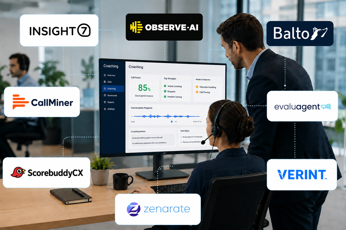
Insight7: Revolutionizing Performance Visualizations
The rapid evolution of tenure-based performance visualization is reshaping how organizations analyze and understand their data. Insight7 steps into the spotlight by offering a comprehensive platform that simplifies the analysis of performance metrics across varying agent tenures. This tools’ ability to visualize trends over time provides a clear picture of performance trajectories, allowing leaders to make informed decisions and tailor strategies accordingly.
Furthermore, Insight7 enhances the effectiveness of tenure-based analysis by providing intuitive dashboards that integrate seamlessly with existing systems. This user-friendly interface allows stakeholders to drill down into performance data, uncovering valuable patterns related to agent experience and productivity. By translating complex data sets into visual insights, organizations can identify strengths and weaknesses swiftly, fostering a culture of continuous improvement in performance metrics. Ultimately, this revolution in visualizations empowers teams to harness data more effectively, aligning with their strategic goals and enhancing overall operational efficiency.
- Overview of Insight7 capabilities
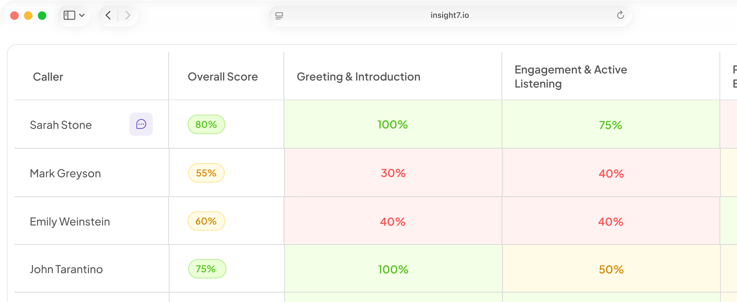
Insight7 offers a comprehensive suite of capabilities designed to enhance tenure-based performance visualization within quality assurance processes. The platform allows users to analyze score trends in relation to agent tenure effectively, offering a clear picture of performance over time. By providing intuitive dashboards and customizable reporting features, Insight7 empowers users to quickly identify patterns that can significantly impact operational success.
With a focus on data accessibility, Insight7 ensures that users can seamlessly navigate through various metrics related to agent performance. This capability helps teams align their strategies and make informed decisions based on historical data, ultimately fostering an environment of continuous improvement. Whether it's tracking individual agent performance or assessing team dynamics, Insight7 frames complex analytics in a user-friendly manner that caters to diverse operational needs and promotes informed decision-making in quality assurance.
- How Insight7 enhances tenure-based analysis
Tenure-based Performance Visualization is a game-changer in understanding agent efficiency over time. Insight7 offers an innovative approach that transforms raw data into meaningful insights, enabling organizations to analyze performance trends seamlessly. By utilizing advanced data analysis capabilities, Insight7 empowers users to visualize how agent tenure impacts overall performance. This enhanced visualization allows teams to identify strengths and weaknesses, guiding informed decision-making.
The platform also supports self-service capabilities, making it accessible for users of varying skill levels. This means that organizations can generate insightful reports on demand without relying on static data presentation methods. Moreover, Insight7 fosters collaboration, ensuring that insights derived from tenure-based analysis can be easily shared across teams. This interconnectedness promotes a holistic understanding of performance dynamics, ultimately driving improvements in customer interactions.
Additional Tools for Enhanced Analysis
To enhance your analysis of agent performance over time, several tools can provide additional insights beyond basic visualization. These tools focus on tenure-based performance visualization, allowing you to track trends and identify areas for improvement. By leveraging specific features offered by these tools, you can gain a more comprehensive understanding of agent behavior and performance metrics throughout their tenure.
Tool 1: Dashboard Visualization
This tool offers customizable dashboards that allow you to visualize key performance indicators (KPIs) in real-time. By tracking metrics such as average handling time and customer satisfaction scores, you can quickly identify performance trends.
Tool 2: Predictive Analytics
Utilizing historical data, this tool employs predictive analytics to forecast future performance based on tenure trends. This proactive approach helps in decision-making, enabling timely adjustments to training and resource allocation.
Tool 3: Comparative Analysis
With comparative analysis capabilities, you can benchmark agent performance against team averages or industry standards. This feature helps highlight strengths and weaknesses, providing actionable insights to improve overall service quality.
Tool 4: Feedback Integration
Integrating feedback tools allows you to merge qualitative insights from customer surveys with quantitative performance data. This holistic view supports deeper analysis and action-oriented strategies to enhance agent performance and customer satisfaction.
By incorporating these tools into your analysis, you can create a robust framework for understanding performance trends throughout agent tenure, ultimately leading to improved service delivery and customer experiences.
- Tool 1: Feature Set and Benefits
In order to maximize insights into agent performance, it’s crucial to understand the feature set and benefits of the selected tool. This tool is designed to enable users to visualize score trends over time, providing a comprehensive view of agent performance across different tenures. By focusing on tenure-based performance visualization, users can easily identify performance peaks and trends, allowing them to make informed decisions related to coaching and development.
One of the key features is its intuitive interface, which ensures that all team members can easily navigate without requiring extensive training. This accessibility allows users to quickly access valuable insights from numerous data points, highlighting areas of strength and opportunity. Additionally, the tool offers customizable reports that summarize critical trends in agent performance, ensuring that stakeholders are always informed of the latest developments and can act swiftly to address any issues. Overall, this tool represents a significant advancement in quality assurance practices, facilitating deeper understanding and targeted improvement in agent performance.
- Tool 2: Feature Set and Benefits
The selected tool provides an extensive feature set that enhances tenure-based performance visualization. With its ability to ingest data from various sources, it streamlines the extraction and analysis of call insights. This means users can quickly visualize trends over an agent's tenure, allowing for timely coaching and adjustments. Moreover, the tool includes customizable dashboards that help users focus on specific metrics, facilitating targeted training interventions.
The benefits extend beyond mere analysis; they empower managers to engage in more consultative approaches during customer interactions. By understanding score trends associated with different tenures, teams can identify strengths and areas for improvement unique to each agent's experience level. This comprehensive view not only aids in mentoring but also optimizes overall performance. Thus, utilizing this tool transforms data into actionable insights, significantly enhancing agent effectiveness and customer satisfaction.
- Tool 3: Feature Set and Benefits
The feature set of Tool 3 focuses on creating a user-friendly interface that simplifies the analysis of agent performance over time. This tool is designed to provide visualizations that are intuitive, allowing users to quickly grasp trends in tenure-based performance. For example, it can display how an agent's scores fluctuate as they gain more experience, highlighting areas that require attention or improvement.
Among its standout features are customizable dashboards and detailed analytics reports. Users can benefit from a comprehensive overview of not only individual performance but also team dynamics over various tenures. This enables managers to identify patterns that correlate with experience levels, driving targeted coaching or resource allocation. By employing this tool, organizations can better understand tenure-based performance visualization, aligning their training and operational strategies to foster continuous growth and improvement.
- Tool 4: Feature Set and Benefits
The feature set of Tool 4 centers around intuitive visualizations that clearly present performance metrics linked to agent tenure. This enables organizations to analyze trends effectively over time, revealing valuable insights that inform coaching and training strategies. One core benefit of tenure-based performance visualization is its ability to illustrate patterns of improvement or decline. By understanding these trends, teams can better identify when and where additional support or training is required.
In addition to trend identification, Tool 4 facilitates seamless integration with existing data systems. This enhances the ease of accessing relevant information, allowing users to generate reports quickly. Moreover, the user-friendly interface ensures that any team member can engage with the tool without requiring extensive training. Overall, these features and benefits contribute significantly to enhancing team performance and improving agent skill development over their tenure.
Steps to Implement Tenure-based Performance Visualization
To implement Tenure-based Performance Visualization, the first step is selecting the right tool that aligns with your organization's needs. Focus on usability, as a user-friendly interface encourages team engagement and efficient training. Ensure that the selected tool integrates seamlessly with existing systems, minimizing disruption while maximizing data flow.
Once the appropriate tool is in place, the next step involves analyzing agent tenure data. Begin by collecting relevant data, such as performance metrics and feedback over time. Organize this data systematically to identify trends accurately. Effective visualization techniques, such as graphs and comparison charts, help illustrate changes in performance related to agent tenure. This visual representation not only makes data more accessible but also empowers informed decision-making by highlighting areas of improvement and success. This structured approach to implementing tenure-based performance visualization fosters enhanced understanding and ensures the continuous development of your workforce.
Step 1: Selecting the Right Tool
Selecting the right tool for tenure-based performance visualization is crucial for effective quality assurance. Start by identifying key features that align with your team's specific needs. Evaluate tools based on how well they can integrate individual agent performance data into visual formats, making trends easier to analyze and understand. The right software should facilitate an intuitive interface that allows users to explore data effortlessly.
Next, consider usability and adaptability. The tool you choose should be user-friendly, allowing team members of varying technical abilities to navigate and utilize its features effectively. Additionally, ensure that the tool can adapt to changing requirements, as the review process may evolve over time. By selecting a tool that meets these criteria, you empower your team to make informed decisions based on tenure-based performance trends. This approach not only enhances productivity but also fosters a culture of continuous improvement.
- Criteria for choosing a suitable tool
Choosing a suitable tool for tenure-based performance visualization requires thorough consideration of several key factors. Firstly, assess the tool's capability to handle diverse data types and provide comprehensive visual analytics. A robust tool should allow for easy tracking of performance trends over time, ensuring that insights are relevant to both management and agents.
Next, evaluate the tool's user interface and ease of integration with existing systems. A user-friendly design will facilitate adoption among team members, while seamless integration with current processes enhances efficiency. Furthermore, consider the flexibility of the tool concerning customization and scalability. It should be adaptable to your evolving needs as your organization grows.
Finally, prioritize tools that offer strong data security and customer support. Reliable technical assistance can greatly enhance the user experience, especially during the implementation phase. By following these criteria, you can ensure the selection of a suitable tool that effectively visualizes performance trends based on agent tenure.
- Importance of usability and integration
Usability and integration are critical factors when selecting QA tools that visualize score trends across agent tenure. A user-friendly design ensures that various team members, regardless of their technical expertise, can access and interpret the data effectively. This ease of use empowers everyone within the organization to draw insights quickly and efficiently, leading to informed decision-making. Additionally, streamlined integration with existing systems allows for seamless data flow, eliminating silos and enhancing collaboration between departments.
After establishing usability, the emphasis shifts to integration capabilities. Effective tenure-based performance visualization tools must connect effortlessly with CRM systems, databases, and other analytics tools. This integration not only simplifies data management but also enriches the analysis process by providing a more comprehensive view of performance trends. Such alignment ultimately facilitates a stronger understanding of agent performance over time, driving improvements in strategy and execution. The importance of usability and integration cannot be overstated, as they are foundational to maximizing the effectiveness of these QA tools.
Step 2: Analyzing Agent Tenure Data
Analyzing Agent Tenure Data is a crucial process that allows organizations to understand performance over time. To start, it’s essential to collect and organize data methodically. This involves gathering information from various sources, such as call logs and customer feedback. By structuring the data effectively, you can uncover significant trends that might otherwise remain hidden.
Next, consider various methods for visualizing these trends. Graphs, heat maps, and other visual aids can help illustrate performance fluctuations across different timeframes. Utilizing these visual tools allows for a clearer understanding of how agents' scores change relative to their tenure. This analysis not only highlights successful practices but also identifies areas requiring improvement, further enhancing overall team performance and customer satisfaction. Emphasizing tenure-based performance visualization empowers organizations to make informed decisions based on accurate insights, driving continuous improvement in quality assurance.
- How to collect and organize data
To collect and organize data effectively for tenure-based performance visualization, begin by defining your specific data needs. Identify key performance indicators (KPIs) relevant to agent performance over time. This includes metrics like call handling time, customer satisfaction scores, and resolution rates. By clarifying these metrics, you can ensure that the data collected is both relevant and useful.
Next, streamline the data collection process. Use various methods such as transcription of calls, feedback forms, or analytics tools that can automate data capture. Integrating these sources into one centralized project allows for easier management and analysis. Once the data is gathered, categorizing it according to agent tenure helps in visualizing trends more clearly. Create visual dashboards that reflect performance changes across different tenure brackets, facilitating insights into the correlation between experience and performance. This structured approach sets the foundation for insightful tenure-based performance visualization, enabling organizations to understand their agents’ development and identify areas for improvement.
- Methods for visualizing trends effectively
To effectively visualize trends in tenure-based performance, it’s essential to select methods that highlight key patterns and insights. Visual representations, such as line charts or bar graphs, can demonstrate performance changes over time. This allows stakeholders to see not only current performance but also how tenure influences these trends. By collecting data across various timeframes, organizations can create visualizations that reveal shifts in agent efficacy, pinpointing areas requiring attention or improvement.
Another effective method includes utilizing heat maps to display performance metrics across different agent tenures. Heat maps can quickly illustrate how scores vary, enabling teams to identify strong performers and those needing additional support. Moreover, interactive dashboards can empower users to manipulate data views, offering personalized insights based on specific query needs. By implementing these visualization strategies, organizations can foster a comprehensive understanding of tenure-based performance, ultimately driving informed decision-making.
Conclusion: The Impact of Tenure-based Performance Visualization
Tenure-based Performance Visualization plays a crucial role in understanding agent performance over time. By analyzing trends related to tenure, organizations can identify strengths and weaknesses in their teams. Not only does this visualization highlight areas for improvement, but it also enables proactive strategies to enhance overall performance through targeted coaching and development.
Furthermore, the insights gained from tenure-based performance data can foster a culture of continuous improvement. When teams understand their progress and challenges, they are more likely to engage in constructive dialogue and collaborative growth. Ultimately, leveraging these visualizations supports better decision-making, resource allocation, and employee satisfaction, driving long-term success for the organization.