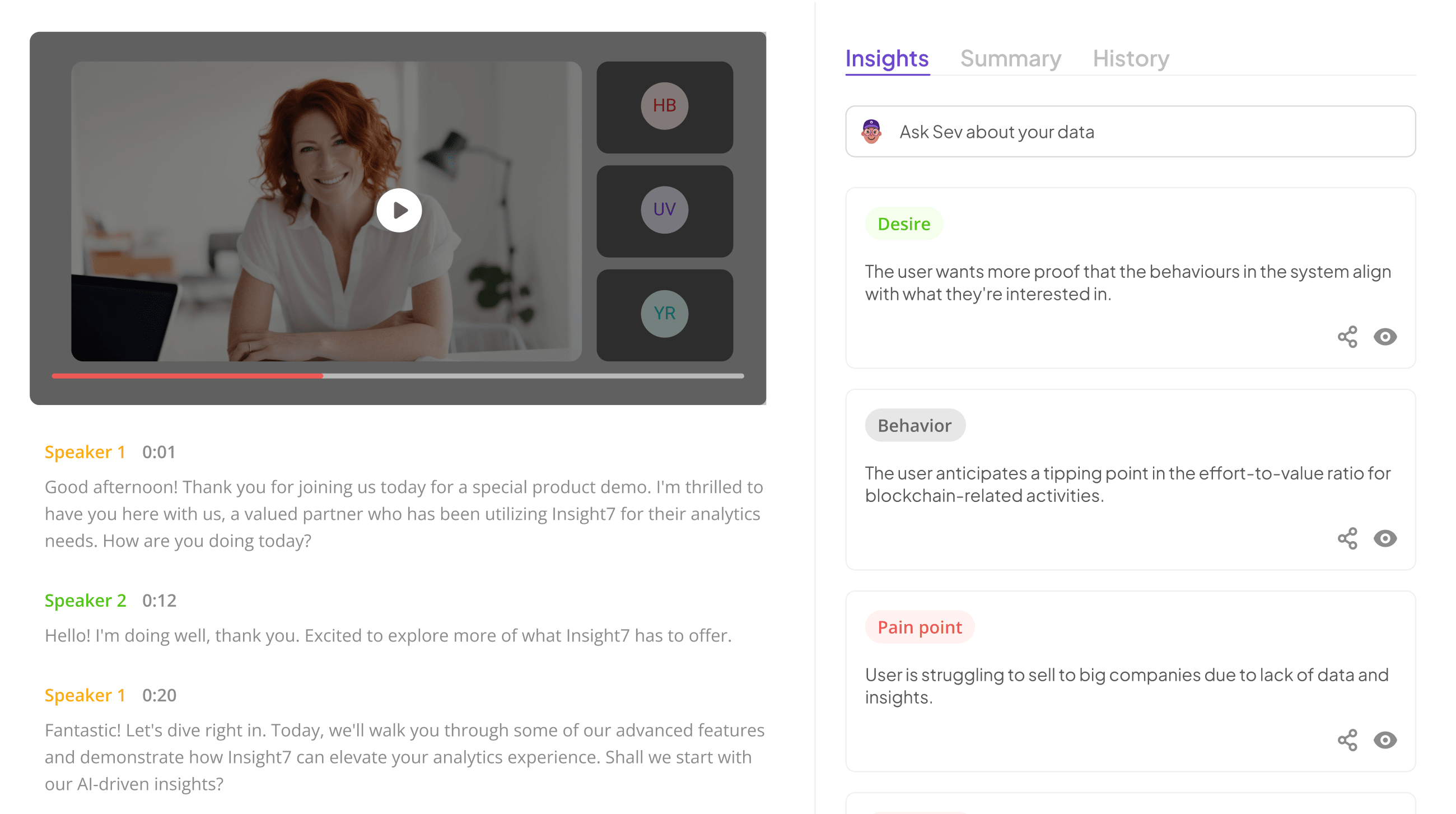
Understanding the importance of survey results presentation begins with recognizing how impactful data storytelling can be. When organizations collect feedback, the real value lies not just in the numbers but in effectively communicating those insights. A strong presentation of survey results can inspire action, drive decision-making, and enhance engagement among stakeholders.
Survey results presentation is crucial for turning data into meaningful narratives that resonate with audiences. By transforming raw data into visual formats, we help stakeholders grasp key insights quickly and easily. This section will explore strategies that not only clarify the findings but also emphasize their relevance, ensuring that the insights gleaned from the data effectively guide future initiatives.
Analyze & Evaluate Calls. At Scale.

Crafting an Engaging Survey Results Presentation
Creating an engaging survey results presentation effectively captures the audience's attention and communicates findings clearly. Begin by using visual aids to present your data compellingly. This could mean incorporating graphs, charts, or infographics that translate complex data into digestible visuals. Select appropriate chart types that reflect the nature of your data, ensuring clarity and understanding. For example, bar charts work well for comparing quantities, while pie charts help illustrate proportions.
Beyond visuals, structuring your narrative around the survey results is crucial. Start by defining the key insights you want to highlight, guiding the audience through the data like a storyteller. Emphasize trends, surprising findings, or areas of improvement to create a more compelling narrative that resonates with your audience. An engaging survey results presentation doesn’t just inform; it inspires action and thoughtful discussion. Ultimately, the goal is to leave your audience with a clear understanding and a sense of urgency to act on the presented insights.
Visualizing Data Effectively
Visualizing data effectively is crucial when presenting survey results. Engaging your audience requires more than just numbers; visual aids can transform complex data into clear insights. Graphs, charts, and infographics are powerful tools that highlight key findings, making them easier to grasp. When done correctly, visual aids not only enhance understanding but also capture attention, maintaining interest throughout the presentation.
It’s essential to choose the right type of visual representation for your data. Different data sets convey varied messages, and selecting the appropriate chart type can significantly enhance clarity. Bar and pie charts are excellent for comparing quantities, while line graphs can illustrate trends over time. This strategic choice between visual formats can elevate your overall survey results presentation, ensuring that your audience walks away with the intended insights. By considering both the style and the story behind the data, you can create a compelling narrative that resonates with your viewers.
- Importance of Visual Aids
Visual aids play a crucial role in enhancing the clarity and impact of your survey results presentation. By employing graphs, charts, and images, complex data becomes easier to digest and interpret for your audience. Visual representations not only engage viewers but also aid in retaining the information being presented. By using these aids effectively, you can transform dry statistics into compelling visuals that captivate and educate.
When creating visual aids, it is essential to match the type of graphic to the data you're presenting. Bar graphs may effectively display comparisons, while pie charts can highlight parts of a whole. Line charts are excellent for showing trends over time, enabling your audience to grasp changes quickly. Remember, the goal of these visuals is not just to decorate your presentation but to elucidate your findings, making the survey results more accessible and memorable for your audience.
- Choosing the Right Chart Types
When presenting survey results, selecting the appropriate chart type is crucial for making your data informative and engaging. Different charts serve various purposes and can impact the interpretation of your findings. For example, bar charts are effective for comparing discrete categories, while line graphs excel in illustrating trends over time. Choosing the right visualization significantly enhances audience comprehension and retention of information.
Consider the nature of your data and the story you wish to tell. If you have categorical data, pie charts can visually represent proportions, but they can become confusing with too many segments. On the other hand, histograms are great for showing frequency distributions. Ultimately, aligning your chart choice with the message you want to convey will elevate your survey results presentation, ensuring your insights resonate with the audience and facilitate informed decision-making.
Telling a Story with Survey Results
To effectively convey survey results, it’s essential to tell a compelling story that resonates with your audience. Structuring your narrative helps in transforming raw data into valuable insights that can inform decision-making. Start by outlining the key points you want to share, ensuring they align with the objectives of your survey. This creates a coherent narrative that guides the audience through the findings.
Highlighting key insights is crucial. Look for patterns, trends, and noteworthy comments in the responses that can support your main message. Use visuals to enhance your storytelling, making complex data more digestible and engaging. A strong survey results presentation not only presents facts but also weaves these elements into a story that captivates and informs the audience. By focusing on the most impactful data points, you create a memorable and actionable presentation that drives your insights home.
- Structuring Your Narrative
When structuring your narrative around survey results presentation, clarity and coherence are vital. Start by organizing your data logically, ensuring each section flows seamlessly into the next. This process not only captivates your audience but also enhances their understanding of the insights gleaned from the data. Begin with a clear introduction that outlines the purpose and significance of the survey, setting the stage for the findings that follow.
Next, focus on highlighting the key insights derived from your analysis. Each insight should be framed within its broader context, illustrating why it's important and what actions might be taken based on this information. This contextual storytelling helps to engage your audience, making the data relatable and impactful. Ultimately, a well-structured narrative fosters a deeper connection, encouraging your audience to internalize the findings effectively.
- Highlighting Key Insights
Highlighting key insights from your survey results is essential for delivering impactful presentations. These insights act as the backbone of your narrative, helping to frame your findings in a way that resonates with your audience. To effectively highlight these insights, identify crucial themes emerging from your data analysis. Isolate key statistics and prevalent trends, then summarize these findings in clear, concise language that everyone can understand.
Moreover, consider using visual aids to maximize the impact of your insights. Charts, graphs, and infographics can transform raw data into compelling visuals, guiding your audience through the significant points. Additionally, contextualize your insights to align them with the broader objectives or challenges your audience may face. By integrating these elements into your survey results presentation, you can ensure that your insights are not only seen but also understood and utilized effectively.
Extract insights from interviews, calls, surveys and reviews for insights in minutes
Tools to Enhance Your Survey Results Presentation
To enhance your survey results presentation, leveraging the right tools is critical. Various software options can significantly improve how your data is visualized and communicated. Each tool comes with unique features that cater to different presentation needs. For instance, Tableau is renowned for its advanced data visualization capabilities, offering a library of customizable chart types. Similarly, tools like Google Data Studio provide easy-to-use templates for creating visually appealing reports.
Beyond visualization, some tools streamline the entire presentation process, making it effortless to share findings. Automation features can save you time by generating reports from your data with minimal manual input. Integration capabilities allow you to merge survey data with other platforms, ensuring a cohesive analysis. By utilizing these tools, you can elevate your survey results presentation, making it more engaging and impactful for your audience.
Top Tools for Effective Visualization
Effective visualization is crucial for showcasing survey results, as it brings clarity and engagement to your findings. Utilizing the right tools can significantly enhance the way you present information, transforming complex data into relatable insights. Here are some top tools perfect for this purpose:
-
Tableau: A powerful data visualization tool that allows you to create interactive dashboards. Its drag-and-drop interface makes it easy for users to visualize survey results dynamically.
-
Microsoft Power BI: This tool offers impressive visualizations and integrates seamlessly with other Microsoft products. It is a great option for users familiar with the Microsoft ecosystem.
-
Google Data Studio: Ideal for real-time data visualization, Google Data Studio enables collaborative reporting, making it suitable for teams working together on survey analysis.
-
SurveyMonkey Analyze: Specifically designed for analyzing survey data, this tool offers intuitive graphical representations that help stakeholders easily interpret insights.
-
insight7: With robust analytical features, insight7 allows users to explore customer feedback and survey results effectively, turning data into actionable insights.
By choosing the right tools for effective visualization, your survey results presentation will not only inform but also engage your audience, making the data more accessible and impactful.
- insight7
Effective Survey Results Presentation hinges on clarity and engagement. One of the most impactful strategies is to utilize visual aids like graphs and charts. These tools can transform raw data into easily understandable visuals, allowing audiences to grasp complex trends quickly. Moreover, selecting the correct type of chart—such as pie charts for parts of a whole or line graphs for trends over time—can greatly enhance comprehension.
In addition, storytelling plays a pivotal role in how data is received. Start by structuring your narrative to build interest and lead to your primary insights. Engaging your audience with a clear beginning, middle, and end can make the presentation more appealing. Highlighting key insights at the end reinforces the message you want to convey and encourages future discussions based on the survey results. Ultimately, an effective presentation combines both visual elements and a compelling narrative, ensuring that your audience retains the essential points.
- Tableau
Tableau serves as a powerful tool for presenting survey results in an engaging manner. Its intuitive interface allows users to create visually compelling data visualizations that can turn complex information into understandable insights. This tool stands out by enabling users to highlight key findings from questionnaire results effectively, making the data more relatable to the audience. The easy drag-and-drop feature simplifies the data manipulation process, facilitating a seamless experience from raw data to final presentation.
To maximize its potential in survey results presentation, consider the following strategies:
-
Utilize Interactive Dashboards: Engage your audience with interactive elements that allow them to explore the data firsthand.
-
Select Appropriate Visualizations: Choose the right chart types for your data, ensuring clarity and relevance.
-
Highlight Key Trends: Use Tableau's analytics features to emphasize significant trends that could inform decision-making.
By implementing these strategies, you can transform the presentation of survey results into a dynamic storytelling experience that resonates with your viewers.
- Google Data Studio
Google Data Studio is a powerful tool that can transform how you present your survey results. With its user-friendly interface, you can easily create dynamic, interactive dashboards that highlight key insights from your data. This platform allows users to connect various data sources, making it simple to visualize trends and patterns across multiple surveys. By leveraging Google Data Studio, presenting your questionnaire findings becomes not just efficient but also engaging for your audience.
To maximize the effectiveness of your survey results presentation, consider these strategies:
-
Utilize Interactive Charts: Interactive elements enable viewers to delve deeper into specific data points, fostering a more immersive experience.
-
Incorporate Custom Templates: Customizable templates ensure that your presentation aligns with your brand identity, enhancing visual appeal and professionalism.
-
Real-time Data Updates: Google Data Studio allows for real-time updates, ensuring that your data remains current and relevant, which is crucial for timely decision-making.
By implementing these strategies, you can create a captivating presentation that not only informs but also delights your audience.
- Microsoft Power BI
Microsoft Power BI is a powerful tool that significantly enhances the presentation of survey results. By allowing users to create dynamic and interactive visualizations, it transforms raw data into insightful visual stories. This capability is essential for effectively conveying findings from surveys, as visual representations can highlight patterns and trends that may not be immediately obvious from tables or text alone.
Creating compelling visualizations in Power BI involves selecting appropriate chart types to display key insights. Options such as bar charts, pie charts, and scatter plots can vividly illustrate data points, making it easier for stakeholders to grasp essential information at a glance. Furthermore, Power BI's integration capabilities allow users to seamlessly connect it with various data sources, streamlining the entire process of gathering and analyzing survey data. This integration ensures that results are presented in real-time, enhancing the relevance and impact of the presented survey results.
- SurveyMonkey Analyze
When considering effective strategies for presenting questionnaire results, understanding the capabilities of SurveyMonkey Analyze is essential. This tool provides robust options for visualizing survey data, allowing users to transform raw information into insightful graphics. By utilizing visual aids, you can present survey results in a compelling way that captivates your audience. Key features enable you to highlight positive and negative feedback, making it easier to identify significant trends and insights across various datasets.
Moreover, the analytical capabilities of this platform facilitate a deeper exploration of your results. Users can query specific datasets, comparing responses from different demographics or locations. This approach not only enriches the survey results presentation but also empowers decision-making based on clear evidence. The combination of effective visualization and thoughtful analysis ensures that your survey results resonate, ultimately enhancing your overall communication strategy.
Streamlining the Presentation Process
To streamline the presentation process of survey results, it’s essential to adopt efficient methods that enhance clarity and engagement. Begin by automating repetitive tasks, allowing more time to focus on content creation. Automation tools can generate reports and visualizations, reducing manual input. This keeps your presentations consistent and saves valuable time, enabling you to refine your narrative around the survey findings effectively.
Integrating various data sources can also significantly aid in the presentation process. Employ tools that unify data sets from different platforms seamlessly, thus ensuring a holistic overview of insights. This integration not only enhances the depth of your analysis but also provides a comprehensive portrayal of survey results. By harmonizing automation features and integration capabilities, your presentations will be more impactful, engaging your audience and drawing attention to key insights that matter most.
- Automation Features
Automation features significantly enhance the presentation of survey results, allowing for a more streamlined and efficient process. By integrating advanced reporting systems, teams can automatically generate and distribute reports at set intervals, such as the first day of each month. This eliminates the need for manual data compilation, saving time and reducing the risk of error.
Additionally, these automation tools can facilitate a user-friendly dashboard for stakeholders to interact with the data. This self-service approach enables users to explore insights and conduct their analyses based on predefined metrics. Ultimately, implementing automation features not only improves accuracy but also empowers users to draw meaningful conclusions from survey results. When participants can easily access and analyze data, the overall effectiveness of the survey results presentation is greatly enhanced. Automating these processes helps organizations focus on interpreting results rather than getting bogged down in administrative tasks.
- Integration Capabilities
Effective survey results presentation hinges greatly on the integration capabilities of the tools you choose. By seamlessly combining various data sources, you can create a more comprehensive view of your findings. Integration allows for enhanced data analysis, letting you pull valuable insights from different systems and present them cohesively.
When evaluating integration capabilities, consider how well your presentation tools work with existing data sources. A powerful integration can help track customer feedback from multiple channels, enabling continuous improvement. Furthermore, utilizing features that analyze and visualize these interactions elevates your presentation. By ensuring your software communicates efficiently with other platforms, you enhance the operational efficiency of your survey results presentation and support informed decision-making—ultimately leading to more impactful outcomes.
Conclusion: Mastering Survey Results Presentation for Impact
Mastering survey results presentation is vital for conveying insights effectively. A well-structured presentation not only highlights key findings but also engages your audience. By employing various visualization techniques, you can create an impactful narrative that resonates with stakeholders. This approach not only informs but also inspires action based on the insights derived from the data.
To achieve the desired impact, consider tailoring your presentation style to your audience. Using clear visuals and storytelling elements can elevate your message and enhance understanding. Ultimately, mastering survey results presentation ensures that your insights lead to meaningful decisions and outcomes.


