Visualization for feedback plays a pivotal role in transforming the insights gained during listening tours. By effectively presenting data, organizations can quickly grasp key themes and sentiments from diverse stakeholder voices. Imagine entering a room filled with feedback and instantly discerning patterns that shape decision-making; visualization makes this possible.
Listening tours gather invaluable feedback, yet analyzing extensive data sets can be daunting. Visualization tools help to distill complex information into clear, actionable insights. These tools allow facilitators to draw comparisons and highlight significant trends, ultimately enabling informed decisions that drive positive change. Embracing visualization for feedback not only enhances understanding but also fosters a culture of responsiveness and engagement.
Analyze & Evaluate Calls. At Scale.

Exploring Tools for Effective Visualization for Feedback
Effective visualization for feedback involves using diverse tools that can translate complex data into easily digestible formats. Various platforms enable users to create representations that highlight critical insights derived from listening tour results. These tools support the identification of patterns and trends, presenting both positive and negative feedback in a visual format that is easier to analyze and share.
Popular visualization tools such as Tableau, Power BI, and Google Data Studio offer intuitive interfaces that make it simpler to manipulate data. They allow users to create charts, graphs, and dashboards that encapsulate essential feedback points. Furthermore, D3.js provides a flexible framework for developers to build customized visualizations, offering deeper insights into specific datasets. Ultimately, these tools enhance collaboration and facilitate discussions based on factual feedback, driving meaningful changes within an organization.
Insight7: Elevating Feedback Analysis
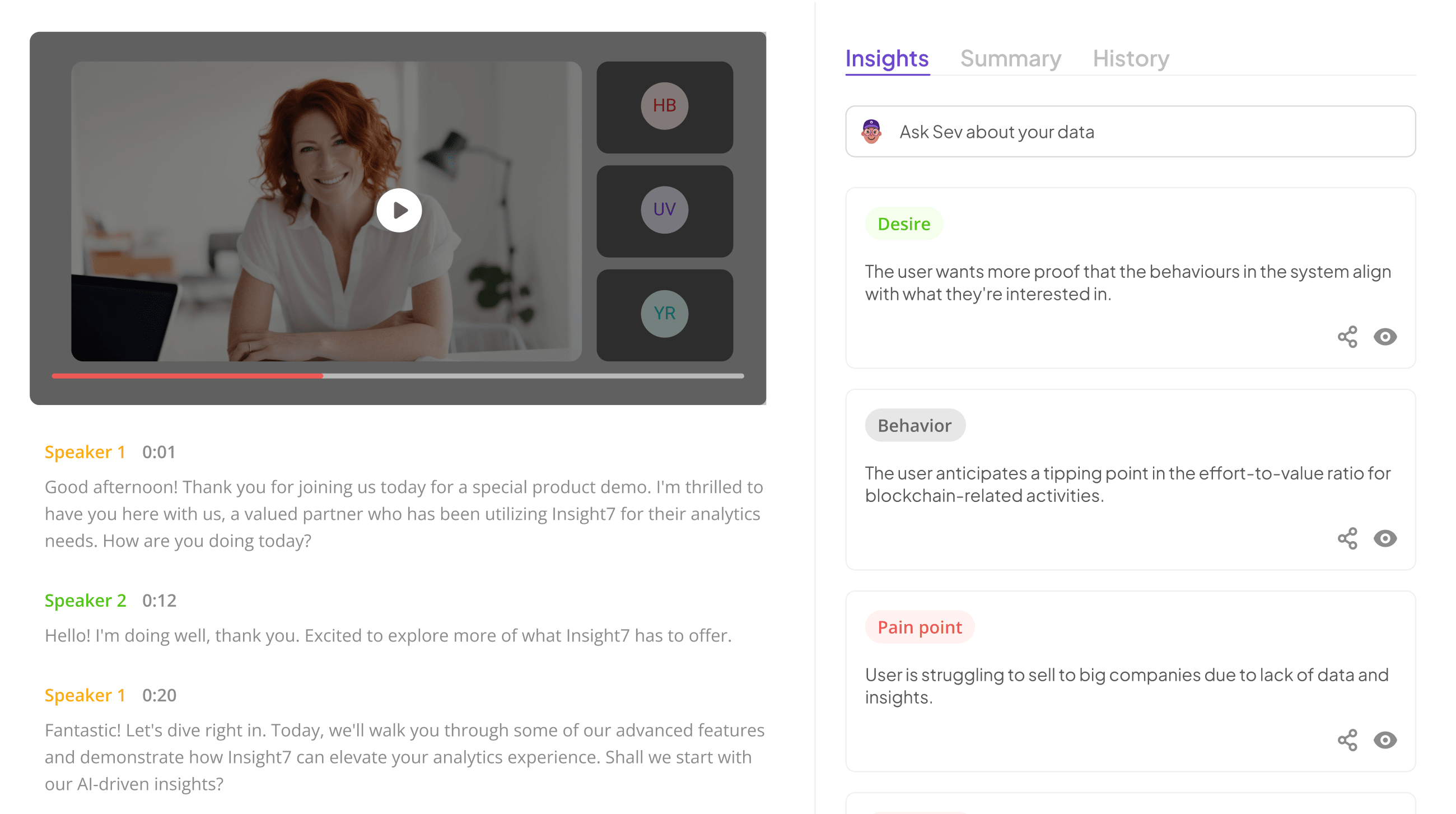
In today's data-driven environment, effective feedback analysis is crucial for organizations striving to understand customer needs. Insight7 emphasizes the importance of visualization for feedback, as it provides a clearer picture of trends and sentiments gleaned from customer interactions. By transforming raw data into visual formats like graphs and dashboards, stakeholders can quickly identify areas for improvement and opportunities for growth.
To elevate your feedback analysis, consider these key approaches:
- Utilizing Visual Patterns: Recognize patterns in the data that may not be immediately obvious through text alone.
- Interactive Dashboards: Implement user-friendly dashboards that allow team members to explore data on their own.
- Tailored Reports: Customize reports to highlight specific metrics relevant to various departments, fostering better decision-making.
These strategies enhance collaboration and ensure that insights are actionable. Ultimately, investing in robust visualization for feedback tools can lead to timely decisions that drive success.
Other Essential Data Visualization Tools
When considering visualization for feedback, various tools offer unique capabilities to enhance the analysis of listening tour results. Tableau is a powerful choice that enables users to develop interactive and shareable dashboards, making complex data more digestible. Alternatively, Power BI integrates seamlessly with Microsoft products, allowing for straightforward data manipulation and visualization. Google Data Studio stands out for its free access and user-friendly interface, which supports a collaborative effort in data visualization.
D3.js, a JavaScript library, provides versatile and custom visualizations, perfect for those with technical proficiency. Each tool serves a distinct purpose and can be effectively utilized depending on the specific needs of your feedback analysis. By selecting the right tool, you can create compelling visual narratives that highlight key insights and trends, ultimately driving meaningful change from the feedback gathered during your listening tour.
- Tableau
Tableau is a powerful tool that facilitates effective visualization for feedback, particularly when analyzing listening tour results. It allows users to transform complex data into intuitive and interactive visual formats. This means you can easily track essential feedback trends, whether they represent positive or negative sentiments expressed by stakeholders.
When utilizing Tableau, consider these key steps:
-
Data Importation: Effortlessly import your gathered data into Tableau. This enables you to begin the visualization process without cumbersome data management.
-
Creating Visuals: Utilize various chart types, such as bar graphs, scatter plots, and dashboards, to present your findings. Each visual should serve to clarify the narrative your data tells.
-
Dynamic Analysis: Tableau’s features allow you to interact with your data in real-time. This dynamic analysis helps you compare feedback across different segments, facilitating deeper insights into stakeholder opinions.
Using Tableau effectively for visualization for feedback not only enhances understanding but also drives actionable discussions based on the visualized data.
- Power BI
Power BI stands out as a powerful tool for effective visualization for feedback gathered during listening tours. With its user-friendly interface, it allows users to easily create detailed reports and dashboards that transform raw data into insightful visuals. These visuals clarify patterns, trends, and sentiments, making it easier to understand the feedback collected from participants.
Utilizing Power BI, you can analyze both qualitative and quantitative data. Users can filter through positive and negative comments to identify key themes within the feedback. This capability enables a focused approach to decision-making, as stakeholders can pinpoint areas needing improvement or highlight successful aspects of a project. Furthermore, Power BI’s capacity to compare datasets from different locations elevates the analysis, allowing for a nuanced understanding of region-specific feedback. This way, the tool not only enhances the visualization for feedback but also drives informed actions based on the insights gathered.
- Google Data Studio
Google Data Studio is a powerful tool designed to enhance visualization for feedback derived from listening tours. It enables users to transform raw data into visually appealing, interactive reports that can effectively communicate insights. With its user-friendly interface, you can easily connect data sources and customize your visuals, making it a fantastic choice for displaying feedback trends and patterns.
To get started, you’ll first want to gather your data, ensuring it captures various aspects of listener feedback. From there, Google Data Studio allows you to explore different visualization options such as charts, graphs, and dashboards. These visuals not only make the data more digestible but also facilitate better decision-making by highlighting key insights. Additionally, by sharing these interactive reports with stakeholders, you foster transparency and encourage collaborative discussions on how to respond to feedback effectively. This makes Google Data Studio an essential component in the process of turning feedback into actionable results.
- D3.js
D3.js is a powerful JavaScript library used for visualizing data using web standards. With its ability to create dynamic, interactive visualizations, D3.js enables users to turn complex data sets into engaging visual narratives. This capacity can significantly enhance visualization for feedback, allowing decision-makers to extract insights directly from user feedback data.
The library supports a variety of visualization types, from simple bar charts to complex hierarchical trees. One of D3.js's strengths is its capability to bind arbitrary data to a Document Object Model (DOM). This feature enables the creation of visualizations that not only represent data effectively but also respond interactively to user input. Furthermore, because it utilizes HTML, SVG, and CSS, D3.js ensures that the created visuals are not only functional but also aesthetically pleasing, making it an ideal choice for analyzing feedback results from listening tours.
Steps to Implement Visualization for Feedback in Listening Tour Results
To implement effective visualization for feedback from listening tour results, the process begins by correctly collecting and preparing your data. First, gather qualitative feedback from various sources—interviews, surveys, or open forums. Once you have the data, clean and organize it to ensure readiness for analysis. This step is crucial as it lays the foundation for generating clear, insightful visualizations.
Next, selecting the right visualization techniques is essential for effectively showcasing feedback. Bar graphs, pie charts, and heat maps can help illustrate trends, patterns, and sentiments within the data. Choose visual formats that align with the specific insights you wish to communicate. After designing your visualizations, analyze and interpret the data meaningfully. Engage with stakeholders to clarify findings and create actionable insights that can influence decision-making. Following these steps will enable you to harness the power of visualization for feedback, ultimately enhancing the impact of your listening tour results.
Extract insights from interviews, calls, surveys and reviews for insights in minutes
Step 1: Collecting and Preparing Your Data
To effectively utilize visualization for feedback, the first step involves meticulous data collection and preparation. Begin by gathering all relevant data from your listening tour efforts, including recorded calls, transcripts, and any feedback from participants. Ensure that each piece of data is organized and labeled clearly to facilitate easier analysis later on. Utilize various sources such as audio recordings and files from cloud services to consolidate your information into one accessible location.
Next, it's crucial to clean and format your data before analysis. This may involve removing irrelevant information or ambiguous responses. Consider creating a structured format, such as a matrix, where you can categorize feedback based on common themes or questions. This initial groundwork is not only beneficial but essential in optimizing your visualizations. Properly prepared data allows visualization tools to reveal meaningful insights that drive informed decision-making.
Step 2: Choosing the Right Visualization Techniques
Selecting appropriate visualization techniques is crucial for effectively communicating insights from feedback collected during a listening tour. Different types of data and feedback require tailored visual approaches. Start by understanding your dataset's nature and the key messages you wish to convey. For instance, if your feedback involves positive and negative sentiments, utilizing a simple bar chart can quickly illustrate the balance of opinions. On the other hand, if you seek to show trends or changes over time, consider using line graphs for a clearer representation.
Collaborative platforms may also support dynamic visualizations, enabling stakeholders to interact with data in real-time. To further enhance understanding, think about incorporating maps or heat maps if location data is involved. Keep in mind the audience's familiarity with different visualization types to ensure effectiveness. The right visualization techniques transform raw data into compelling narratives, making your listening tour results not just informative but also action-oriented.
Step 3: Analyzing and Interpreting Visualizations
In this step, analyzing and interpreting visualizations, you focus on extracting meaningful insights from your visual data representations. Start by identifying key trends and patterns within your data. Look for areas of strong agreement or concern, which are crucial for developing actionable feedback. Understanding these insights will guide you in making informed decisions based on the opinions and sentiments gathered during your listening tour.
Consider the context of your findings as you interpret the visualizations. What demographics or groups showed significant feedback? How can these insights inform your next actions or product developments? Analyzing visualizations not only helps you grasp current sentiments but also allows for strategic planning to address any identified issues. Emphasizing a thoughtful analysis ensures that the feedback you receive translates into effective and responsive actions, ultimately enhancing your engagement strategy.
Conclusion: Leveraging Visualization for Feedback to Drive Change
Data visualization can play a crucial role in transforming feedback into actionable insights. By representing data graphically, you simplify complex information, making it easier to identify trends and patterns that can inform decision-making. This clarity enhances communication, helping stakeholders understand the nuances of feedback and guiding strategic changes.
When utilized effectively, visualization for feedback creates a feedback loop that drives continuous improvement. By consistently analyzing visual data representations, teams can adapt and refine their approaches based on real input. Ultimately, this data-driven method fosters a culture of responsiveness, ensuring that organizations remain aligned with the needs and expectations of their audiences.


