Understanding QA Score Trends is essential for effective CX OKR planning. By recognizing these trends, businesses can identify strengths and weaknesses in their customer service strategies. For instance, a steady increase in QA scores might indicate successful initiatives, while a decline could signal the need for immediate adjustments to processes.
Moreover, integrating QA Score Trends into OKRs provides a structured approach to achieving customer experience goals. This linkage not only aligns performance metrics with strategic objectives, but also promotes a culture of continuous improvement. Ultimately, prioritizing QA Score Trends fosters a proactive mindset, enabling organizations to enhance customer satisfaction and drive long-term success.
Analyze & Evaluate Calls. At Scale.

Analyzing QA Score Trends to Align with CX Goals
Analyzing QA Score Trends to Align with CX Goals is essential for optimizing customer experiences effectively. By observing QA score trends, organizations can gain insights into the quality of their service and identify areas needing improvement. It becomes invaluable to track these trends over time, connecting them directly to the overall customer experience goals set within the OKR framework.
To effectively analyze these trends, consider three key aspects. First, monitor the consistency of QA scores across different teams to identify training needs. Second, evaluate the direct correlation between QA scores and customer feedback to understand which service aspects impact customer satisfaction. Finally, incorporate data from various sources to enhance the context around QA score trends. By methodically identifying and analyzing these trends, teams can ensure their customer experience strategies are not only aligned with their goals but also informed by actionable insights.
How to Identify Key QA Score Trends in Your Data
To identify key QA score trends in your data, start by collecting comprehensive information from various customer interactions. This data may include call transcripts, customer feedback, and transactional records. Organizing this information is crucial; categorizing it by months, teams, or specific service areas can help in detecting significant patterns. Use visual tools to summarize these trends, focusing on common themes or recurring issues highlighted by customers.
Next, analyze your QA scores against specific objectives and KPIs related to customer experience. Look for correlations between high scores and specific service actions or team behaviors. Also, watch for dips that coincide with changes in process or staffing. By identifying these key QA score trends, organizations can make informed adjustments, enhance training, and ultimately improve overall customer satisfaction. Regularly revisiting and analyzing this data fosters a culture of continuous improvement aligned with your CX goals.
Linking QA Score Trends to Customer Experience OKRs
To effectively link QA Score Trends to Customer Experience OKRs, it is essential to understand the relationship between service quality and customer satisfaction. By analyzing QA scores, businesses can glean insights into customer pain points and service gaps. These trends provide a tangible connection to Customer Experience (CX) OKRs by highlighting areas needing improvement and informing actionable goals. For instance, if QA scores indicate a decline in service quality during certain interactions, this insight can drive specific CX objectives aimed at enhancing customer support.
Next, organizations should utilize these insights to set measurable OKRs. Establishing clear goals based on QA Score Trends allows teams to focus on critical improvement areas, ensuring a cohesive approach to enhancing customer experience. By regularly monitoring these trends, organizations can adapt their strategies and training initiatives, ultimately driving superior customer engagement and satisfaction. This methodical alignment ensures that Quality Assurance and Customer Experience efforts are seamlessly integrated for maximum impact.
Extract insights from interviews, calls, surveys and reviews for insights in minutes
Tools and Techniques for Visualizing QA Score Trends
Visualizing QA score trends is essential for making informed decisions in customer experience (CX) planning. By effectively utilizing different tools, teams can unveil deeper insights from their data, allowing for clearer communication and strategic adjustments. Visual representations, such as graphs and charts, facilitate the understanding of trends over time, highlighting areas that need attention or improvement.
Several tools can aid this process. Insight7 provides robust analytics tailored for monitoring QA trends. Tableau excels in creating visually appealing data dashboards, allowing users to explore their data dynamically. Power BI offers seamless integration with various CX data sources, while Google Data Studio simplifies dashboard creation for those unfamiliar with advanced tools. Even basic platforms like Excel remain valuable for generating quick analyses and visualizations. By selecting the right tools and employing effective techniques, organizations can present QA score trends that significantly enhance their CX OKR planning efforts.
Top Tools to Present QA Score Trends
When exploring the top tools to present QA score trends, you’ll discover various solutions designed to simplify data interpretation. Tools like Insight7 provide comprehensive analytics and visualization capabilities, making it easier to spot significant changes in QA scores over time. Tableau stands out for its powerful data visualization features, allowing teams to create insightful dashboards tailored to their specific needs.
For seamless integration with existing customer experience data sources, Power BI is a valuable choice. Google Data Studio offers a user-friendly interface, making dashboard creation straightforward for teams of any technical ability. Lastly, while it may seem basic, Excel remains a versatile tool for quickly analyzing and interpreting QA score trends. Selecting the right tool will enhance your understanding of QA performance, ultimately contributing to more informed decision-making in CX OKR planning.
- insight7: Offers comprehensive analytics and visualization capabilities.
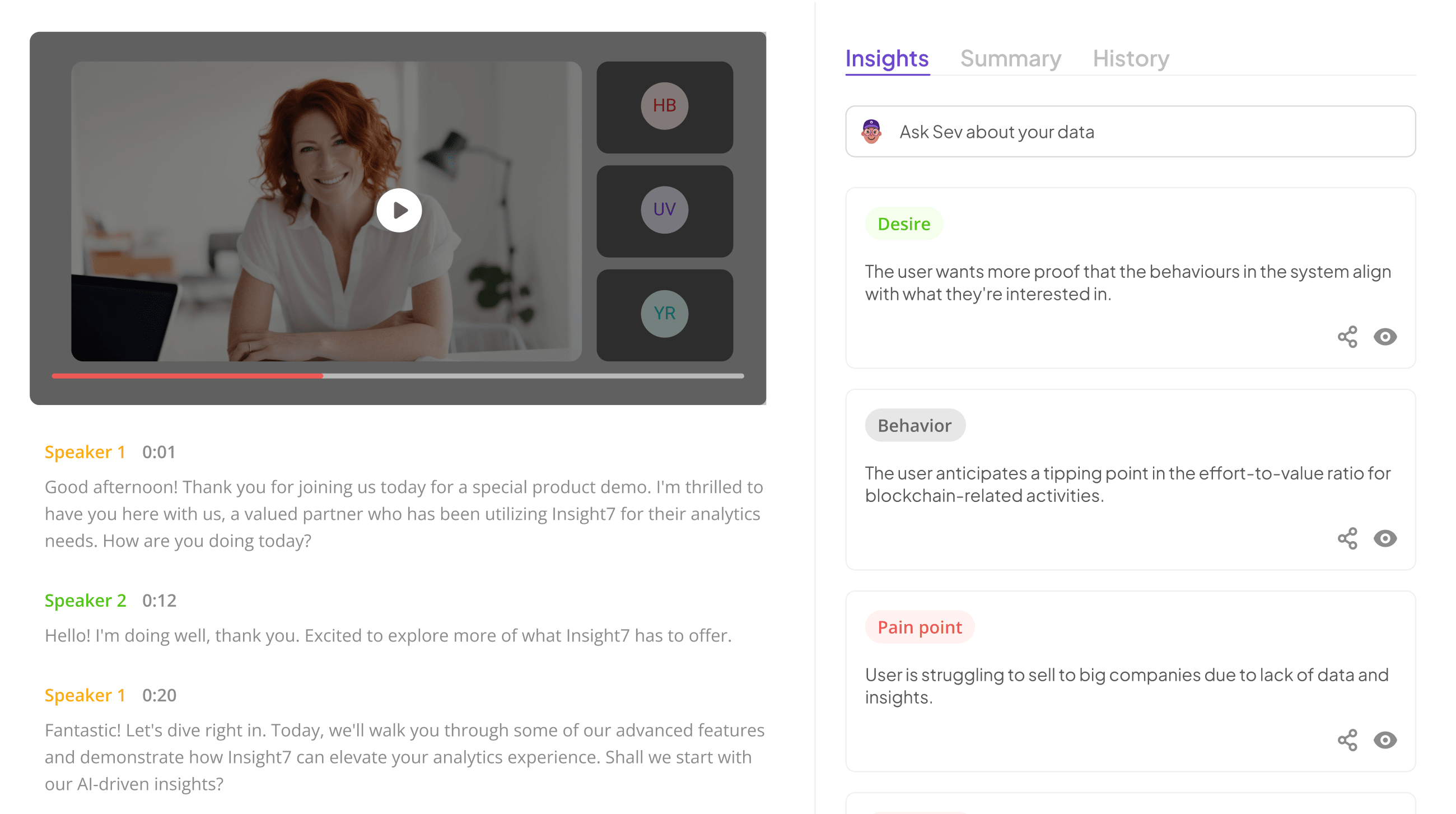
In any effective CX OKR planning, the ability to analyze QA score trends plays a pivotal role. Insight7 addresses this need by offering comprehensive analytics and visualization capabilities that enable organizations to track performance effectively. By turning complex data into clear visual representations, teams can quickly identify patterns and insights that emerge from customer feedback and quality assessment.
One of the key features of Insight7 is its user-friendly interface. This allows users to create customized dashboards and reports tailored to specific needs. Organizations benefit from real-time analytics that facilitates timely decision-making, ensuring they stay ahead in a competitive market. Furthermore, the collaborative tools within Insight7 allow teams to share these insights seamlessly, fostering a culture of data-informed dialogue. By harnessing these capabilities, teams can not only understand their QA score trends but also translate this knowledge into actionable strategies that enhance customer satisfaction and drive overall performance.
- Tableau: Known for powerful data visualization options.
Tableau stands out as a robust tool for visualizing QA score trends effectively. Its powerful data visualization capabilities allow users to create dynamic, interactive dashboards that simplify the process of identifying patterns and insights within quality assurance scores. This functionality is essential for organizations aiming to track their performance and enhance customer experience.
Combining various data sources, Tableau empowers users to examine QA trends across different contexts, such as products and customer feedback. By presenting data visually, it becomes easier to communicate findings and make informed decisions. Users can filter and segment data based on specific categories, enabling them to highlight critical areas for improvement. With its intuitive interface and advanced analytical features, Tableau is indispensable for anyone looking to present QA score trends in alignment with CX OKR planning.
Through effective use of Tableau, teams can transform raw data into compelling narratives that drive actionable strategies and enhance overall customer satisfaction.
- Power BI: Integrates seamlessly with CX data sources.
Power BI serves as a robust tool that integrates seamlessly with CX data sources, enhancing the way organizations analyze and present QA score trends. Its user-friendly interface allows stakeholders to effortlessly connect various customer experience data, transforming complex datasets into clear and actionable insights. This capability is vital for teams striving to monitor QA performance effectively and make informed adjustments to their strategies.
One of Power BI's standout features is its ability to visualize trends over time, making it easier to spot patterns in QA scores. By connecting to diverse data sources, users can compile a holistic view of customer interactions. This comprehensive analysis empowers businesses to identify areas of improvement within the customer journey, ultimately leading to enhanced service delivery. By utilizing Power BI, teams can translate data into visually appealing, impactful reports that align with their CX objectives.
- Google Data Studio: Provides easy-to-use dashboard creation.
Creating a dynamic dashboard in Google Data Studio is crucial for effectively presenting QA score trends. Its user-friendly interface allows teams to easily visualize complex datasets, enabling insights to be quickly translated into actionable plans. By integrating various data sources, users can create customized reports that highlight key metrics, trends, and performance indicators relevant to customer experience objectives.
The flexibility of Google Data Studio encourages collaboration, as stakeholders can access and interact with the dashboards in real time. This is particularly beneficial for visualizing QA score trends over time, allowing teams to identify patterns and make informed decisions. The ease of sharing and exporting reports also ensures that insights are communicated clearly across departments, fostering an environment where data-driven strategies can enhance customer engagement and satisfaction.
- Excel: Still a versatile tool for quick data insights.
Excel remains a go-to tool for those seeking swift and effective insights into QA score trends. Despite the rising popularity of advanced analytics platforms, Excel excels in its straightforward interface and accessibility. It allows users to easily input data, create charts, and perform calculations without requiring extensive training or technical expertise.
One of the key advantages of using Excel is its flexibility in handling diverse data sets. Users can organize QA scores, apply filters, and analyze trends over time. Additionally, the software supports various visualization options, such as line graphs or bar charts, to illustrate score trends clearly. This capability empowers teams to present insights in an engaging and comprehensible manner, aiding in informed decision-making during CX OKR planning. Excel remains a powerful ally for professionals looking to quickly gain insights from QA data, ensuring effective alignment with customer experience objectives.
Step-by-Step Guide to Creating Impactful QA Score Trend Charts
Creating impactful QA score trend charts is essential for effective CX OKR planning. First, gather your QA scores over a defined period to establish a comprehensive dataset. This dataset will serve as the foundation for visualizing trends, helping you identify patterns and fluctuations in quality over time. Next, choose a visualization tool that suits your needs, such as Tableau or Power BI, to bring clarity to your data.
Once you have selected your tool, determine the key metrics to highlight. For example, trends might show improvements in customer feedback or quality control measures over specific time frames, allowing you to pinpoint significant changes. Utilize color coding and annotations within your charts to emphasize important insights. Additionally, ensure the charts are easy to read, as visually accessible data encourages better alignment among team members regarding QA goals. By following these steps, you'll create trend charts that not only convey data but also support informed decision-making in CX OKR initiatives.
Conclusion: Leveraging QA Score Trends to Drive CX Success
Utilizing QA score trends is crucial for driving customer experience (CX) success. These trends provide invaluable insights into how well customer service representatives are performing, helping to highlight areas for improvement. By consistently monitoring these scores, organizations can align their training and processes with customer needs, enhancing overall satisfaction.
Moreover, analyzing QA score trends allows teams to adapt quickly to changing customer preferences. When specific questions or concerns arise from customers, this data can inform targeted training sessions, ensuring that representatives are well-equipped to address issues effectively. Thus, a focus on QA score trends can profoundly influence CX strategy and outcomes, leading to lasting improvements.


