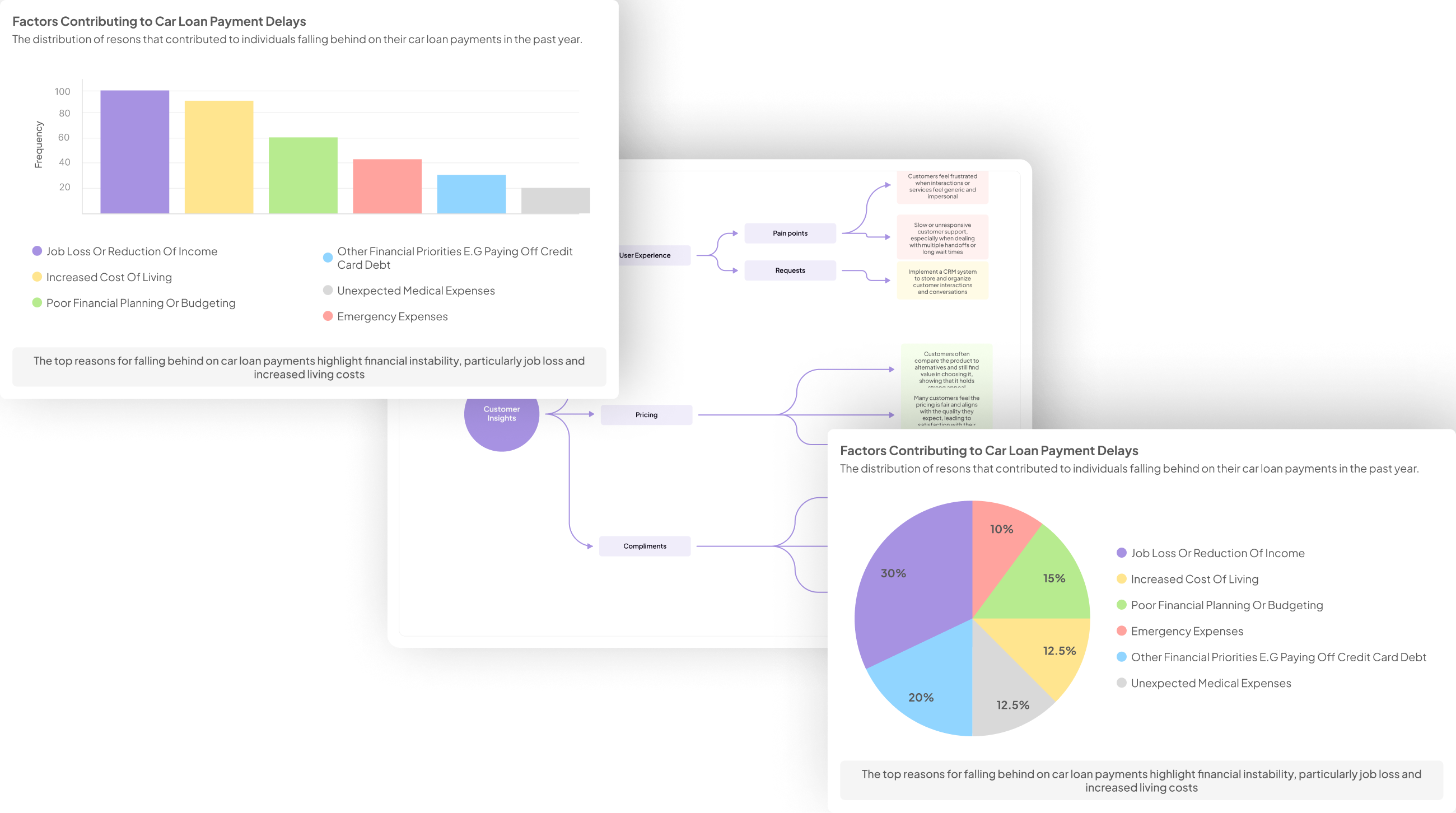
Interview Data Visualization serves as a powerful tool for making sense of customer feedback gathered during interviews. Imagine listening to countless hours of conversations, rich with emotions and insights. Transforming that raw information into visual forms can illuminate patterns, trends, and sentiments that might otherwise go unnoticed.
In this introduction, we will explore the essential aspects of transforming interview data into compelling visual representations. Understanding how to effectively visualize this information can enhance your ability to derive actionable insights that inform business decisions and strategies. By the end of this section, you will see the value of these visualizations in enriching the narrative extracted from customer interviews.
Generate visualizations from your qualitative data. At Scale.

Planning Your Interview Data Visualization
When planning your interview data visualization, it's crucial to structure your insights systematically. Begin by organizing the data gathered from your customer interviews into distinct projects. For instance, you might categorize by month or theme, allowing for a clearer analysis of trends over time. Utilize a matrix to pull specific questions from your interviews, making it easier to identify recurring themes or pain points.
Next, think about how you want to present these insights visually. Consider which types of graphs, charts, or dashboards will best illustrate your findings. Visual representations should highlight key data points and facilitate understanding for your audience. This thoughtful planning phase will ensure that your interview data visualization effectively communicates the core insights derived from your research, allowing stakeholders to make informed decisions based on clear and actionable data.
Organizing Interview Insights
To effectively organize insights from interviews, start by collating all relevant transcripts and notes into dedicated projects. This approach allows for a focused review of specific timeframes, such as monthly analyses. By collecting data from July, for example, one can identify patterns and trends by comparing various interviews. It helps in pinpointing key pain points shared by customers, thereby establishing a clearer understanding of prevalent issues.
Next, it's beneficial to categorize the extracted data based on themes. Analyzing the frequency of certain topics across several conversations can yield valuable insights. For instance, if 80% of interviewees mention a particular challenge, that highlights an urgent area for action. Summarizing these insights into reports or visual dashboards enhances comprehension and facilitates decision-making. This structured approach to organizing interview insights greatly aids in creating meaningful interview data visualization, making it easier to communicate essential findings with stakeholders.
Identifying Visualization Needs
Identifying visualization needs is a critical step when working with interview data visualization. Before generating any visual representations, it's essential to understand what insights you aim to convey. Discussions with stakeholders can shed light on their expectations and requirements regarding the data. Understanding the audience's preferences can help in selecting the right visualization methods and tools, ensuring the final display effectively communicates the intended message.
It’s beneficial to categorize the types of data you gather during interviews. For instance, differentiate between positive, negative, and neutral feedback, as these categories can significantly influence visualization choices. Additionally, consider the context in which the visualizations will be used. Will they be displayed in reports, presentations, or interactive dashboards? By addressing these considerations upfront, you streamline the creation process, making it easier to produce engaging and informative interview data visualizations that resonate with your target audience.
Generate Journey maps, Mind maps, Bar charts and more from your data in Minutes
Tools for Creating Effective Interview Data Visualizations
Effective visualizations of interview data can significantly enhance your understanding of customer insights. Choosing the right tools is essential for transforming raw data into visually appealing and informative presentations. Various software options cater to different needs, so it's important to select one that aligns with your specific goals, whether you're examining patterns or highlighting key feedback.
Popular tools for interview data visualization include Insight7, Tableau, Microsoft Power BI, and Google Data Studio. Insight7 offers a streamlined process designed to simplify the visualization of qualitative data. Tableau excels in creating interactive dashboards that allow users to drill down into specific metrics. For those seeking comprehensive analysis, Microsoft Power BI is an excellent choice, offering robust data modeling features. Lastly, Google Data Studio enables seamless integration with other Google products, making it easy to collaborate and share insights.
By leveraging these tools, you can effectively convey customer perspectives and drive meaningful discussion around your findings.
💬 Ask About This Article
Have questions? Get instant answers about this article.
Insight7: Streamlining the Visualization Process
The process of Interview Data Visualization can often feel overwhelming. However, streamlining this process can transform complex data into clear, actionable insights. To begin, organizations should first focus on collecting and organizing interview insights effectively. Defining specific visualization needs at this stage is crucial, as it allows teams to tailor their approach based on the objectives and outcomes expected from the visualizations.
Next, employing robust tools can greatly enhance the streamlining process. Opting for tools that facilitate quick queries across datasets enables users to uncover patterns and trends with ease. For instance, using software that allows visual comparisons between different datasets—such as feedback from different locations—can provide valuable context. By establishing a streamlined approach, teams can drastically improve the quality and impact of the visualizations generated from customer interviews. This clarity not only benefits stakeholders but also drives informed decision-making moving forward.
Tableau: Interactive Dashboards
Tableau offers a powerful platform for creating interactive dashboards, making it easier to visualize insights from customer interviews. By translating qualitative feedback into visually engaging formats, stakeholders can quickly grasp trends and patterns. Users can explore data independently, allowing for deeper insights beyond standard reports. This self-service capability empowers teams to adapt visualizations according to their specific needs without significant technical expertise.
Interactive dashboards in Tableau enable dynamic data representation, fostering better collaboration and decision-making. Users can filter information, drill down into specifics, and manipulate variables to understand customer sentiments more clearly. Through this approach to Interview Data Visualization, organizations can efficiently highlight key insights from interviews, ultimately enhancing their strategic planning and response to customer needs. Utilizing tailored dashboards ensures that valuable feedback is effectively communicated and leveraged for actionable outcomes, enhancing overall responsiveness and customer satisfaction.
Microsoft Power BI: Comprehensive Analysis
Microsoft Power BI offers powerful capabilities for transforming raw interview data into insightful visualizations. By organizing the insights gathered from customer interviews, users can create comprehensive reports that highlight key patterns and themes. The tool enables you to compile transcripts from multiple sessions, making it easier to identify recurring pain points and trends within customer feedback.
With features that allow you to analyze and visualize data efficiently, Microsoft Power BI can create a dashboard that captures important metrics. This includes summarizing data, highlighting major themes, and revealing customer sentiments. As this analysis unfolds, users gain a clearer understanding of customer needs and experiences. Ultimately, a structured visualization process can turn customer interviews into action-oriented insights, facilitating informed decision-making and strategic planning.
Google Data Studio: Seamless Integration
Google Data Studio offers a powerful platform for transforming customer interviews into dynamic visuals. As organizations gather qualitative insights from customer conversations, the ability to visualize this data seamlessly becomes essential. Through its user-friendly interface, businesses can combine various data sources, making the analytical process straightforward and accessible.
One of the significant advantages of this tool is its capacity to compile data into customizable reports that can be shared across teams. Stakeholders can easily interpret findings from interviews without needing extensive training. The drag-and-drop functionality allows users to create stunning charts and graphs that highlight key themes and pain points identified in interview data visualization. By integrating seamlessly with other Google services, it enhances collaboration and ensures that everyone stays informed about customer sentiments, leading to better decision-making and strategy formulation.
Conclusion: Making the Most of Interview Data Visualization
To maximize the benefits of interview data visualization, it is essential to focus on clarity and actionable insights. By translating qualitative data into visual formats, organizations can easily identify patterns, trends, and areas for improvement. Visualizations should highlight both the positive and negative feedback received during interviews, allowing teams to address concerns while also celebrating successes.
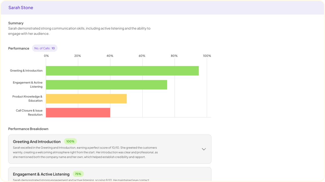
Additionally, using varied visualization techniques can enhance understanding among different stakeholders. Whether through bar charts, word clouds, or comparative analysis, these representations make complex information digestible. Ultimately, effective interview data visualization bridges the gap between insights and action, empowering teams to make informed decisions that resonate with customers.
💬 Ask About This Article
Have questions? Get instant answers about this article.


