Best AI tools for visualizing themes from user experience interviews
-
Bella Williams
- 10 min read
UX Interview Visualization plays a vital role in transforming raw user feedback into actionable insights. As designers and researchers sift through transcripts from interviews, identifying patterns and themes can become overwhelming. By utilizing innovative AI tools, professionals can streamline this process, making it easier to extract significant data points that inform design decisions.
The visualization of user experience interviews enhances understanding, revealing user pain points and preferences. A graphical representation of these insights allows teams to better grasp complex information, fostering collaboration and ensuring that everyone is aligned on user needs. By embracing advanced visualization techniques, organizations can significantly improve their user experience strategies.
Generate visualizations from your qualitative data. At Scale.

Top AI Tools for UX Interview Visualization
Visualizing themes from user experience interviews is crucial for identifying patterns and insights that can drive product improvements. Several AI tools excel in this area, simplifying the analysis and enhancing comprehension. These tools allow UX researchers to convert raw transcripts into meaningful visual reports, highlighting key themes, pain points, and trends across user feedback.
Prominent AI tools for UX Interview Visualization include NVivo, Dovetail, and ATLAS.ti. NVivo excels in qualitative data analysis, allowing researchers to code and categorize responses effectively. Dovetail provides a user-friendly interface that focuses on extracting insights from interviews and presenting them visually. ATLAS.ti employs advanced network visualization techniques to reveal complex relationships among different insights.
Using these tools enables teams to effectively translate user feedback into actionable strategies, enhancing overall user experience and product design. With the right tools, UX interview visualization becomes a streamlined process, empowering organizations to make data-informed decisions based on real user voices.
Insight7: Leading the Way
In the context of UX interview visualization, Insight7 is at the forefront of transforming how organizations analyze user conversations. As businesses gather vast amounts of data from interviews, the need for efficient tools becomes essential. Facing challenges like slow analysis and scattered insights, companies are turning to automated solutions that streamline the process and enhance collaboration.
One of the key innovations with Insight7 is its self-service platform, which allows for real-time analysis of customer data. By prioritizing speed and efficiency, it empowers teams to convert valuable insights into actionable strategies. With intuitive visualization features, stakeholders can easily comprehend themes emerging from user interviews, leading to more informed decision-making. Ultimately, the path to improving user experiences lies in embracing tools that facilitate clearer communication and integration of insights into business practices.
Other Noteworthy AI Visualization Tools
In addition to the top AI tools already discussed, several other noteworthy AI visualization tools can enhance UX interview visualization. These tools provide valuable insights into user experiences, enabling teams to identify patterns and themes. Among these are NVivo, Dovetail, ATLAS.ti, and Quirkos. Each tool offers unique features aimed at simplifying the analysis of qualitative data from user interviews.
- NVivo is excellent for qualitative data analysis, supporting various data types and allowing for in-depth coding of user feedback. This aids researchers in uncovering insights that may not be immediately apparent.
- Dovetail focuses on collaboration, making it easier for teams to share insights and visualize data together. Its user-friendly interface ensures that insights from user experience interviews can be quickly turned into actionable recommendations.
- ATLAS.ti provides powerful tools for coding and analyzing complex data sets, making it a favorite among researchers in academia and business alike. Its strengths lie in its robust data management and visualization capabilities.
- Quirkos offers visualizations that are simple yet effective, helping teams make sense of data intuitively. Its bubble-like interface allows for quick identification of themes, enabling a seamless analysis process.
These tools not only facilitate the organization of data but also support a deeper understanding of user experiences, thereby informing better design and decision-making processes.
NVivo
NVivo is a powerful software designed for qualitative data analysis, making it invaluable for UX interview visualization. Its user-friendly interface simplifies the process of organizing and analyzing interview data, allowing researchers to identify key themes and insights effectively. By importing transcripts and audio files, it enables researchers to quickly extract relevant quotes and feedback, serving as a crucial tool in understanding user experiences.
The software shines when it comes to creating projects where multiple interviews can be compiled. Users can easily create new projects, upload materials, and utilize features like data matrices to analyze responses. This capability allows teams to ask specific questions about user feedback and visualize patterns and trends efficiently. With NVivo, turning complex interview data into actionable insights becomes a streamlined process, ultimately enhancing the quality of UX research.
Dovetail
Using Dovetail offers a streamlined approach to UX interview visualization. This platform is designed to transform the way researchers analyze qualitative data gathered from user interviews. By centralizing user insights, Dovetail enables teams to visualize themes efficiently. This approach ensures that critical insights are not buried in text but are instead highlighted for easy access and collaboration.
One notable feature of Dovetail is its ability to categorize user feedback into themes automatically. This function empowers teams to identify patterns in user behavior swiftly. Another advantage is the platform's intuitive interface, which enhances user experience during the analysis phase. Access to real-time data also helps teams make quicker decisions based on user input. Overall, Dovetail stands out as a crucial tool for those seeking to improve their UX interview visualization processes.
ATLAS.ti
When considering tools for UX interview visualization, ATLAS.ti stands out for its robust capabilities in qualitative data analysis. This tool serves as a powerful ally for researchers looking to synthesize and visualize themes from user experience interviews. With its project-based approach, users can easily upload and organize various data formats, including transcripts from interviews, making it efficient to manage large volumes of information.
💬 Questions about Best AI tools for visualizing themes from user experience interviews?
Our team typically responds within minutes
One significant feature is the ability to create matrices that help visualize patterns across different data points. This allows for insightful queries, revealing what users say about specific products or experiences. By categorizing findings, researchers gain a clearer understanding of user needs and feedback, which is crucial for enhancing user experience. In summary, ATLAS.ti provides essential functionalities for effective UX interview visualization, enabling teams to derive actionable insights from their qualitative research.
Quirkos
Quirkos is an innovative tool designed specifically for visualizing themes from user experience interviews. By utilizing a visual approach, it allows researchers to identify and organize key insights with ease. This method enhances understanding and clarity, making it crucial for effective UX Interview Visualization.
When engaging with Quirkos, users can take advantage of its user-friendly interface that promotes collaboration and interaction. It offers a visual mapping feature that helps in categorizing responses, making it easier to see relationships between various themes. Such capabilities are invaluable for teams looking to derive actionable insights from interviews, enabling them to make informed decisions and improvements. Ultimately, Quirkos stands out as a vital resource for those aiming to streamline their UX research processes through effective visualization techniques.
Steps to Effective UX Interview Visualization with AI
Effective UX Interview Visualization with AI encompasses a strategic approach to organizing and displaying interview data. First, begin with data preparation by cleaning and categorizing responses in a way that highlights recurring themes. Clear organization aids in identifying key insights that user experience design can benefit from. This foundational step ensures that the data used for visualization is both meaningful and relevant.
Next, select the right AI tool that aligns with your visualization goals. Different tools offer unique features, so consider what best fits your needs—be it sentiment analysis or thematic mapping. After choosing your tool, implement various visualization techniques, such as charts or word clouds, to represent the data visually. By following these steps, designers can transform raw interview data into clear, actionable insights, enhancing the overall user experience design process.
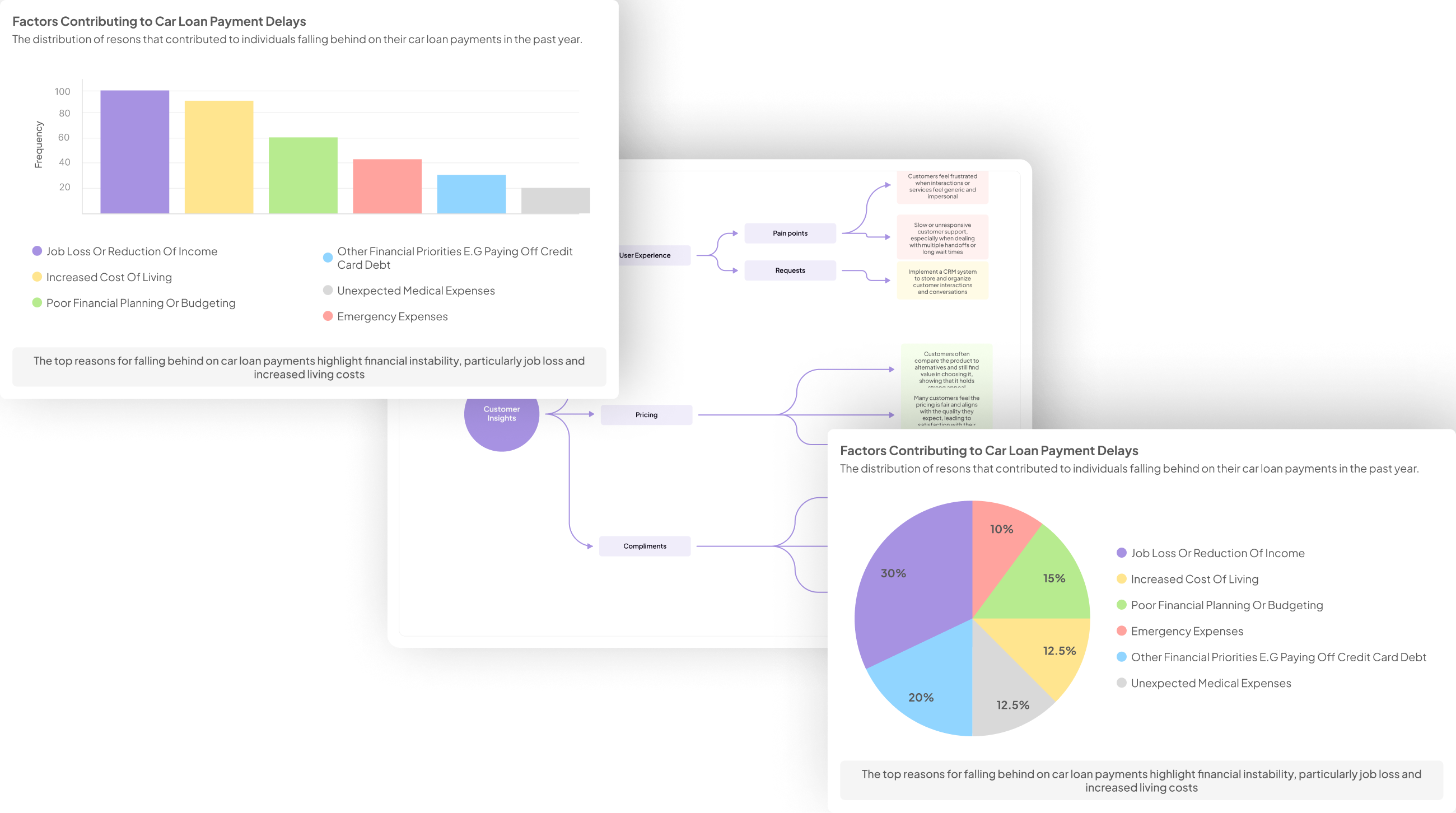
Generate Journey maps, Mind maps, Bar charts and more from your data in Minutes
Step 1: Data Preparation
Data preparation is a crucial first step in the UX interview visualization process. It involves organizing and cleaning the raw data collected from interviews to ensure clarity and accuracy. Start by transcribing the interviews and categorizing responses based on themes that arise. This initial categorization provides a framework for deeper analysis and visualization later on.
Next, filter out irrelevant or repetitive data, as it can dilute the insights derived from your interviews. Take the time to identify key phrases or sentiments that consistently appear across different interviews. By effectively preparing your data, you set a solid foundation for meaningful UX interview visualization. This preparation not only ensures that your current analysis is robust but also facilitates easier comparison across data subsets in later stages, ultimately leading to more actionable insights.
Step 2: Selecting the Right AI Tool
Choosing the right AI tool is pivotal for effective UX interview visualization, as it shapes how insights are derived and presented. Begin by assessing your specific needs. Different tools offer a variety of features—some excel in organizing data, while others shine in generating visual representations. Understanding the unique capabilities of available tools helps in selecting one that best aligns with your project goals.
Next, consider user-friendliness and integration capabilities. An intuitive interface reduces the learning curve and allows your team to focus on analyzing data rather than getting bogged down in technicalities. Integration with existing platforms is also vital, as it ensures a seamless workflow. Lastly, evaluate the support and resources each tool provides. Detailed guides and customer support can make a significant impact on your project’s success. By following these considerations, you can confidently select an AI tool that transforms your UX interview insights into compelling visual narratives.
Step 3: Implementing Visualization Techniques
Implementing visualization techniques is a crucial aspect of UX interview visualization, allowing teams to translate qualitative data into meaningful insights. Effective visualization helps illustrate themes and sentiments found in user feedback, making the data more comprehensible for stakeholders. To begin, consider using various types of charts and graphs to represent data effectively, highlighting both positive and negative comments.
Next, applying techniques like word clouds can emphasize frequently mentioned terms and concepts from the interviews, providing visual cues to key themes. Furthermore, timelines can showcase user experiences over specific periods, helping to identify trends or shifts in feedback. By utilizing these visualization methods, teams can transform raw data into actionable insights, fostering a more profound understanding of user perspectives. This process encourages collaboration and informed decision-making, ultimately enriching the product development cycle.
Conclusion on UX Interview Visualization
Effective UX Interview Visualization provides critical insights that guide design and development decisions. By utilizing AI tools, professionals can uncover key themes from user interviews, allowing for a more nuanced understanding of user needs. The visualization process helps distill complex data into clear, actionable insights, enabling teams to address pain points and enhance user experiences.
In conclusion, embracing UX Interview Visualization with the right AI tools can significantly impact product development. Integrating various visual techniques fosters collaborative discussions and informed decision-making, ultimately leading to better outcomes. It is not just about analyzing data; it's about transforming insights into meaningful action.
💬 Questions about Best AI tools for visualizing themes from user experience interviews?
Our team typically responds within minutes


