Best AI tools for visualizing reports from open-ended surveys
-
Bella Williams
- 10 min read
Survey Visualization Tools have become indispensable in the world of data analysis, especially when working with open-ended surveys. These tools enable researchers to translate vast amounts of qualitative feedback into clear, understandable visuals. By transforming textual comments into graphical representations, stakeholders can quickly grasp trends and sentiments that may otherwise go unnoticed.
In an era where data drives decision-making, utilizing effective survey visualization tools is crucial. They not only enhance the analysis process but also make the data accessible for various audiences. By employing these tools, organizations can derive actionable insights, refine strategies, and ultimately improve services or products based on user input.
Transcribe & extract insights from interviews. At Scale.

Survey Visualization Tools play a crucial role in making sense of open-ended survey responses. These tools transform raw text data into insightful visuals, making it easier for users to identify trends, patterns, and sentiments. By employing various forms of visualization, such as word clouds or sentiment graphs, these tools can reveal the underlying emotions and opinions of respondents, enhancing understanding and decision-making.
The effectiveness of Survey Visualization Tools lies in their ability to simplify complex data. They help researchers to distill significant insights from vast amounts of information quickly. Additionally, many tools utilize AI capabilities to automate the process, further enhancing efficiency. For researchers, selecting the right tool can significantly impact how well they interpret results and communicate findings, streamlining their overall analysis process. By enhancing clarity and engagement, these tools ensure that the qualitative feedback from surveys is both accessible and actionable.
Why Survey Visualization Tools are Essential
Survey visualization tools play a crucial role in helping organizations make sense of open-ended survey data. The insights gained from such surveys can often be overwhelming due to the complexity and volume of responses. By utilizing visualization tools, the data can be transformed into clear, meaningful visuals that highlight patterns and trends. This not only aids in understanding customer sentiments but also allows teams to identify strengths and weaknesses in their offerings.
Moreover, these tools facilitate better decision-making by providing a platform for comparative analysis. For instance, teams can visualize positive and negative feedback across different locations or demographics. This capability enables organizations to tailor their strategies effectively. Ultimately, embracing survey visualization tools empowers businesses to turn raw data into actionable insights, enhancing their responsiveness to customer needs and informing future initiatives.
Understanding Open-Ended Survey Data
Open-ended survey data provides rich insights that can reveal customer feelings and perceptions. However, this type of data often comes in unstructured formats, making it challenging to analyze without effective tools. Understanding open-ended survey data involves recognizing its potential to uncover nuanced feedback, which is crucial for making informed decisions.
To effectively visualize this type of data, several key aspects must be considered. First, categorizing responses by common themes or sentiments can help streamline analysis. Next, employing natural language processing (NLP) techniques enhances the understanding of customer opinions. Additionally, utilizing visualization tools can present these insights in an easily digestible format, showcasing patterns and trends clearly. By doing so, businesses can derive meaningful conclusions that drive strategic actions. Selecting the right survey visualization tools ensures that you can harness the full power of open-ended survey responses, transforming them into valuable insights for decision-making.
Transforming Complex Data into Visual Insights
Transforming complex data into visual insights is a vital process for understanding open-ended survey responses. The raw data often consists of varied sentiments and opinions, making it challenging to identify trends. Utilizing effective survey visualization tools allows users to distill this intricate information into clear, meaningful graphics that highlight key insights. Visual representations, such as charts or word clouds, can simplify analysis, helping teams quickly grasp customer feedback.
To leverage these insights most effectively, consider the following approaches:
- Categorize responses: Group similar comments to uncover themes in feedback.
- Highlight sentiment: Use color-coded visuals to differentiate between positive and negative sentiments.
- Compare datasets: Visualize variations in responses across different demographics or geographical locations.
By implementing these strategies with the right survey visualization tools, businesses can make more informed decisions and enhance their overall strategies.
Generate Detailed Reports from Your Qualitative Data in Minutes.
Top Survey Visualization Tools for Open-Ended Data
Open-ended surveys can yield rich, qualitative data but require specialized tools for effective visualization. The right Survey Visualization Tools enable you to transform complex narratives into easily interpretable visuals, making insights more accessible. With these tools, you can categorize sentiments, identify patterns, and effectively communicate findings to stakeholders.
Several standout tools excel in visualizing open-ended survey data. First is MonkeyLearn, which uses AI to analyze text and offers various visualization options. Next, Qualtrics provides sophisticated analytics features, allowing users to create interactive dashboards. NVivo stands out for its robust qualitative data analysis capabilities, enabling detailed exploration of open-ended responses. Lastly, Tableau is renowned for its powerful data visualization functionalities, giving users the ability to create stunning, comprehensive graphics from survey data. Together, these tools can significantly enhance your ability to interpret and present insights drawn from open-ended surveys.
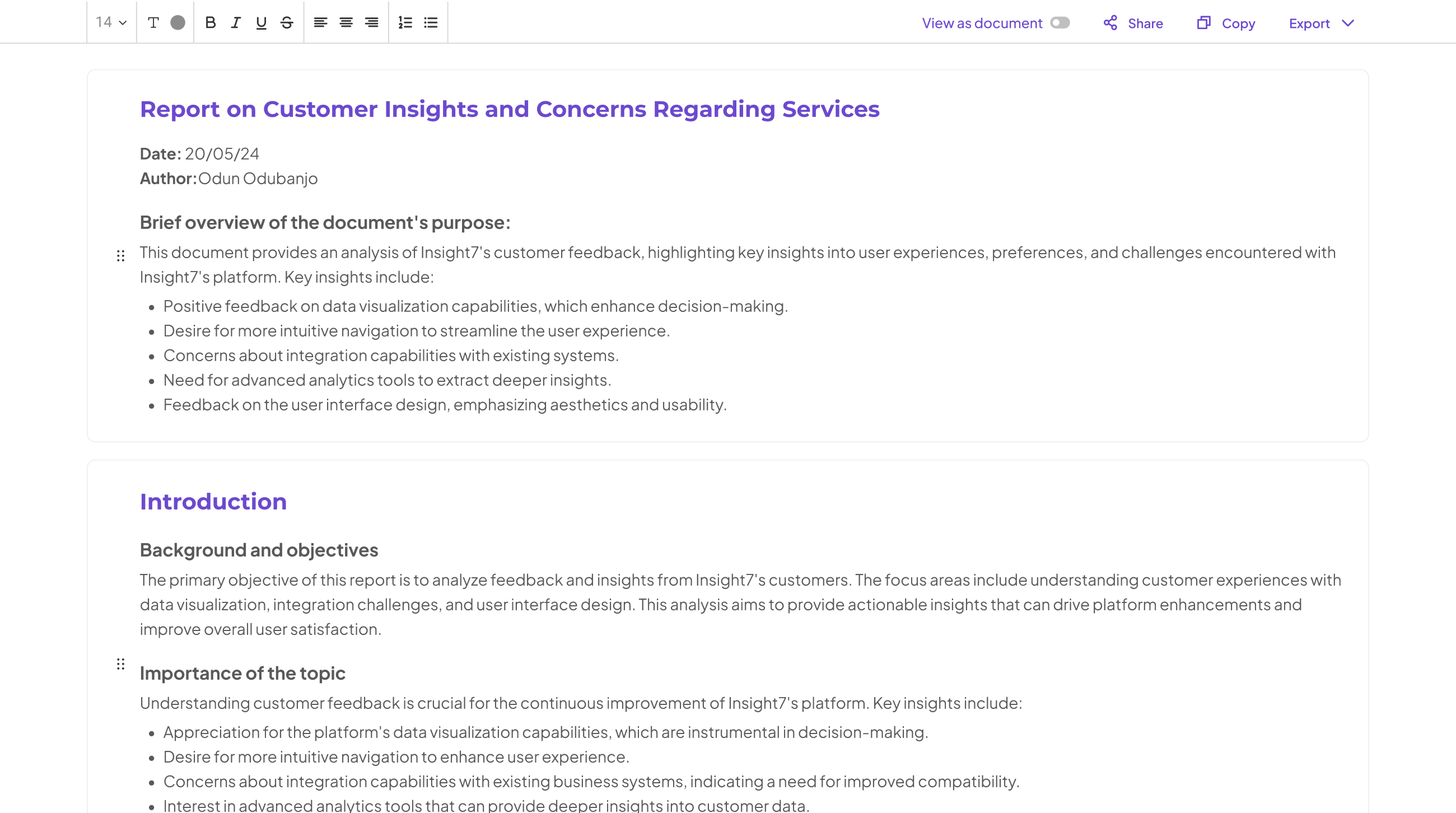
insight7: Leading the Way in Survey Visualization
Survey visualization tools play a pivotal role in interpreting the vast data from open-ended surveys. By transforming raw textual responses into visual formats, these tools enable organizations to glean actionable insights effectively. Without proper visualization, valuable customer feedback can be overwhelming, leading to missed opportunities for improvement and innovation.
💬 Questions about Best AI tools for visualizing reports from open-ended surveys?
Our team typically responds within minutes
In this section, we explore various aspects of survey visualization, highlighting how leading tools excel in providing clear, impactful visual representations of data. Users can identify patterns and trends within responses, distinguishing between positive and negative sentiments effortlessly. This ability to visually query datasets enhances decision-making processes, allowing businesses to respond more adeptly to customer needs and preferences. As more organizations turn to these advanced tools, understanding their capabilities becomes essential for extracting valuable insights from survey data.
Other Noteworthy Survey Visualization Tools
There are several noteworthy survey visualization tools that can enhance your ability to interpret open-ended survey data effectively. These tools each bring unique features that cater to different visualization needs, enabling you to extract actionable insights from customer feedback. For instance, MonkeyLearn specializes in text analysis, providing intuitive dashboards for visualizing sentiment trends in your data. This can facilitate quick understanding of general customer sentiments and critiques.
Qualtrics is another strong contender, offering advanced analytics capabilities that allow you to create detailed reports based on open-ended responses. Its interactive visualizations can help present data in a way that's accessible and insightful. NVivo, on the other hand, excels in qualitative data handling and can be particularly useful for more in-depth analysis. Lastly, Tableau stands out for its robust data visualization features, enabling intricate explorations of your dataset. By leveraging these survey visualization tools, you can enhance the effectiveness of your reports and make informed decisions based on your findings.
MonkeyLearn
This powerful tool excels in converting qualitative data from open-ended surveys into actionable insights. With features designed for ease of use, anyone in an organization can analyze complex surveys without needing extensive training. Its intuitive interface allows users to upload audio, transcribe conversations, and visualize the insights gathered from customer feedback.
The analytics capabilities are particularly beneficial for understanding pain points and desires expressed by respondents. Users can generate detailed reports quickly, and with just a few clicks, they can explore various aspects of the data. This adaptability makes it a vital player among survey visualization tools, helping businesses identify key themes and trends in customer experiences. By transforming narrative responses into digestible insights, organizations are better equipped to enhance their strategies and drive meaningful change based on user feedback.
Qualtrics
Qualtrics stands out among the top survey visualization tools owing to its versatility and robust capabilities. This platform excels in transforming complex open-ended survey responses into meaningful visual insights, simplifying the process of data interpretation. Users can generate dynamic dashboards that visually represent qualitative data, making it easier to draw conclusions and identify key trends.
Moreover, this tool offers advanced analytics features that allow for the exploration of customer sentiments in real time. These insights are crucial for organizations aiming to adapt their strategies based on customer feedback. With intuitive reporting capabilities, it empowers users to create customized reports that resonate with stakeholders. In essence, its comprehensive functionality positions it as a vital resource for effectively visualizing open-ended survey results.
NVivo
NVivo excels as a powerful survey visualization tool, particularly for analyzing open-ended survey data. It provides a platform where users can efficiently organize their data, allowing for a comprehensive understanding of qualitative feedback. By enabling the categorization of responses, NVivo helps users identify themes and patterns that might otherwise be overlooked. This intuitive interface allows for quick uploads of files and transcripts, making the process streamlined and effective.
One of the standout features of NVivo is its project capability, which allows simultaneous analysis of multiple data sets. Users can generate insights by asking specific questions and receive summarized results that highlight trends. This functionality is vital in turning raw responses into meaningful insights, especially for marketing and product development teams. In summary, NVivo is unmatched in its ability to deliver clear, visual representations of qualitative survey data, making it an essential tool for anyone looking to enhance their understanding of survey results.
Tableau
Tableau is a powerful tool that excels in the realm of Survey Visualization Tools. It allows users to transform complex survey data into engaging, easy-to-understand visuals. By utilizing its intuitive drag-and-drop interface, even individuals without a background in data analysis can create informative dashboards.
One of Tableau's standout features is its ability to handle open-ended survey responses efficiently. The software can categorize and visualize qualitative data, revealing trends and insights that may not be immediately apparent. Users can design charts, graphs, and infographics that showcase key themes, enabling stakeholders to grasp the findings at a glance. This capability enhances the decision-making process, making Tableau a go-to option for anyone looking to turn survey data into actionable insights.
Conclusion: Choosing the Right Survey Visualization Tools
Selecting the right survey visualization tools is vital for effective data interpretation. As organizations sift through open-ended survey responses, the need for clarity and insight becomes paramount. Different tools offer various capabilities, from simple data displays to complex analytic functions, making it essential to choose the one that matches your specific needs. When evaluating options, consider the types of insights you want to extract and the volume of data you'll be analyzing.
Moreover, a well-chosen tool can enhance your understanding of customer feedback, helping you to make informed decisions. Keep in mind factors such as ease of use, integration with existing systems, and visual appeal. Ultimately, the right survey visualization tools not only streamline data analysis but also empower organizations to derive actionable insights that drive progress and innovation.
Generate Detailed Reports from Your Qualitative Data in Minutes.
💬 Questions about Best AI tools for visualizing reports from open-ended surveys?
Our team typically responds within minutes


