In the fast-paced environment of a call center, having the right tools can revolutionize operations and enhance performance. The need for an optimal call center dashboard becomes evident as teams grapple with high volumes of data and strive for customer satisfaction. A well-structured dashboard is not merely a visual representation; it acts as a powerful decision-making tool, facilitating clear insights and aligning team goals.
Understanding the components that contribute to the optimal call center dashboard layout is crucial. By identifying key metrics, simplifying navigation, and focusing on effective visual hierarchies, organizations can create dashboards that not only convey essential information but also improve user experience. Properly implemented, this layout can significantly enhance overall productivity and drive insightful performance analytics.
Extract insights from Customer & Employee Interviews. At Scale.

Benefits of an Optimal Call Center Dashboard Layout
An optimal call center dashboard layout serves as a vital tool for monitoring agent performance and customer interactions. By clearly displaying key metrics, such as call duration, response time, and customer satisfaction, the dashboard enables supervisors to make informed decisions quickly. When call center agents and management have access to clear, actionable data, they can enhance their strategies and, in turn, improve overall service quality.
Beyond efficiency, an effective dashboard layout improves data visibility, allowing teams to identify trends and areas for growth. This is particularly useful for analyzing customer inquiries and adjusting training programs accordingly. For instance, if data reveals frequent questions regarding specific products, management can tailor training to address these areas proactively. Ultimately, a well-designed dashboard not only streamlines operations but also fosters a culture of continuous improvement and accountability within the team.
Improved Efficiency and Productivity
An optimal call center dashboard should prioritize improved efficiency and productivity to achieve desired results. By streamlining access to important data, it allows team members to quickly identify trends and insights. Dashboards should be designed with the user experience in mind, ensuring that relevant information is prominently displayed and easily accessible. This facilitates faster decision-making, empowering agents to respond to customer concerns more effectively.
Moreover, utilizing visual elements, such as charts and graphs, can enhance data comprehension. A well-structured layout promotes clarity, enabling users to sift through information efficiently. This organization reduces the cognitive load and enables agents to focus on what truly impacts performance. Key performance indicators should be highlighted to inform strategy adjustments, ultimately driving better results. By creating a dashboard focused on these elements, a call center can achieve significant improvements in efficiency and productivity, maximizing both agent and customer satisfaction.
Enhanced Data Visibility
Enhanced Data Visibility is crucial for effective call center reporting. An Optimal Call Center Dashboard ensures that data is not only accessible but also presented in a clear and actionable manner. By integrating various data visualization techniques, stakeholders can quickly grasp performance metrics and identify trends. An intuitive layout helps users see essential information at a glance, facilitating timely decision-making.
To maximize data visibility, several key strategies can be implemented. First, prioritize the most relevant metrics, such as average call handling times and customer satisfaction scores. Second, employ color coding to differentiate performance levels, making it easier to spot areas needing attention. Finally, interactive elements like filters allow users to drill down into specific data subsets, which enriches understanding. This dynamic approach transforms raw data into meaningful insights, leading to improved operational efficiency and a higher quality of service.
[optional]
Top Tools for Creating an Optimal Call Center Dashboard
Creating an optimal call center dashboard involves utilizing the right tools to transform data into actionable insights. Various tools cater to different analytics needs, providing features that enhance user experience and facilitate data visualization. First, Insight7 stands out with its customer-centric analytics, enabling tailored performance insights. DashThis excels in simplifying the creation of visual reports, ideal for managers wanting a clear overview of their team's performance.
Zoho Analytics and Tableau offer robust capabilities for deep data analysis and integrations. Google Data Studio provides a user-friendly interface for real-time data visualization, making it accessible even for those with limited technical knowledge. Lastly, Power BI boasts powerful visualization and sharing features that can revolutionize reporting practices. By strategically selecting tools, organizations can ensure their dashboard not only meets their reporting needs but also enhances decision-making and overall efficiency.
Insight7
Creating an Optimal Call Center Dashboard involves understanding user needs and aligning them with essential data. It is crucial to consider layout and design to highlight key metrics effectively. Begin by identifying core performance indicators that directly impact call center operations. This focus ensures that critical information is readily available, empowering managers to make informed decisions swiftly.
Next, streamline the user experience by prioritizing simplified navigation. A clear layout minimizes cognitive load, allowing users to find necessary data quickly. Furthermore, employing visual hierarchies, such as charts and graphs, can enhance data visibility, making trends and performance fluctuations easier to understand. By following these steps, you can develop an insightful dashboard that promotes efficiency, better analysis, and impactful decision-making in call center management. Ultimately, the goal is to ensure that your team can act on insights promptly, leading to improved customer satisfaction and operational success.
DashThis
DashThis provides a platform that can significantly enhance your call center reporting capabilities. Its user-friendly interface allows for the seamless integration of various data sources, helping you create a tailored experience for visualizing key metrics. When considering the optimal call center dashboard, this tool stands out for its flexibility in design and customization. Users can easily choose the most relevant metrics to display, ensuring that essential data is front and center, which aids in quick decision-making.
To craft the optimal call center dashboard, focus on essential features offered by DashThis. First, prioritize clear visualization of KPIs, allowing teams to spot trends and anomalies in real-time. Next, consider the layout; a clean design with intuitive navigation enhances the user experience, enabling staff to quickly access the information they need. By using DashThis effectively, call centers can drive performance improvements through better data visibility and actionable insights.
Zoho Analytics
Zoho Analytics offers a powerful platform for developing an optimal call center dashboard that serves multiple functions. By ensuring that users can easily access and visualize their data, the platform democratizes insights and empowers team members, regardless of their technical background. Users can create comprehensive reports in real time, capturing the essence of customer interactions without extensive training.
Key features of Zoho Analytics include the ability to analyze call data through visual representations, which represent trends and performance metrics effectively. This is crucial for understanding customer experiences and identifying pain points. The streamlined interface allows users to quickly generate actionable insights, enhancing decision-making and overall productivity. With the right configuration, Zoho Analytics can transform complex data into an intuitive dashboard layout, ensuring that critical performance indicators are always at the forefront of call center operations.
Tableau
Tableau is a powerful tool for creating an Optimal Call Center Dashboard, allowing businesses to visualize critical data effectively. It transforms complex data sets into intuitive visualizations, streamlining the analysis of call center performance metrics. Users can access various features, such as drag-and-drop functionality, which makes designing reports straightforward, even for those without technical expertise.
The platform supports integration with numerous data sources, providing a comprehensive overview of key performance indicators (KPIs). These dashboards can highlight trends in call volume, average handling time, and customer satisfaction scores. By employing Tableau, businesses can ensure that essential insights are accessible to all team members, fostering a culture of data-driven decision-making and improving overall operational efficiency. Emphasizing user-friendly design practices, it allows managers to customize dashboards tailored to specific reporting needs and enhance the overall user experience.
Google Data Studio
Google Data Studio is an essential tool for creating an Optimal Call Center Dashboard. This platform empowers users to transform complex data into visually appealing and interactive reports. It provides flexibility in data visualization, which is crucial for monitoring call center performance metrics, such as agent productivity and customer satisfaction.
To design an effective dashboard in Google Data Studio, you should focus on three key aspects: data integration, user-centric design, and insightful visualizations. First, ensure that you're integrating diverse data sources, allowing for a comprehensive analysis of call trends and feedback. Next, prioritize user experience by crafting a dashboard layout that facilitates easy navigation while ensuring that essential KPIs stand out prominently. Finally, utilize visualizations that effectively communicate insights, enabling stakeholders to make informed decisions quickly.
By leveraging Google Data Studio, organizations can create an Optimal Call Center Dashboard that enhances data visibility and decision-making.
Power BI
Power BI is an exceptional tool for creating an optimal call center dashboard, enabling organizations to visualize and analyze performance data effectively. By utilizing its intuitive interface, users can effortlessly design dashboards that highlight key performance indicators (KPIs) relevant to call center operations. For effective reporting, it’s essential to select metrics that illustrate productivity, customer satisfaction, and agent performance.
When building your optimal call center dashboard, consider incorporating elements like real-time data updates and visual hierarchies. These features facilitate effective navigation and allow decision-makers to grasp insights quickly. Additionally, Power BI supports integration with various data sources, providing a holistic view of call center metrics, which empowers teams to make data-driven decisions swiftly. Ultimately, a well-structured Power BI dashboard not only enhances visibility but also boosts overall operational effectiveness within call centers.
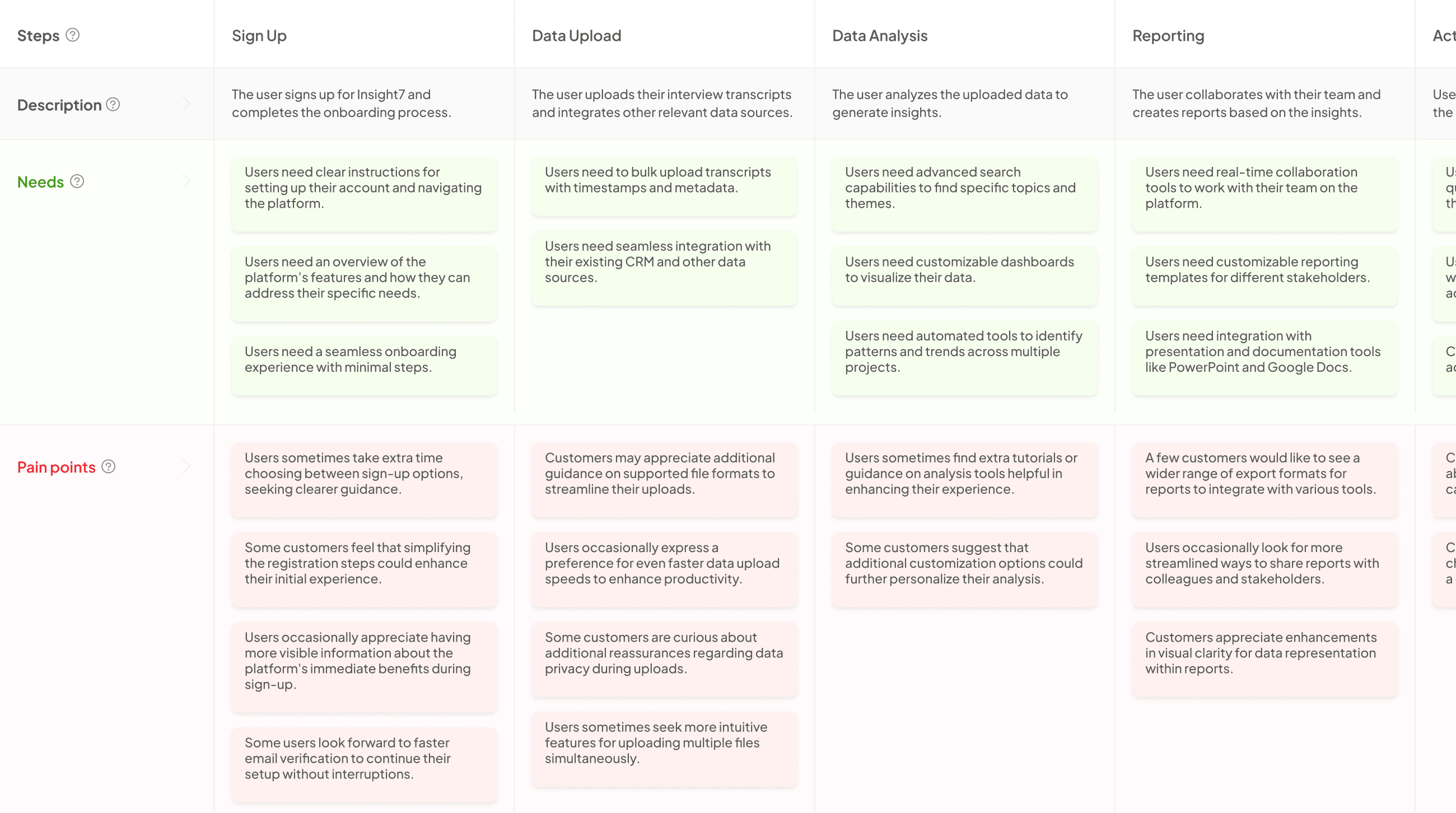
Generate Journey maps, Mind maps, Bar charts and more from your data in Minutes
Crafting the Optimal Call Center Dashboard Layout
Creating the Optimal Call Center Dashboard layout involves careful planning and design focused on enhancing user experience. The first step is identifying key metrics and KPIs that will be showcased. These should include core performance indicators, which reflect essential aspects like average handling time, customer satisfaction scores, and first call resolution rates. Understanding what your team needs in terms of real-time reporting will further inform your design.
Next, designing for user experience is crucial. Prioritizing simplified navigation ensures that users can quickly access the information they need without unnecessary steps. Effective visual hierarchies—using contrasting colors, font sizes, and graphics—can draw attention to vital data points at a glance. Balancing functionality and aesthetics contributes significantly to the effectiveness of the Optimal Call Center Dashboard, making it a valuable tool in enhancing operational success.
Identifying Key Metrics and KPIs
To create an Optimal Call Center Dashboard, it is crucial to identify key metrics and performance indicators tailored to your specific goals. First, clearly define core performance indicators that align with your call center objectives. Consider metrics like average handle time, first-call resolution rate, and customer satisfaction scores. These indicators provide insights into operational efficiency and customer experience.
Next, focus on real-time reporting needs. Determine which metrics require frequent monitoring to respond promptly to trends and issues. This allows teams to adjust strategies quickly, improving overall performance. Employing visual elements like charts and graphs can enhance understanding, making it easier to analyze data at a glance. By concentrating on these metrics, you ensure that your dashboard effectively communicates the most important information, guiding your team's efforts toward continuous improvement.
Step 1: Define Core Performance Indicators
To create the Optimal Call Center Dashboard, the first task is to define core performance indicators (KPIs) essential for evaluating call center performance. These KPIs enable organizations to benchmark and measure their success in areas like customer satisfaction, efficiency, and service quality. Clear identification of these key indicators sets the stage for data-driven decision-making and allows leaders to focus on areas requiring improvement.
There are several important KPIs to consider. First, call resolution rate reflects how effectively agents address customer inquiries. Second, average handling time measures the efficiency of agents in resolving issues. Third, customer satisfaction scores provide insights into the service experience. Lastly, agent performance metrics help identify training needs for continuous improvement. By establishing these core performance indicators, the dashboard can effectively communicate results, empowering teams to enhance service delivery and achieve operational goals.
Step 2: Focus on Real-Time Reporting Needs
Real-time reporting is essential for an optimal call center dashboard, as it allows for immediate insight into performance metrics. This enhances decision-making processes and helps managers respond quickly to emerging issues. By providing live data, call center teams can identify areas needing attention, thus improving operational efficiency and customer service.
To focus on real-time reporting needs, consider the following elements:
-
Key Performance Indicators (KPIs): Identify crucial metrics such as call volume, average response time, and customer satisfaction scores. These metrics should be prominently displayed for easy access.
-
Dynamic Data Visualization: Use charts and graphs to represent data visually. This not only aids comprehension but also highlights trends and outliers.
-
Alerts and Notifications: Implement alerts for specific thresholds, such as call wait times exceeding a predetermined limit. Real-time notifications allow for swift action to mitigate customer frustrations.
-
User Customization Options: Allow users to customize their dashboard views. This ensures that team members focus on the metrics most relevant to their functions.
By prioritizing these factors, you can create a dashboard that meets the real-time reporting needs of your call center effectively.
Designing for User Experience
When designing for user experience in an optimal call center dashboard, the foremost goal is to create an accessible and intuitive interface. Users should ease into the dashboard without the need for extensive training or technical knowledge. A simplified navigation system can empower all users, allowing them to find relevant information and insights quickly. The key is to ensure that every feature is designed with the user in mind, facilitating smooth interactions that promote positive engagement with the data.
Equally important is the effective use of visual hierarchies. This approach involves strategically arranging elements to guide users' attention to the most critical metrics first. For instance, presenting key performance indicators at the top, along with dashboards that utilize distinct colors and sizes, can significantly enhance data visibility. These design principles not only foster usability but also support informed decision-making in the fast-paced environment of a call center.
Step 1: Prioritize Simplified Navigation
A well-designed dashboard for call center reporting begins with simplified navigation. By prioritizing ease of use, you empower anyone within the organization to access vital insights effortlessly. This accessibility fosters a culture of data-driven decision-making, allowing team members at every level to engage with the data directly. A clutter-free interface minimizes distractions, enabling users to focus on key insights and metrics that matter most.
Furthermore, an optimal call center dashboard should categorize information logically. Users will benefit from intuitive layouts that guide them to the metrics they need quickly. This can be achieved by employing straightforward menus, clear labels, and an organized dashboard layout. Ensuring that users can navigate seamlessly through various reports enhances both efficiency and productivity, ultimately leading to improved overall performance in the call center. Simplified navigation is not just a design choice; it’s essential for maximizing the dashboard’s effectiveness.
Step 2: Utilize Visual Hierarchies Effectively
Visual hierarchies are essential in creating an optimal call center dashboard. By organizing information clearly, users can easily identify important metrics at a glance. The placement, size, and color of components can significantly impact data interpretation. Prioritize key performance indicators, ensuring they stand out prominently. Larger visual elements draw attention, while subdued tones should be used for less critical data.
Utilizing consistent layouts across your dashboard can deepen user familiarity, making navigation effortless. Group related information together to create understandable sections. For example, performance metrics might be placed at the top, with more detailed data below. By establishing a strong visual hierarchy, call center operators can swiftly access insights, enabling prompt decision-making and enhanced service delivery. This structured approach ultimately leads to a more efficient information flow, paving the way for better customer support outcomes.
Conclusion: Achieving Success with an Optimal Call Center Dashboard
An optimal call center dashboard serves as a pivotal tool, shaping the overall effectiveness of customer service operations. By presenting key performance indicators in an accessible format, it allows managers to gauge training efficacy and team compliance seamlessly. Rather than manually evaluating lengthy calls, a well-structured dashboard automates these insights, enabling supervisors to focus on actionable strategies that enhance performance.
In conclusion, success in call center management is greatly enhanced through the adoption of an optimal call center dashboard. With features that highlight customer intelligence and trend analysis, organizations can tailor training efforts based on real data from actual interactions. This proactive approach not only improves customer satisfaction but also accelerates team member development, ensuring sustained success in an evolving landscape.


