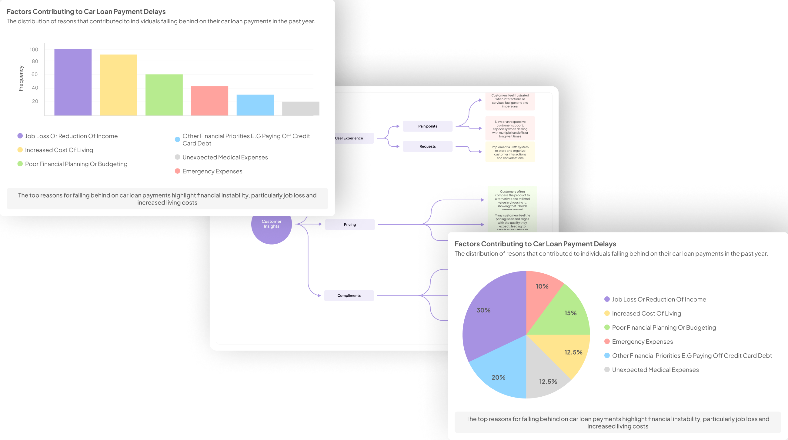
In today's data-driven environment, organizations are inundated with information from stakeholder interviews. The challenge remains not in collecting data but in transforming it into meaningful visuals that inform decision-making. Stakeholder Visualization AI serves as a powerful tool, enabling the synthesis of complex interview data into clear, actionable insights. By converting qualitative responses into visual formats, stakeholders can grasp critical patterns and themes more easily.
This innovative approach to data visualization empowers teams to make informed choices based on concrete evidence. As organizations strive for clarity, these AI tools simplify the process of highlighting key pain points and emerging trends. Ultimately, Stakeholder Visualization AI enhances communication within teams and drives strategic decisions by turning words into visuals that tell compelling stories.
Generate visualizations from your qualitative data. At Scale.

Exploring Stakeholder Visualization AI Tools
Exploring Stakeholder Visualization AI tools is essential for transforming qualitative data gathered from stakeholder interviews into meaningful visual representations. These tools help illustrate insights effectively, allowing teams to discern patterns and take informed actions. By leveraging advanced algorithms, these AI solutions analyze text-based feedback, identifying key themes that are often overlooked in traditional analysis.
The power of Stakeholder Visualization AI lies in its ability to present complex data in digestible formats. For instance, tools such as Tableau Public and Power BI enable users to create interactive dashboards that display stakeholder sentiments visually. Additionally, exploring options like RAWGraphs and Infogram further enhances the visualization experience, offering tailored graphics to suit various data types. Ultimately, the integration of these AI tools in stakeholder research facilitates a deeper understanding of stakeholder needs and perspectives.
Insight7: Leading the Charge in Visualization AI
In the realm of data analysis, Insight7 stands at the forefront of Visualization AI, revolutionizing how stakeholders interpret interview data. Stakeholder Visualization AI provides organizations with the tools needed to transform dialogue into actionable insights effortlessly. By simplifying the analysis of stakeholder conversations, organizations can discern patterns and trends that might otherwise go unnoticed. This leap forward is vital for businesses seeking to make informed decisions based on robust evidence gleaned from customer interactions.
The power of Visualization AI lies in its capability to handle vast amounts of qualitative data swiftly. It enables teams to visualize complex information in user-friendly formats, making it accessible for non-technical stakeholders. By doing so, Insight7 not only enhances collaboration but also ensures that insights from interviews translate directly into actionable strategies. Ultimately, this approach empowers organizations to anticipate customer needs and stay ahead in a competitive market landscape.
Additional Tools for Enhanced Visualization
To enhance the visualization of stakeholder interview data, various supplementary tools can significantly elevate the analytical process. These tools contribute to generating compelling visuals that encapsulate insights derived from stakeholder feedback. When integrating these tools into your workflow, it’s vital to select options that align with your specific data visualization needs.
Among these tools, Tableau Public stands out for its interactive dashboards and robust data analysis capabilities. Power BI provides seamless integration with other Microsoft services, making it ideal for organizations already using that ecosystem. Meanwhile, RAWGraphs simplifies complex data by offering custom visualizations that are easy to interpret. Lastly, Infogram excels in creating infographics that effectively communicate key insights in a visually appealing manner. By leveraging these additional tools for enhanced visualization, teams can transform stakeholder insights into actionable strategies that drive decision-making.
Tool 1: Tableau Public
Tableau Public stands out as a powerful tool for transforming data from stakeholder interviews into vivid visualizations. This platform allows users to create interactive and shareable dashboards, facilitating the analysis of feedback and insights derived from interviews. By leveraging its user-friendly interface, stakeholders can effectively portray their findings, making it easier to identify trends and patterns in the feedback collected. This is essential for distilling complex information into something more digestible and impactful.
One of the major advantages of Tableau Public is its ability to handle large datasets seamlessly. Users can mix and match various data sources, enhancing their visual storytelling capabilities. Furthermore, its community aspect promotes sharing and collaboration, allowing teams to gather diverse insights. This collaborative environment enhances stakeholder engagement and ensures that visualizations align closely with specific strategic goals. Through these features, Tableau Public effectively meets the demands of Stakeholder Visualization AI, offering a comprehensive solution for turning data into engaging insights.
Tool 2: Power BI
Power BI is an advanced data visualization tool that transforms raw interview data into compelling visual narratives. With its intuitive interface, it enables users to efficiently filter and analyze stakeholder insights, making it easier to identify trends and themes. It excels in showcasing both positive and negative feedback, allowing teams to respond effectively to stakeholder needs. By organizing data through interactive dashboards, users can derive significant insights from comprehensive datasets, enabling informed decision-making.
By grouping data points from interviews, Power BI’s capabilities in visualizations help to clarify complex information. It supports collaborative analysis, allowing multiple stakeholders to engage with the data in real-time. This dynamic interaction fosters richer discussions based on visual evidence, ensuring that stakeholder voices are adequately represented. Utilizing Power BI enhances the process of Stakeholder Visualization AI by offering a clear, impactful way to present findings drawn from interviews.
Tool 3: RAWGraphs
RAWGraphs serves as a vital tool in the realm of Stakeholder Visualization AI, transforming complex data into meaningful visual representations. This open-source data visualization framework is particularly advantageous when dealing with stakeholder interviews, allowing users to convert qualitative insights into visually engaging forms. By using RAWGraphs, teams can easily upload their interview data and choose from various visualization styles to effectively showcase findings and trends.
The primary features of RAWGraphs include versatility in data formats, ease of integration, and a user-friendly interface that caters to both novice and experienced users. Once interview data is transformed into graphics, these visuals can facilitate discussions and inspire actionable strategies within stakeholder engagements. Moreover, the ability to customize visuals ensures that the presented information resonates with the targeted audience, fostering a clearer understanding of the insights gathered. By harnessing the capabilities of RAWGraphs, organizations can enhance their decision-making processes based on extracted stakeholder feedback.
Tool 4: Infogram
Infogram stands out as a powerful tool for visualizing data derived from stakeholder interviews. Users can effortlessly craft stunning graphics, such as charts and infographics, enabling effective data communication. Its intuitive interface allows project teams to transform complex insights into accessible visuals, making it easier to identify patterns and trends from stakeholder feedback.
One of the key features of Infogram is its variety of templates tailored for different data types. Choosing the right visualization is crucial for engaging stakeholders and conveying insights effectively. With Infogram, users can easily customize their visualizations, ensuring that they resonate with their audience. Furthermore, the tool supports collaboration, allowing teams to work together in real-time. Ultimately, Infogram serves as a valuable ally in harnessing Stakeholder Visualization AI, helping organizations make informed decisions based on comprehensive visual data representations.
Evaluate Performance on Customer Calls for Quality Assurance.
Step-by-Step Guide to Utilizing AI for Stakeholder Visualizations
To effectively utilize AI for stakeholder visualizations, it's essential to begin with a solid foundation. Start by preparing your stakeholder interview data for analysis. This involves collecting and organizing the data carefully, ensuring each critical insight is captured accurately. Once organized, move on to identifying key themes and patterns. This step is crucial, as it sets the stage for generating meaningful visualizations that reflect the stakeholders' perspectives.
Next, create compelling visualizations. Begin by selecting appropriate visualization types that align with the insights you've gathered. Depending on the data, bar charts, word clouds, or heat maps might be excellent choices. After selecting your visualization types, customize them for clarity, ensuring they effectively communicate the insights. It's important to iterate on these visualizations, seeking feedback to refine and improve your final product. Engaging with stakeholders about these visual representations can yield valuable feedback and enhance understanding. By following this structured approach, you can maximize the potential of Stakeholder Visualization AI to inform decision-making processes.
Preparing Stakeholder Interview Data for AI Tools
To effectively prepare stakeholder interview data for AI tools, the process begins with meticulous data collection and organization. Start by compiling transcripts from interviews, categorizing them into relevant projects, such as monthly analyses. This structured approach allows you to see trends and patterns over time, facilitating valuable insights. For example, by reviewing data from July, you can identify recurring themes and pain points, which are essential for insightful visualizations.
Next, it’s crucial to identify key themes and patterns within the collected data. AI tools can assist in extracting critical insights by summarizing findings and highlighting significant issues presented across interviews. For instance, if a specific pain point is mentioned frequently by stakeholders, this can guide visualization efforts, ensuring that the most pressing concerns are captured. This preparation phase is vital for maximizing the effectiveness of Stakeholder Visualization AI and ensures that the resulting visuals are not only informative but also aligned with stakeholders' needs.
Step 1: Data Collection and Organization
To effectively harness the power of Stakeholder Visualization AI, the first step revolves around meticulous data collection and organization. Begin by gathering transcripts from stakeholder interviews, ensuring all relevant conversations are included. This comprehensive compilation allows for a nuanced analysis of what various stakeholders express regarding their experiences and challenges. Organizing this information into distinct projects, based on themes or timeframes, provides clarity and facilitates deeper insights.
Once data is gathered, organize it into various categories such as pain points, needs, and suggestions. By employing a matrix approach, you can extract crucial information like the percentage of respondents highlighting specific issues. This systematic arrangement of data enables you to discern patterns and themes, forming a foundation for effective analysis and visualization. Ultimately, well-organized data sets the stage for creating impactful visualizations that translate interview insights into actionable intelligence.
Step 2: Identifying Key Themes and Patterns
Identifying key themes and patterns in stakeholder interviews is crucial for deriving actionable insights. This process involves systematically analyzing the collected interview data to uncover recurring ideas and sentiments. By organizing the information, you can start recognizing trends that may emerge across multiple interviews, helping to encapsulate the voice of the stakeholders effectively.
To facilitate this, consider the following steps:
- Data Segmentation: Divide the interview transcripts into manageable sections, focusing on specific questions or topics.
- Theme Extraction: Use AI-powered tools to pinpoint common themes that arise from the conversations. This might include pain points or suggestions that frequently surface.
- Quantifying Findings: Analyze the frequency of mentions for specific themes to understand their significance. For example, how many stakeholders identified similar challenges?
- Visual Representation: Transform this quantitative data into visualizations that clearly depict key insights and themes.
By following these steps, you can effectively leverage Stakeholder Visualization AI to present a clear narrative supported by data. This approach not only streamlines the analysis process but also enhances communication with stakeholders by visually representing their collective input.
Creating Visualizations Using AI
Creating visualizations using AI offers a transformative approach to interpreting stakeholder interview data. The process begins with gathering insights from interviews, making it essential to translate qualitative data into visual formats that are easily understandable. Stakeholder Visualization AI tools can analyze large datasets, identifying key themes and sentiments that emerge from the discussions. This allows teams to see not just numbers, but the underlying narratives within their data.
To maximize the effectiveness of these tools, follow these essential steps: first, data collection and organization should be meticulous to ensure accuracy. Next, pinpointing key themes and patterns from interviews lays the groundwork for impactful visuals. After this, selecting appropriate visualization types, such as charts or graphs, enhances clarity. Finally, customizing the visuals based on audience feedback ensures that the presentation aligns with stakeholder expectations and objectives. Embracing this structured approach can help turn complex data into clear and actionable insights, fostering better decision-making.
Step 3: Selecting Appropriate Visualization Types
When engaging with stakeholder interviews, the selection of appropriate visualization types is crucial. Visual representations can significantly enhance the understanding of complex data derived from these interviews. Various formats, such as bar charts, pie charts, or heat maps, can provide clarity and context to stakeholders. Each visualization type serves a distinct purpose, helping to highlight trends, comparisons, or distributions effectively.
To make informed choices, consider the following factors: first, the nature of the data; second, the audience’s preferences; and third, the insights you aim to convey. For qualitative data, word clouds or sentiment maps can visualize themes succinctly. Conversely, quantitative results are better suited to formal graphs or tables. By aligning the right visualization with the data characteristics, stakeholders can ultimately draw more meaningful conclusions from their analysis, enhancing decision-making and strategic planning driven by stakeholder visualization AI.
Step 4: Customizing and Iterating for Clarity
Customizing and iterating for clarity is crucial when using Stakeholder Visualization AI to enhance insights from interviews. After generating initial visualizations, take the time to tailor them for your audience’s needs. This involves adjusting colors, labels, and data points to ensure that the visuals resonate and communicate effectively. A clearer visualization can significantly improve comprehension and drive engagement across stakeholders.
Moreover, the process does not end with the first draft. Gather feedback from colleagues and stakeholders to refine your visual presentations further. Iteration allows you to identify areas of ambiguity or confusion, enabling you to make data more accessible. By continuously customizing visuals based on this feedback, you ensure that the insights derived from stakeholder interviews are represented in the most impactful way possible. This ongoing journey of refinement ultimately leads to better decision-making and a deeper understanding of the themes uncovered in the interviews.
Conclusion on the Impact of Stakeholder Visualization AI
The growing significance of Stakeholder Visualization AI highlights its transformative role in interpreting qualitative data from stakeholder interviews. By generating clear and impactful visuals, these AI tools empower organizations to uncover essential insights that may otherwise remain hidden. Decision-makers can leverage these visualizations to enhance collaboration and drive strategic initiatives based on real, data-driven narratives.
Furthermore, Stakeholder Visualization AI fosters a more inclusive dialogue among stakeholders. Engaging visual formats encourage participation and facilitate understanding, allowing diverse perspectives to surface. Ultimately, the impact of these tools lies not just in their ability to summarize data, but in their potential to bridge gaps between insights and actionable outcomes, paving the way for informed decision-making.


