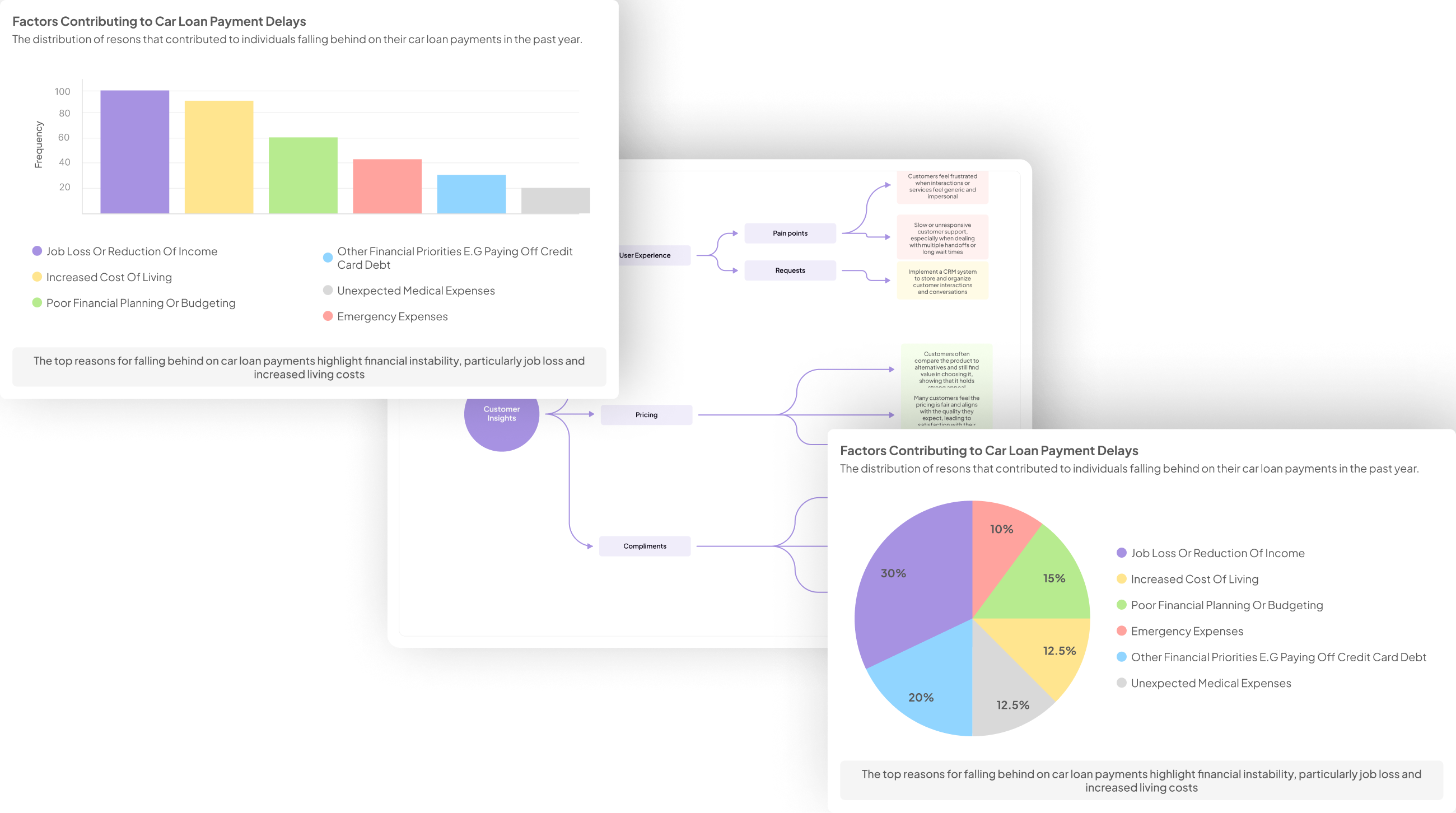
Visualizing insights from user experience interviews can turn raw data into powerful narratives that drive product development. An effective UX Insights Visualization transforms complex qualitative feedback into formats that are digestible and actionable for teams. By adopting visual tools, organizations can highlight patterns, reveal user pain points, and discover opportunities for improvement in a clear and compelling way.
This introduction to UX Insights Visualization focuses on the significance of translating user feedback into visual formats. These visuals facilitate better decision-making, ensuring that the voice of the user resonates throughout the organization. Utilizing infographics, user journey maps, and various software tools enables teams to enhance their understanding and communicate findings effectively. Ultimately, well-executed visualizations can foster empathy within teams, guiding them toward creating user-centered solutions.
Generate visualizations from your qualitative data. At Scale.

Gain an understanding of why visualizing insights from user experience (UX) interviews is crucial, and explore the benefits of translating qualitative data into visual formats for better decision-making.
Visualizing insights from user experience (UX) interviews is crucial for translating rich qualitative data into actionable findings. When insights are expressed visually, patterns emerge more clearly, making it easier for stakeholders to understand user needs. This clarity not only aids in design decisions but also fosters a shared understanding among team members. By transforming raw qualitative data into engaging visual formats like charts and diagrams, businesses can better communicate the essence of user feedback.
The benefits of UX Insights Visualization extend beyond mere aesthetics. First, visual formats enhance memory retention, allowing team members to recall insights more effectively during discussions. Second, they streamline the decision-making process by making complex information accessible and digestible. Finally, visual representations can highlight key themes, revealing pain points and areas for innovation. Consequently, investing time in visualizing UX insights leads to enhanced collaboration and improved product outcomes, crucial for staying competitive in today’s market.
Methods of UX Insights Visualization
Effective UX Insights Visualization transforms complex data from user experience interviews into clear, understandable formats. Such visualization serves multiple purposes, from identifying user pain points to highlighting actionable insights. By focusing on visual elements, teams can communicate key findings more effectively. This can directly inform decision-making and enhance the design process by revealing underlying patterns within user feedback.
Common methods for UX Insights Visualization include creating infographics and utilizing user journey maps.
-
Creating Infographics: Infographics condense intricate data into visually engaging formats, allowing stakeholders to grasp essential insights quickly. They combine text, graphics, and data to emphasize important findings, making them accessible to broader audiences.
-
Utilizing User Journey Maps: These maps visually represent the user experience, showcasing the steps users take while interacting with a product. They help trace pain points and triumphs, allowing teams to pinpoint opportunities for improvement and adjust their strategies accordingly.
Overall, leveraging these visualization methods can significantly enhance the understanding and impact of UX insights.
Evaluate Performance on Customer Calls for Quality Assurance.
Creating Infographics
Creating infographics is an essential skill when it comes to effectively communicating UX insights visualization. Infographics allow you to distill complex findings from user experience interviews into clear, visually engaging representations. This not only helps your audience grasp the information quickly but also highlights key patterns and trends that may otherwise be overlooked.
To create impactful infographics, consider the following steps:
-
Identify Key Insights: Start by reviewing your interview data to pinpoint themes, particularly those that could influence future design decisions.
-
Choose a Visual Style: Determine the best format for presenting your insights, whether through statistical charts, flow diagrams, or narrative illustrations.
-
Utilize Color and Typography: Use colors strategically to emphasize significant findings and select fonts that promote readability.
-
Keep It Simple: Focus on conveying a single message per infographic. Too much information can overwhelm your audience, diluting the impact of your findings.
By following these steps, you'll be able to produce visually striking infographics that enhance the understanding of user experience insights.
Learn how to distill complex insights into simple, impactful infographics that effectively communicate key findings from user interviews.
Transforming complex insights into impactful infographics is vital for effectively communicating findings from user interviews. To achieve successful UX Insights Visualization, one must prioritize clarity and simplicity. Start by identifying key themes and messages from the lengthy interview transcripts and categorizing insights into coherent sections. These sections can then serve as the backbone of your infographic.
Next, choose a visual format that resonates with your target audience. Infographics should incorporate engaging visuals coupled with concise text to summarize findings. Use graphics like charts, icons, and color-coded elements to highlight critical data points and user sentiments. This approach not only attracts attention but also enhances comprehension, making complex insights accessible to stakeholders.
By skillfully distilling information and presenting it visually, you empower teams to make informed design decisions based on user feedback. Ultimately, your goal is to transform the nuanced narratives of user interviews into straightforward graphics that drive actionable insights.
Utilizing User Journey Maps for UX Insights Visualization
User journey maps are essential in visualizing the insights gathered from user experience (UX) interviews. By charting the stages a user goes through, you can gain comprehensive perspectives on their interactions and experiences. Starting from initial research and continuing through the decision-making process, these maps help identify user pain points and areas of opportunity for improvement.
To create an effective user journey map, focus on several key steps:
- Define User Personas: Establish clear personas to represent different user types and their unique interactions.
- Outline Key Stages: Identify and divide the user's journey into distinct phases, from awareness to post-purchase engagement.
- Highlight Pain Points: Use the insights from interviews to illustrate moments of frustration or confusion in the user experience.
- Identify Opportunities: Pinpoint areas where improvements can enhance the overall journey.
- Illustrate Recommendations: Provide actionable suggestions based on the journey map to address user needs effectively.
By employing user journey maps, you can create a visual narrative that encapsulates user experiences while fostering a user-centered approach in designing more effective services and products.
Understand how user journey maps can serve as powerful tools to highlight user pain points and opportunities.
User journey maps can transform insights from user experience interviews into powerful visual tools. By detailing each step a user takes, these maps highlight critical touchpoints in their interactions, revealing significant pain points and opportunities for improvement. When visualizing these journeys, it’s easier to identify where users encounter challenges, such as confusing interfaces or lack of resources. This clarity allows teams to address specific issues more effectively.
Moreover, user journey maps facilitate a deeper understanding of customer emotions and motivations at different stages. They provide a holistic view, emphasizing not only where users struggle but also where they find value. By aligning user feedback with visual maps, teams can prioritize enhancements that matter most, ensuring a more user-centered design. Ultimately, integrating user journey maps into the process leads to impactful UX insights visualization, driving better decision-making and fostering an enriching user experience.
Top Tools for Effective UX Insights Visualization
Effective UX insights visualization is vital for translating qualitative data into actionable strategies. Choosing the right tools can significantly enhance your ability to visualize insights from user experience interviews. Popular platforms provide intuitive interfaces that enable teams to synthesize and communicate findings effectively.
Miro is an excellent choice for collaborative work, allowing teams to create user journey maps and affinity diagrams. Tableau powerful analytics software enables users to generate impactful visual representations of complex data. Dovetail focuses specifically on synthesizing qualitative research, helping to visualize insights clearly. Lucidchart simplifies diagram creation, making it accessible for all team members. Lastly, Airtable fuses spreadsheet functionality with visualization capabilities, offering a versatile approach for organizing and presenting insights. By leveraging these tools, you can enhance your UX insights visualization, fostering improved decision-making and user experience design.
insight7
Visualizing user experience insights is a critical step in transforming raw data into actionable strategies. Insight7 emphasizes the importance of narrative in UX Insights Visualization, where data becomes more than just numbers or quotes. By creating visual narratives, stakeholders can better understand user experiences and make informed decisions quickly.
To achieve effective visualization, consider these essential components:
- Identify Key Themes: Focus on main insights from interviews. Group similar ideas to highlight overarching patterns.
- Choose the Right Format: Whether infographics, charts, or maps, the selected format should resonate with the target audience and convey insights clearly.
- Incorporate User Stories: Use real user experiences to illustrate findings. This approach makes data relatable and emphasizes its relevance.
- Utilize Collaborative Tools: Platforms like Miro or Dovetail can streamline the process, enabling teams to co-create visuals that encapsulate insights effectively.
By following these guidelines, organizations can significantly enhance their UX Insights Visualization, driving better user-centered design outcomes.
Discover how insight7 excels in transforming interview insights into visual narratives.
Transforming user experience interviews into visual narratives is an art that goes beyond mere presentation. It involves understanding and distilling qualitative insights into forms that resonate with diverse stakeholders. By utilizing techniques such as infographics and user journey maps, organizations can turn scattered data points into coherent stories that drive action. This process empowers teams to quickly grasp user sentiments and behaviors, making decision-making more agile and informed.
The significance of UX insights visualization lies in its ability to reveal patterns and trends that might remain hidden in raw data. For instance, infographics can summarize critical findings in an engaging format, while user journey maps can illustrate the user experience and identify pain points effectively. By integrating these visualization methods, teams can not only enhance their understanding of user feedback but also foster collaboration around shared insights. Ultimately, effective visualization transforms abstract ideas into compelling narratives that inform strategic business decisions.
Additional Tools
When exploring additional tools for UX insights visualization, it’s important to consider various options that enhance your ability to interpret user experience interview data. Each tool serves a distinct purpose, helping you to create clear visual representations of qualitative insights. Utilizing platforms like Miro can facilitate collaborative efforts, allowing team members to brainstorm and map out user journeys collectively. This fosters a more engaging environment for synthesizing insights.
Tableau stands out for its robust capabilities in generating impactful visual analytics. It transforms complex data into easily digestible visuals that everyone can understand. Dovetail, on the other hand, specializes in synthesizing qualitative research, making it easier to visualize critical insights directly from interviews. Lucidchart offers versatility with a user-friendly interface for diagram creation, while Airtable blends spreadsheet functionality with creative visualization options. By integrating these tools, you’ll foster a more efficient workflow for turning interviews into actionable UX insights.
- Miro: A versatile platform for collaborative creation of diagrams and maps.
Miro is an exemplary platform that facilitates collaborative diagramming and mapping, making it an ideal choice for visualizing insights gathered from user experience interviews. This tool enables teams to co-create visual formats that translate complex information into accessible visuals, fostering shared understanding. Its user-friendly interface ensures that anyone can engage with the platform without extensive training, which democratizes the visualization process and encourages broad participation from team members.
Moreover, Miro supports various methodologies for organizing UX insights visualization. Users can create flowcharts, mind maps, and user journey diagrams that pinpoint key themes and pain points identified during interviews. This collaborative environment not only enhances the synthesis of findings but also allows team members to contribute insights in real-time. With Miro, transforming user research into visually compelling narratives becomes seamless, enabling teams to drive informed decisions based on shared understanding and collective intelligence.
- Tableau: A robust tool for generating impactful visual analytics.
Tableau stands out as a formidable tool for generating impactful visual analytics, especially in the realm of UX insights visualization. By transforming raw data into dynamic visuals, Tableau allows researchers to uncover trends and patterns that might otherwise remain obscured. Whether it's pinpointing user pain points or identifying opportunities, the platform empowers teams to derive actionable insights from complex datasets.
To maximize Tableau's effectiveness, consider the following approaches:
- Data Preparation: Input clean and structured data to ensure accurate visualizations.
- Custom Visualizations: Create tailored dashboards that reflect specific research goals and user feedback.
- Interactivity: Utilize features that allow stakeholders to explore data in real time, fostering a deeper understanding of user experiences.
- Comparative Analysis: Leverage Tableau’s capabilities to compare datasets, such as between different user groups or product iterations.
Using Tableau will not only enhance the clarity of your insights but also facilitate informed decision-making that elevates the overall user experience.
- Dovetail: An application focused on synthesizing and visualizing qualitative research.
Dovetail empowers researchers and UX professionals to synthesize and visualize qualitative data seamlessly. By aggregating insights from user experience interviews, the application helps identify key trends and patterns that may otherwise go unnoticed. Users can organize their findings into structured projects that allow for easier analysis over time, facilitating a comprehensive understanding of customer feedback.
The platform offers various features that enhance UX insights visualization. For instance, it provides a matrix tool to extract specific questions and responses, allowing users to quantify pain points mentioned during interviews. Additionally, Dovetail's thematic analysis furthers this understanding by highlighting recurring themes across multiple conversations. Finally, the ability to publish findings as reports or visual dashboards enables a more profound presentation of data insights. All these features work together to enrich the overall research process, ultimately driving better design decisions based on user needs and preferences.
- Lucidchart: Offers an easy-to-use interface for creating various types of diagrams.
The platform provides an intuitive and accessible interface that simplifies the process of diagram creation. By utilizing this tool, users can effortlessly visualize insights from user experience interviews. This ease of use empowers team members across various departments, enabling them to collaborate effectively on visual projects without needing prior training or expertise. The ability to create flowcharts, mind maps, and data diagrams can significantly enhance the clarity of insights gathered during interviews.
Furthermore, the platform supports a range of project workflows. Users can organize their findings by grouping various calls and insights, making it easier to identify trends and pain points. This organized approach allows for a comprehensive analysis of user feedback, which is vital for informed decision-making. Adopting such a straightforward tool transforms raw data into clear visuals, facilitating a deeper understanding of the user experience journey.
- Airtable: Combines the functionality of spreadsheets with visualization capabilities.
Airtable seamlessly integrates the functionalities of spreadsheets with dynamic visualization tools, making it incredibly useful for UX insights visualization. Users can easily input their qualitative data from interviews, allowing for straightforward organization and management. This powerful platform not only presents data in a structured format but also transforms it into interactive visuals, enabling teams to quickly grasp critical insights and make informed decisions.
By creating intuitive dashboards and graphs, Airtable helps teams identify trends, pain points, and user preferences within their data. This is particularly valuable in synthesizing and contextualizing user feedback during product development. As a result, stakeholders are empowered to visualize collective insights and communicate outcomes effectively, fostering a deeper understanding of user experiences. Leveraging Airtable can dramatically improve how insights derived from user interviews are visualized, driving more user-centric design strategies.
Conclusion: Mastering UX Insights Visualization
Mastering UX Insights Visualization is essential for transforming user experience interview data into actionable insights. By effectively visualizing insights, you create a narrative that communicates the emotions and thoughts of your users. These visuals make complex data accessible, allowing teams to identify patterns and themes crucial for enhancing product design and user satisfaction.
To continuously improve your UX Insights Visualization skills, experiment with different tools and techniques to find the best fit for your needs. Prioritize clarity and engagement in your visuals, ensuring they resonate with your audience. By refining your approach, you can further leverage visualizations to drive effective decision-making and foster a user-centered design process.
Wrap up the discussion with tips on continously improving UX insights visualization skills, and reiterate the value of effective visualization in enhancing user-centered design.
To continuously improve your UX insights visualization skills, consider engaging in regular practice and seeking feedback from peers. Embrace various visualization techniques, such as infographics, journey maps, and charts, to effectively communicate complex data. Familiarity with different tools can enable you to discover new ways to present insights and adapt to different audiences.
Effective visualization enhances user-centered design by making data more accessible and actionable. When stakeholders easily grasp insights, they can make informed decisions aligned with user needs. Remember that visualization is not just about aesthetics; it's about clarity and impact. By focusing on these elements, you can significantly contribute to creating products that resonate with users, ultimately leading to more successful design outcomes.
Generate visualizations from your qualitative data. At Scale.
