Data Presentation Techniques play a crucial role in effectively conveying research findings. When written correctly, the results section of a research paper not only presents data but also interprets it for the reader, making complex information accessible and engaging. Visual aids like graphs, charts, and tables can enhance understanding, allowing readers to grasp key patterns and trends at a glance.
Additionally, clarity and coherence in presenting results are essential. Thoughtful organization of data contributes to a narrative flow that guides the reader through the findings. By thoughtfully incorporating Data Presentation Techniques, researchers can ensure their results are not just a collection of numbers, but a compelling story that highlights significant insights and implications.
Structuring Your Results Section with Effective Data Presentation Techniques
In constructing your results section, using effective data presentation techniques can significantly enhance clarity and engagement. Begin by organizing the data logically, ensuring that each finding is presented in a straightforward manner. Use clear headings and subheadings to guide the reader through your results, making it easy to locate specific information. Visual aids such as charts, graphs, and tables can help highlight essential trends and relationships within the data.
Additionally, ensure that each visual element complements the narrative of your results. Label all figures and provide a brief description to explain their significance. Highlight key findings in the text to evoke interest and direct attention. Effective data presentation techniques not only make your results section more visually appealing but also facilitate better understanding of your research outcomes. By implementing these strategies, you will create a compelling and informative results section that resonates with your audience.
Organizing Quantitative Data for Clarity
Effective organization of quantitative data is crucial for clarity in research presentations. Data Presentation Techniques allow researchers to transform raw numbers into understandable insights. It's essential to categorize and visualize your data, as well-organized information enhances reader comprehension. For instance, consider using tables to summarize complex datasets, and ensure they are labeled clearly with headings that aid interpretation.
When presenting data, employing graphical elements like bar graphs, line charts, or pie charts can significantly enhance clarity. These visual tools can effectively illustrate trends, comparisons, and distributions. Additionally, using descriptive statistics such as means, medians, and standard deviations can help contextualize findings. By intentionally structuring and presenting your quantitative data, you not only facilitate understanding but also bolster the persuasive impact of your results. Remember, clarity in data organization directly contributes to the credibility of your research and conclusions.
Visualizing Qualitative Data for Maximum Impact
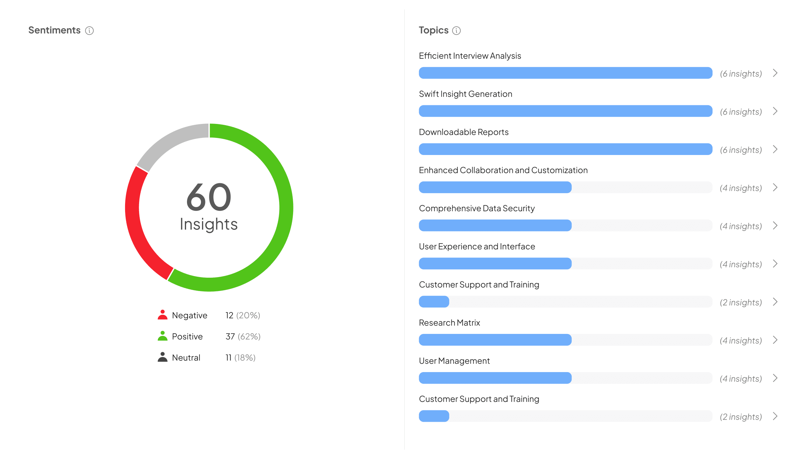
Visualizing qualitative data enhances comprehension and impact, guiding audiences through complex insights. When presenting these findings, employ effective data presentation techniques that foster clarity and engagement. Graphs, charts, and infographics can transform raw data into compelling narratives, highlighting trends and themes that emerge from qualitative research.
Consider these key techniques to maximize impact:
-
Thematic Mapping: Identify and visually represent overarching themes to encapsulate the essence of qualitative feedback. This makes it easier for readers to grasp the main ideas quickly.
-
Quotes and Anecdotes: Use direct quotes from participants to add authenticity and emotional resonance. Integrating real voices into your visuals can significantly deepen understanding.
-
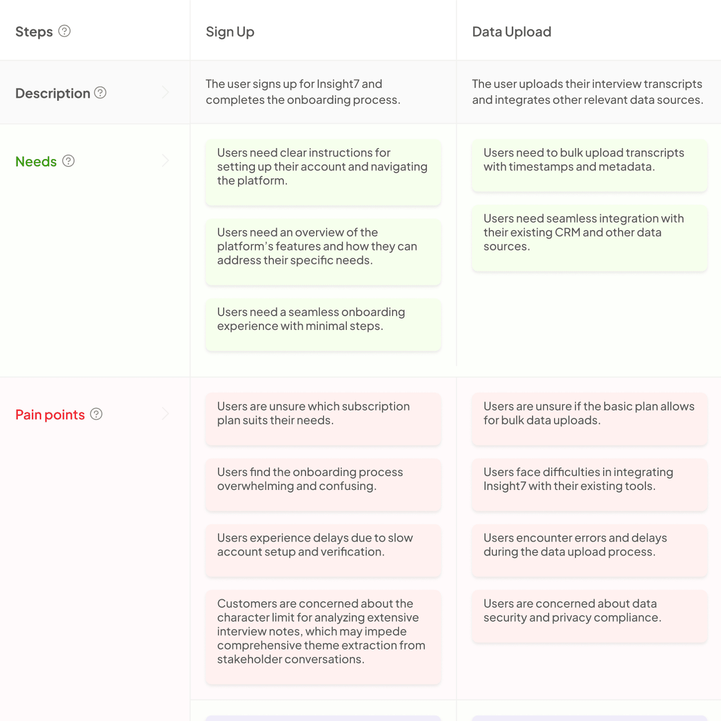
Flow Diagrams: Illustrate processes or customer journeys visually. Flow diagrams help delineate steps, showcasing experiences and highlighting critical touchpoints.
Incorporating these strategies will not only enhance the presentation but also make qualitative insights more actionable.
Practical Data Presentation Techniques for Clarity
Presenting data effectively is crucial for clarity in the results section of a research paper. By utilizing practical data presentation techniques, researchers can ensure their findings are accessible and engaging for their audience. Effective techniques include using charts, graphs, and tables to visually represent data, making complex information easier to digest. Additionally, highlighting key statistics or trends can draw attention to the most significant findings, allowing readers to focus on essential points.
It is also important to consider the layout and organization of the results. Grouping related results together provides context and improves comprehension. Using consistent formatting across visuals reinforces clarity and helps maintain the reader’s attention. Furthermore, including concise captions for each visual element assists in contextualizing the data. Ultimately, these data presentation techniques enhance the readability of the results section, ensuring that insights are communicated effectively.
Creating Tables and Figures for Enhanced Understanding
In research papers, creating tables and figures significantly enhances the comprehension of complex data. Using clear visuals helps to break down large volumes of information, making it more accessible to readers. Different data presentation techniques, such as charts and graphs, illuminate trends and relationships that might be lost in text alone. Utilizing visuals cleverly positions your findings in the best light, reflecting the rigor of your research.
Tables can efficiently summarize numerical data, while figures can illustrate relationships and trends over time. Incorporating these elements fosters a more engaging experience for the reader, allowing them to grasp key insights quickly. When crafting your results section, ensure that each table or figure has a clear title and is referenced in the text. This will guide readers and help them connect the visual data to your narrative, ultimately improving the clarity of your research presentation.
Descriptive and Inferential Statistics: How to Present Data Effectively
Descriptive and inferential statistics play a crucial role in presenting data effectively within research papers. When showcasing research results, clear and concise data presentation techniques are essential for conveying your findings accurately. Start with descriptive statistics, which summarize your dataset through measures such as mean, median, and mode. Visual aids like graphs and charts can enhance understanding, making it easier for the audience to grasp major trends or patterns.
Next, employing inferential statistics allows you to draw conclusions beyond your sample data. Techniques such as hypothesis testing and confidence intervals help you make predictions about the broader population. By using a combination of these methods, you engage your audience and provide a comprehensive view of your research. The key is to balance clarity with depth, ensuring readers can quickly understand your findings while appreciating their significance in the broader context.
Conclusion: Mastering Data Presentation Techniques in Your Results Section
Effectively presenting your data in the results section is crucial for conveying the significance of your research. To master data presentation techniques, start by organizing your findings clearly and logically. Use tables and figures judiciously to provide visual context, making it easier for readers to grasp complex information while maintaining engagement.
Additionally, always interpret your data in the context of your research questions. Highlight key trends and patterns that emerge for better understanding. Incorporating concise commentary alongside visual elements can enhance clarity, enabling your audience to recognize the relevance of your results in the broader research landscape. Remember, mastering these techniques not only improves your paper but also enhances the impact of your findings.


