
Data visualization tools have become indispensable in today’s information-heavy environment, acting as the bridge between complex data sets and actionable insights. Choosing the right tools can make all the difference in how effectively you analyze and present your findings. By transforming raw data into visually appealing formats, these tools help you uncover patterns, identify trends, and communicate your results with clarity.
In this section, we’ll explore various data visualization tools available to analysts and researchers. Understanding their unique features, strengths, and best use cases can empower you to make informed decisions. Whether you need interactive dashboards or simple charting capabilities, the right data visualization tools can enhance your analysis and elevate your presentations.
Understanding the Importance of Data Visualization Tools
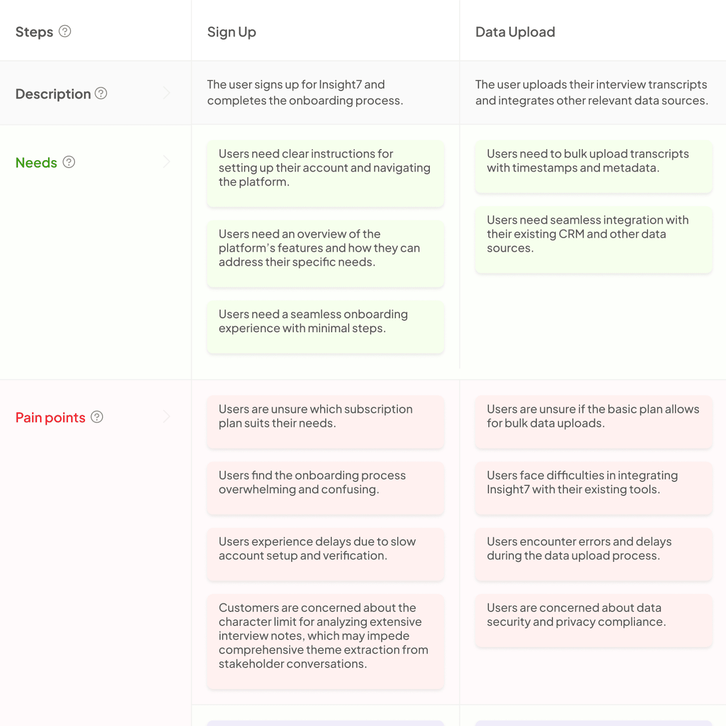
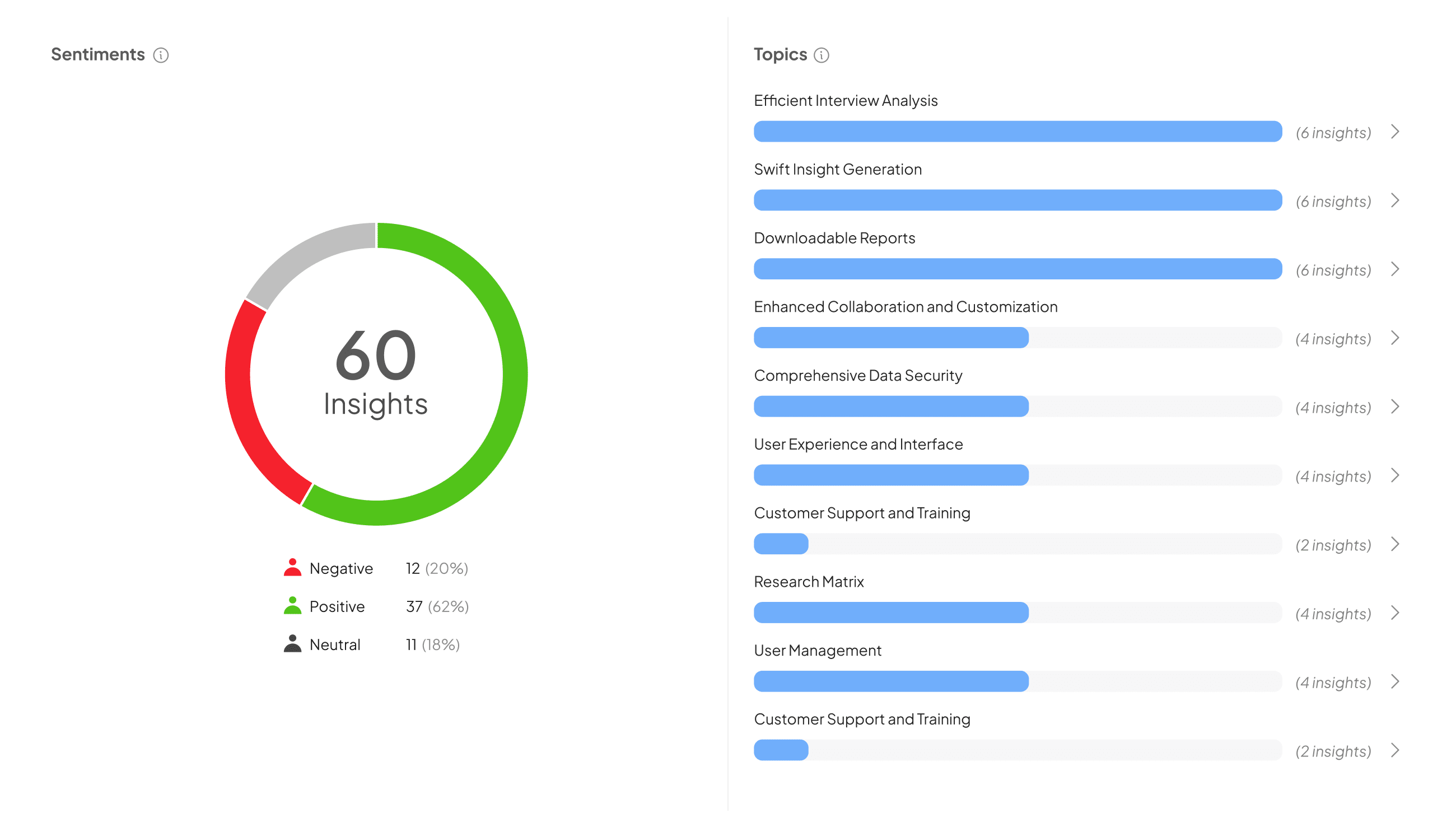
Data visualization tools play a crucial role in transforming raw data into insightful representations. These tools help users identify patterns, trends, and outliers in data, making complex information more accessible and understandable. By visually presenting data through charts, graphs, and maps, individuals can quickly grasp essential insights and make informed decisions.
When selecting the right data visualization tool, consider the specific needs of your analysis. Factors such as user-friendliness, customization options, and integration capabilities are important. Evaluating these aspects will aid in choosing a tool that best aligns with your objectives and enhances your data analysis experience. By utilizing effective data visualization tools, you equip yourself to better communicate findings and drive meaningful actions based on data insights.
Why Data Visualization Matters in Analysis
Data visualization is a vital aspect of data analysis that transforms raw numbers into meaningful insights. By using visual representations, complex information becomes easier to understand, enabling clearer communication of findings to stakeholders. Charts, graphs, and maps provide a visual summary that quickly highlights trends, comparisons, and outliers, which text alone often cannot convey effectively.
Utilizing Data Visualization Tools enhances the analytical process. These tools simplify the interpretation of data, allowing analysts to identify patterns and draw conclusions swiftly. Moreover, they make it easier for non-technical audiences to grasp data insights, fostering collaboration and informed decision-making across teams. In an era where data-driven strategies are crucial, investing in effective data visualization not only improves analysis but also contributes to organizational success by making data accessible and actionable.
Common Challenges in Selecting Data Visualization Tools
Selecting the right data visualization tools can be a daunting task for many users. One common challenge stems from the overwhelming variety of options available. Users often find themselves in a dilemma, torn between using widely known tools and exploring newer, innovative solutions. This confusion can lead to inadequate decision-making, ultimately impacting the quality of data analysis.
Another significant challenge is the specific needs of the organization or project. Different tools offer unique features, requiring users to evaluate their specific requirements against tool capabilities. This assessment often involves verifying ease of use, compatibility with existing systems, and scalability for future growth. Balancing these factors can be tricky, as selecting the wrong tool may result in wasted time, resources, and dissatisfaction among team members. Hence, understanding both the features of potential tools and the organizational needs is vital for making an informed choice.
Key Features to Look for in Data Visualization Tools
When choosing Data Visualization Tools, certain key features can significantly enhance your analysis capabilities. Firstly, ensure the tool provides intuitive and flexible design options. This allows for easy customization of visual aids, enabling users to tailor presentations to their audience seamlessly. Secondly, look for robust data integration capabilities. A good tool should connect effortlessly with multiple data sources, providing real-time updates for a more dynamic analysis experience.
Another crucial aspect is interactivity. Interactive visualizations allow users to manipulate data views easily, making insights more accessible and comprehensible. Additionally, consider the tool's ability to support collaboration. Features that enable sharing among team members can streamline the decision-making process, fostering a cohesive understanding of the data. Lastly, prioritize tools that offer comprehensive support and user training, ensuring you can maximize the tool's potential with minimal friction. Being aware of these features will guide you in selecting the best-fit Data Visualization Tools for your needs.
Usability and User Experience
When selecting data visualization tools, usability and user experience are paramount for effective analysis. These tools should provide intuitive interfaces that allow users to explore data easily. If users encounter confusing layouts or difficult navigation, it hinders their ability to derive meaningful insights. A well-designed tool facilitates a smooth experience, promoting engagement and efficiency during data exploration.
Moreover, an optimal user experience enhances learning and aids decision-making. Key elements to consider include clarity of visualizations, the ability to customize views, and responsive support for users. Each data visualization tool's effectiveness relies not just on its features but also on how accessible and pleasant it is to interact with. By prioritizing usability, organizations can empower users to make data-driven decisions with confidence. Ultimately, data visualization tools should not only present data but also enrich the user’s analytical journey.
Compatibility with Data Sources
When selecting data visualization tools, compatibility with data sources is crucial. These tools must effectively connect to various data platforms to ensure a seamless analysis process. Without proper integration, gathering insights becomes a cumbersome task, often leading to inaccuracies in reporting and decision-making.
Firstly, consider the types of data sources you will be using. Popular options include Excel spreadsheets, databases like SQL, and cloud storage solutions. Next, evaluate the tools based on their ability to connect with these sources easily. Some visualization platforms offer built-in integrations that streamline data imports, while others might require additional configuration. Lastly, think about scalability. As your data needs grow, ensure the tools can accommodate larger datasets without sacrificing performance. Ensuring compatibility with your existing data sources allows for efficient analysis and promotes informed business decisions.
Conclusion: Making Informed Choices on Data Visualization Tools
Selecting the right data visualization tools can significantly enhance the clarity and impact of your analysis. By understanding the unique features and benefits of each tool, you can make strategic choices that align with your specific needs. Whether you're looking for interactive dashboards or simple charting options, the key is to prioritize usability and effectiveness in communicating your insights.
Informed decisions on data visualization tools often depend on the audience and the nature of the data at hand. Take the time to explore various options, considering factors such as ease of use, available features, and integration capabilities. By doing so, you can enrich your analytical process and ensure your findings are presented in the most engaging manner possible.