


AI Performance Visualization is revolutionizing the way organizations assess and enhance their training effectiveness. By integrating sophisticated analytics with platforms like Microsoft Teams, teams can access actionable insights in real time. This integration streamlines the monitoring of training performance and fosters enhanced collaboration among team members, thus driving informed decision-making.
Employing AI Performance Visualization tools enables organizations to gather data-driven metrics that reflect team progress and individual learning outcomes. As teams utilize these insights, they can optimize training strategies more effectively, ensuring that resources are allocated where they are needed most. With this innovative approach, teams can harness the full potential of their training programs to achieve exceptional results.
Understanding AI Performance Visualization Dashboards
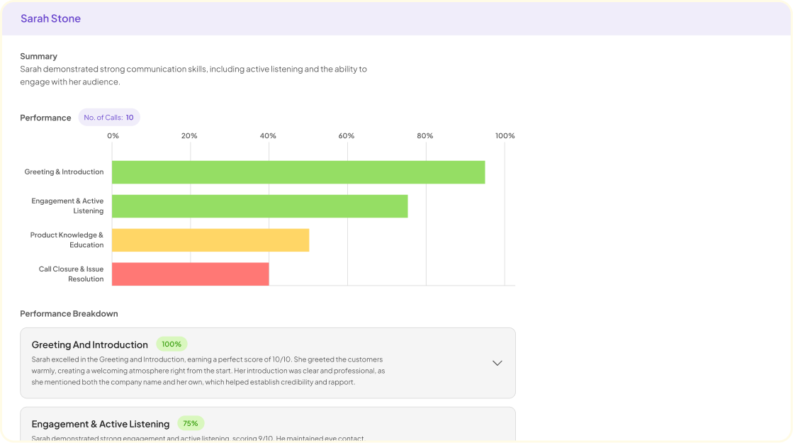
AI Performance Visualization Dashboards are essential tools that help organizations monitor and interpret performance data effectively. These dashboards transform complex data into insightful visual representations, making it easier for teams to identify strengths and areas for improvement. By utilizing various visualization techniques, teams can break down data into manageable insights, allowing for quicker decision-making and strategy adjustments.
Understanding how to design effective AI Performance Visualization Dashboards involves focusing on usability and clarity. A well-organized dashboard should highlight key performance metrics relevant to training and provide an intuitive user experience. Users can explore information through charts, graphs, and tables tailored to specific training goals. This visualization not only enhances comprehension but also facilitates communication among team members, ensuring everyone stays aligned on training assessments and performance objectives.
What Makes an Effective AI Performance Visualization?
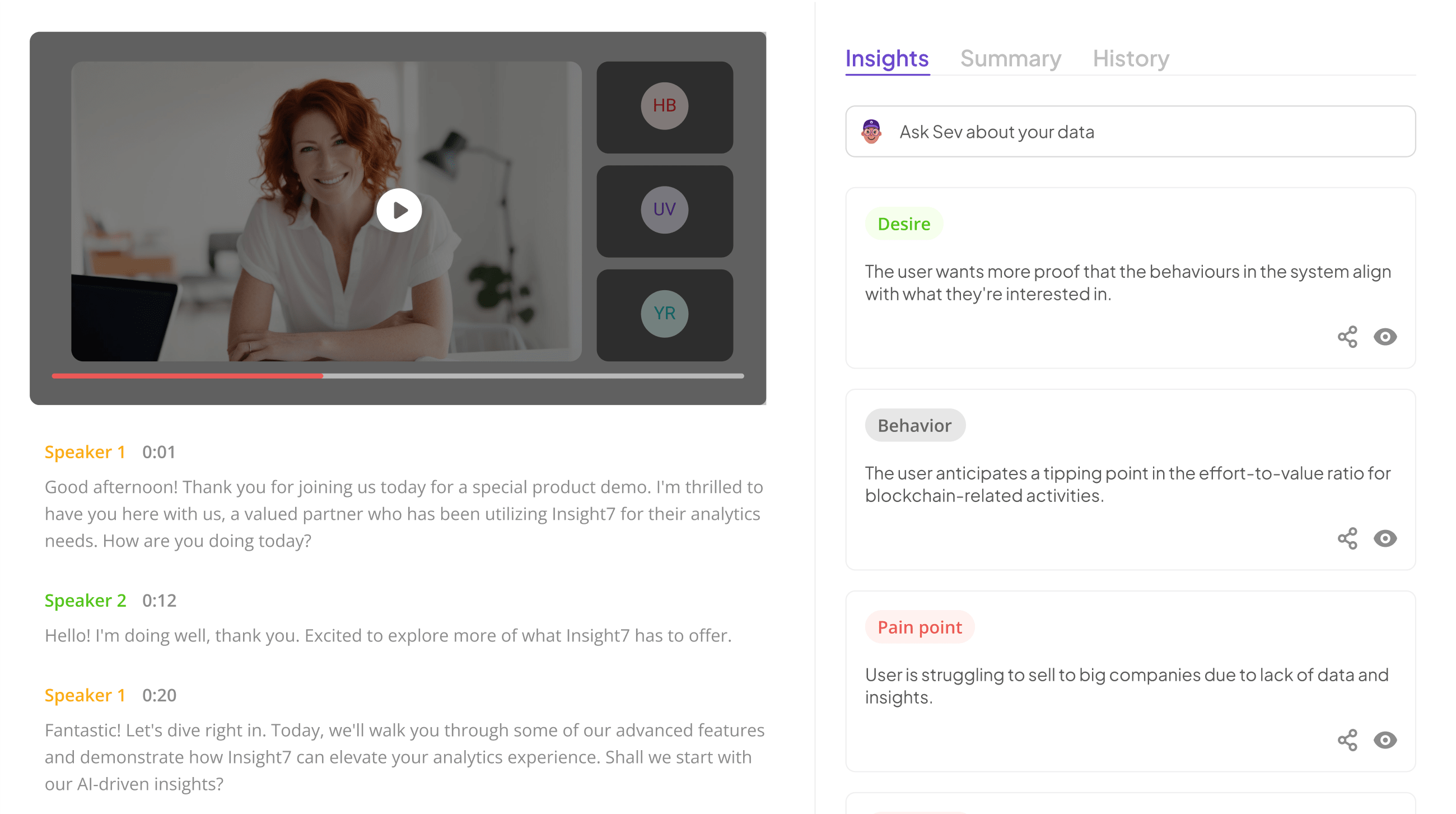
An effective AI performance visualization requires clarity, relevance, and interactivity. It should succinctly present key metrics, allowing users to grasp complex data at a glance. When visualizations are designed with user experience in mind, they foster engagement and enhance understanding. Data should be organized logically, with distinct visuals that highlight significant insights and trends, making it easier to identify areas that require attention.
Moreover, interactivity is crucial in AI performance visualization. Allowing users to drill down into specific data points can lead to deeper insights and informed decision-making. Real-time updates ensure the information presented remains current and actionable. By prioritizing these elements, organizations can create impactful dashboards that facilitate effective training assessments, ultimately driving performance improvement within their teams.
The Role of Dashboards in Assessing Training Performance
Dashboards play a crucial role in assessing training performance by providing a visual representation of key metrics and outcomes. These tools consolidate data from various sources, allowing managers and trainers to quickly identify trends and make informed decisions. With AI performance visualization, organizations can track employee engagement, comprehension, and overall effectiveness of training sessions.
The integration of dashboards into training programs facilitates real-time monitoring, enabling timely interventions when performance dips below expectations. By displaying metrics such as completion rates and retention scores, dashboards empower team leaders to celebrate successes and address challenges. Moreover, visual analytics can highlight areas requiring improvement, guiding targeted coaching efforts. This data-driven approach fosters a culture of continuous improvement, ensuring that both trainers and trainees benefit from a clear and accessible overview of performance outcomes. Ultimately, effective dashboards support strategic planning and contribute to enhanced overall training success.
Integration of Microsoft Teams for Enhanced AI Performance Visualization
The integration of Microsoft Teams enhances AI performance visualization by streamlining communication and collaboration while offering insightful data. By connecting AI-driven performance dashboards directly with Teams, users can engage with real-time analytics without switching platforms. This integration ensures that stakeholders remain informed and can promptly address performance insights, ultimately leading to improved decision-making.
Setting up this integration involves several key steps. First, organizations must establish the necessary tools, including performance dashboards that align with Teams capabilities. Following setup, configuring the AI dashboard for seamless integration becomes essential, allowing for a smoother user experience. By implementing this dashboard within Teams, the visualization of performance metrics becomes more accessible, enabling teams to swiftly identify trends and areas for improvement. This unified approach fosters a culture of data-driven performance management.
Steps to Implement Microsoft Teams Integration
To implement Microsoft Teams integration effectively, it's essential to follow a systematic approach. Begin by setting up the required tools that support AI Performance Visualization. This involves selecting the right software platforms like Insight7, which aids in data analysis, alongside tools like Power BI and Tableau for creating dynamic dashboards.
Next, configure your AI dashboard for Teams integration by connecting necessary APIs and ensuring that data flows seamlessly from Microsoft Teams to your chosen visualization tool. It's crucial to establish proper channels within Teams for real-time data sharing and feedback, enabling teams to access performance metrics effortlessly. Regularly review the integration’s performance and gather user feedback to refine the setup. With these steps, you'll create a robust platform for assessing training and coaching effectiveness, fostering engagement among your team members, and ultimately enhancing your AI Performance Visualization.
Step 1: Setting Up the Required Tools
To successfully set up AI Performance Visualization, the first step is identifying and gathering the essential tools. Start by choosing robust platforms that can effectively integrate with Microsoft Teams. Consider tools like Power BI, Tableau, or Domo, which are particularly useful for creating insightful performance dashboards.
Next, ensure that your chosen platform is compatible with data sources you intend to use. Data connectivity is crucial for accurate visualization, so verify that your data can be seamlessly imported into these tools. Once you've configured your tools, it’s time to establish a user-friendly framework for your AI dashboards. Organizing data based on performance metrics will help streamline the evaluation process. These steps will lay a solid foundation for achieving effective AI Performance Visualization, leading to improved insights and enhanced decision-making capabilities.
Step 2: Configuring Your AI Dashboard for Teams Integration
Configuring your AI dashboard for Teams integration is a crucial step in optimizing AI performance visualization. Start by selecting the appropriate tools that best fit your needs. Options like Power BI and Tableau can create interactive and insightful visualizations that provide clear insights into training assessment data. This process allows teams to track performance metrics effectively, making it easier to identify trends and areas for improvement.
Next, ensure that your dashboard is tailored to highlight key performance indicators relevant to your training objectives. Integrating these metrics will empower your team to make data-driven decisions. Moreover, seamless collaboration within Teams enhances real-time communication and data sharing, fostering a more effective learning environment. Ultimately, a well-structured AI dashboard serves as a powerful tool in driving team engagement and improving overall training outcomes.
Top Tools for AI Performance Visualization
When it comes to AI performance visualization, selecting the right tools is crucial for effective data assessment. Insight7 emerges as a vital player in this category, providing quantitative analysis solutions that streamline the evaluation of training data. Additionally, Power BI offers interactive dashboards that help visualize key performance metrics, making the data easily digestible. Tableau stands out for its powerful data blending capabilities, enabling users to combine various data sources seamlessly.
Domo specializes in unifying data from multiple platforms while presenting it through user-friendly interfaces. Finally, Qlik Sense excels in its associative data modeling, allowing users to explore relationships within data intuitively. Each of these tools underscores the importance of AI performance visualization, driving actionable insights for improved training assessments. By leveraging these innovative technologies, organizations can enhance their training outcomes and accelerate their AI initiatives.
insight7
To achieve a deeper understanding of AI performance visualization, it is crucial to appreciate its role within training assessment dashboards. Effectively designed dashboards can translate complex data into actionable insights, ultimately fostering improved training outcomes. By visualizing performance metrics, organizations can identify trends and areas for improvement in real-time. This clarity allows teams to make informed decisions, driving better results in their training programs.
Integrating Microsoft Teams enhances this visualization, as it facilitates seamless collaboration and communication among team members. Teams can easily access and share performance dashboards, ensuring that everyone is on the same page. The ability to view data dynamically and collaboratively can significantly optimize training assessment processes, allowing for quicker adjustments and better alignment with strategic goals. Thus, leveraging AI performance visualization tools leads to comprehensive insights that strengthen overall training effectiveness.
Power BI
Power BI serves as a powerful platform for AI Performance Visualization by transforming raw data into compelling visual narratives. Through captivating charts, graphs, and real-time metrics, users can delve into insights that drive effective decision-making. With its accessibility, teams can seamlessly explore training assessments directly within their Microsoft Teams environment, enhancing collaboration and engagement.
The integration of Power BI allows organizations to monitor performance easily. Teams can tailor dashboards to meet specific training needs, ensuring relevant data visibility. This customization aids in identifying performance trends and anomalies swiftly, facilitating timely interventions. Moreover, Power BI supports extensive data sources, making it an ideal choice for organizations looking for flexibility in their reporting. In essence, Power BI empowers teams by providing clarity and context, ultimately leading to improved training outcomes and enhanced overall performance.
Tableau
Tableau offers a powerful platform for AI performance visualization, enabling teams to create dynamic dashboards that provide critical insights. Through its intuitive interface, users can effectively connect and analyze data from various sources, transforming raw numbers into visually appealing representations. This transformation plays a crucial role in enhancing the decision-making process—especially in the context of training assessments within Microsoft Teams.
Utilizing Tableau, organizations can visualize training performance metrics, track progress, and identify trends over time. This leads to more informed strategies and improvements in training programs. As teams integrate Tableau with Microsoft Teams, collaboration becomes seamless, allowing stakeholders to engage with real-time data. This synergy not only enhances understanding but also fosters a proactive approach to performance management, making it an essential component of the AI performance visualization initiative.
In summary, Tableau serves as a vital tool for converting complex data into insightful visuals, thereby optimizing training assessment processes and enhancing overall organizational capability.
Domo
Domo stands out as a powerful tool for AI performance visualization in the landscape of business intelligence. This platform simplifies data integration and provides insightful visualizations to enhance decision-making. Organizations can easily import data from various sources, streamlining the process of obtaining actionable insights. With its user-friendly interface, Domo allows teams to create dynamic dashboards that cater to their specific needs.
Implementing Domo enhances collaboration, especially within an integrated Microsoft Teams environment. Users can access real-time performance metrics, making it possible to monitor training assessments effectively. This capability helps companies identify trends and areas needing improvement, ensuring that training initiatives align with overall business goals. By fostering a culture of transparency and data-driven decisions, Domo empowers teams to navigate the complexities of training assessments more efficiently.
Qlik Sense
Qlik Sense plays a pivotal role in the realm of AI performance visualization, offering users dynamic and interactive data analytics capabilities. Its robust platform allows users to create custom dashboards that vividly display key performance indicators, helping teams gauge the effectiveness of their training programs. Users can efficiently track metrics related to training effectiveness, employee engagement, and skill acquisition, all in real time.
Utilizing Qlik Sense equips teams to make informed decisions based on comprehensive insights. This visualization tool enhances the ability to interpret complex datasets, turning raw data into actionable insights. As a result, teams can identify areas for improvement and optimize training programs to better suit their objectives. In this evolving landscape of AI performance visualization, Qlik Sense stands out by providing a significant advantage in understanding and improving training assessments through its innovative dashboard capabilities.
Conclusion: Enhancing AI Training Assessment through Performance Visualization
The integration of AI Performance Visualization into training assessment processes heralds a new era of data-driven insights. With the ability to visualize key metrics and trends, organizations can gain a deeper understanding of training effectiveness and learner engagement. By leveraging visual tools, decision-makers can quickly identify areas for improvement, thereby enhancing overall training outcomes.
Furthermore, these visualizations streamline the communication of complex data, making it accessible for all stakeholders involved. This approach not only fosters transparency but also encourages feedback and collaboration, ultimately leading to more informed strategies in AI training. Embracing a performance visualization framework thus empowers organizations to optimize their training programs and drive continuous improvement in performance assessment.