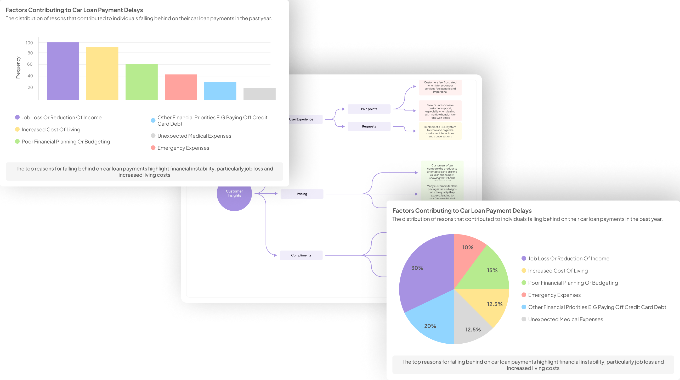
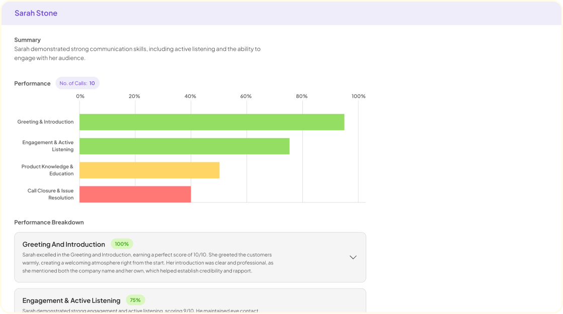
User testing often uncovers valuable insights, but effectively visualizing this data can be challenging. Interview data visualization transforms raw feedback from users into comprehensible graphics, making it easier to identify patterns and themes. By applying visual techniques, researchers can illustrate positive and negative sentiments, facilitating more informed decision-making during product development.
In this section, we explore various methods for creating impactful visualizations from user testing interviews. Understanding how to represent your data visually empowers teams to distill complex findings into straightforward, actionable insights. This approach enhances communication within the team, ensuring everyone shares a common understanding of user experiences.
Generate visualizations from your qualitative data. At Scale.

The Process of Interview Data Visualization
Interview Data Visualization transforms raw user feedback into compelling visual narratives. To accomplish this, it’s essential first to analyze user feedback methodically. Begin by collecting qualitative data from interviews, focusing on participants' experiences, feelings, and challenges. Organizing this information into themes helps illustrate common user pain points and preferences, revealing underlying patterns.
Next, extracting key insights from the organized data is crucial. Highlight significant quotes or anecdotes that encapsulate the user experience. Additionally, prioritize insights that align with your objectives and resonate with your audience. Visuals such as graphs, charts, and infographics can then communicate these insights effectively. By visualizing interview data, you create a tangible representation of the users' voices, enabling stakeholders to understand and act upon user needs and preferences. This approach not only enhances decision-making but also fosters a more empathetic understanding of the end-users.
The Process of Interview Data Visualization
The process of interview data visualization begins with careful organization of user feedback. By compiling transcripts from user interviews, you can create a structured project. This project might focus on a specific timeframe or theme, allowing you to analyze trends and patterns effectively. As you delve into the data, it's essential to break down the information into manageable segments. Syncing the insights with specific questions can help highlight key pain points discussed by users.
Next, you transform these insights into visual formats that convey information clearly. Using graphs and dashboards, you can illustrate customer journeys and highlight recurring themes. Visualizations can encapsulate key ideas, such as customer needs and pain points, across multiple interviews. By systematically analyzing and visualizing the data, you enable stakeholders to grasp critical insights quickly. Ultimately, this process of interview data visualization enhances understanding and drives more informed decision-making based on user feedback.
Analyzing User Feedback
Analyzing user feedback is crucial to improving product development. This process involves thoroughly examining insights gathered from user testing interviews. By categorizing feedback into positive and negative comments, one can identify patterns and areas for improvement. Engaging with this data can help in understanding user perspectives, which ultimately informs future product iterations.
To effectively analyze user feedback from interviews, several steps should be followed. First, collect and organize all feedback received from participants. Next, categorize this feedback into themes to ease the analysis. This could involve tracking positive and negative sentiment separately. Finally, use visualizations, like charts or graphs, to present the findings clearly, enabling stakeholders to grasp the insights at a glance. Such Interview Data Visualization not only highlights critical insights but also drives data-informed decision-making, leading to a more user-centered product development process.
Extracting Key Insights
Extracting key insights from user testing interviews is crucial for understanding user needs and pain points. Once the interviews are conducted, the next step is to analyze the conversation data to identify patterns and recurring themes. By compiling responses into a matrix, you can succinctly quantify the pain points mentioned by users, allowing you to summarize the data easily. This enables you to see which issues are most prevalent and deserve immediate attention.
In addition to summarizing findings, visualizations can provide clarity. Creating dashboards or reports that map out user journeys helps illustrate the diverse experiences of users. By visualizing where users encounter challenges, you can formulate targeted strategies for improvement. Consistent analysis of interview data enhances your understanding of user feedback. Ultimately, the goal is to translate qualitative insights into actionable decisions, ensuring that the user voice informs each step of the development process.
Generate Journey maps, Mind maps, Bar charts and more from your data in Minutes
Tools for Creating Interview Data Visualizations
Creating engaging visualizations from user testing interviews requires the right tools. Each tool offers unique features that can help in transforming raw interview data into insightful visual content. Popular choices include insight7, Tableau, Microsoft Power BI, and Google Data Studio, each catering to different visualization needs and levels of complexity.
Insight7 allows for interactive data manipulation, making it easy to query specific insights from a large dataset. Tableau excels in crafting stunning visual narratives, enabling users to present data stories effectively. Microsoft Power BI integrates well with other Microsoft products, offering robust reporting features. Lastly, Google Data Studio provides a user-friendly platform for creating shareable dashboards with real-time data updates. Selecting the right tool depends on your project requirements and desired outcomes in presenting interview data visualization.
insight7
To effectively utilize interview data visualization, it's essential to extract key insights from user testing interviews. This process transforms raw conversation data into visual formats that enhance understanding and retention. Start by identifying recurring themes and significant feedback points as they emerge from the interviews. Consider using tools that assist in categorizing these findings to streamline future analysis.
Next, create visual representations that resonate with your audience. Graphs, charts, and infographics can simplify complex data and highlight critical trends at a glance. For best results, choose visualization styles that align with your objectives. By prioritizing clarity and engagement, you can convey powerful insights that drive business strategies and improve user experiences. This approach ensures that valuable information is not lost amid extensive data, paving the way for informed decision-making.
Tableau
Tableau serves as a powerful tool for transforming raw interview data into engaging visualizations. By providing intuitive methods to present complex information clearly, it caters to users with varying levels of technical expertise. Users can easily upload their interview transcripts and utilize Tableau's features to create interactive dashboards that bring insights to life.
Using Tableau for Interview Data Visualization can enhance understanding of user experiences by showcasing patterns, themes, and trends from multiple interviews. It facilitates the identification of common pain points and desires expressed by participants, making these insights readily accessible. Additionally, Tableau's dynamic filtering options allow users to drill down into specific data segments, providing deeper context to the findings. Ultimately, harnessing Tableau in your data visualization process elevates the effectiveness of your storytelling, making the insights derived from user testing interviews actionable and impactful.
Microsoft Power BI
Microsoft Power BI serves as a powerful tool for visualizing interview data, transforming raw feedback into clear, actionable insights. By integrating varied data sources, this platform enables users to create interactive dashboards that highlight trends and patterns from user testing interviews. With features like drag-and-drop functionality and customizable visuals, stakeholders can effectively communicate findings to guide decision-making processes.
To begin utilizing Microsoft Power BI for interview data visualization, it's essential to follow a few key steps. First, gather and clean your data to ensure accuracy. Next, import the data into Power BI, where you can apply various visual elements such as charts and graphs. Finally, customize the dashboard to encapsulate critical insights, allowing for dynamic exploration of the user feedback. This streamlined approach not only enhances comprehension but also fosters continuous improvement based on user insights.
Google Data Studio
Google Data Studio is an effective platform for creating visualizations from interview data. It allows users to turn raw feedback into comprehensible charts and graphs, facilitating the identification of trends and sentiments. By integrating various data sources, you can easily visual what users think about your products. This capability enhances the depth of insights derived from user testing interviews.
Importantly, Google Data Studio promotes collaboration. Teams can work together in real-time to analyze interview data, making it easier to draw conclusions and share findings. The platform supports various visualization types, including line graphs, pie charts, and heat maps. Utilizing these options, you can tailor your visualizations to emphasize specific insights, allowing stakeholders to grasp the essential points quickly. Overall, Google Data Studio serves as a powerful tool in the realm of Interview Data Visualization, ensuring insights are not only gathered but effectively communicated.
Conclusion: Bringing User Testing Insights to Life
Transforming insights from user testing interviews into effective visualizations is crucial in bringing valuable data to life. By employing techniques that highlight key findings, organizations can make data-driven decisions that genuinely reflect the user experience. These visualizations create a narrative that not only communicates essential information but also engages stakeholders in a meaningful way.
In conclusion, prioritizing interview data visualization empowers teams to harness user insights effectively. This approach ensures a consistent understanding of user needs and pain points, fostering an environment where decision-making is informed by the user’s voice. Ultimately, by embracing these visual strategies, businesses can bridge the gap between raw data and actionable insights, enhancing the overall user experience.


