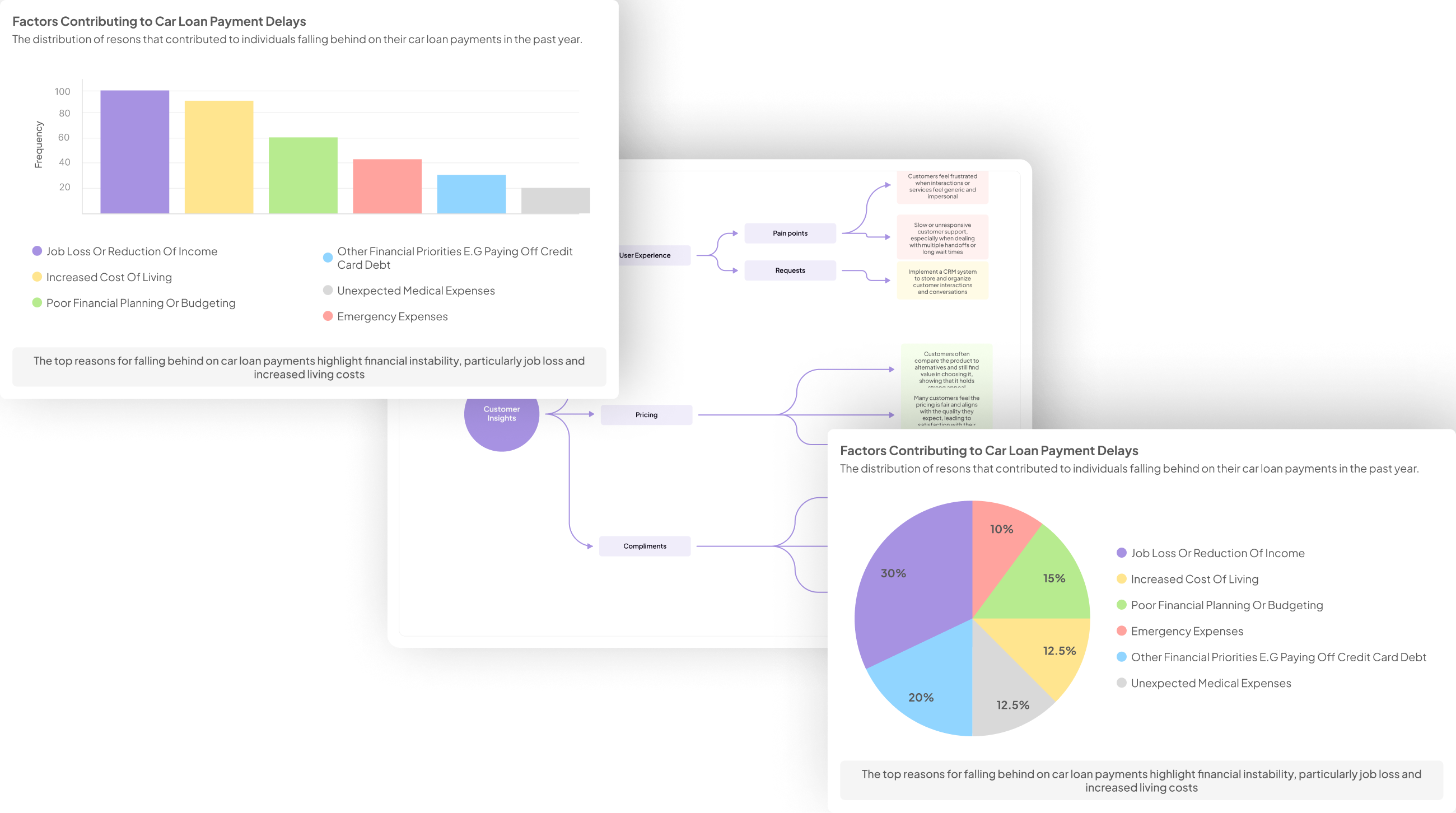
Exit Interview Visualization Tools are essential in transforming qualitative data from exit interviews into actionable insights. These tools help organizations gain a deeper understanding of employee sentiments, thereby enhancing decision-making processes. As companies strive to improve retention rates and workplace culture, visualizing this feedback can reveal patterns and trends that might otherwise go unnoticed.
The effectiveness of Exit Interview Visualization Tools lies in their ability to present complex data in an understandable format. By utilizing various visualization methods, stakeholders can easily identify areas of concern and engagement within their workforce. This section will explore how these tools not only streamline analysis but also facilitate ongoing dialogue about employee experience and satisfaction.
Generate visualizations from your qualitative data. At Scale.

Understanding Exit Interview Visualization Tools
Exit Interview Visualization Tools serve as essential instruments to interpret and understand the rich qualitative data gathered during exit interviews. The process involves converting raw feedback into engaging visual formats, making it easier for teams to identify trends, patterns, and concerns. By utilizing these tools, organizations can simplify complex information, thereby enhancing analytical clarity and decision-making capabilities.
Understanding how to navigate these visualization tools involves awareness of various formats, such as graphs, charts, and heat maps. For instance, you may analyze positive and negative feedback separately for more precise insights. This approach allows an organization to directly address areas of improvement while celebrating successes. Additionally, the capacity to compare data sets from different locations or departments can reveal deeper insights into organizational dynamics, leading to informed strategies for employee retention and engagement. Ultimately, these visualization tools play a critical role in translating exit interview data into actionable recommendations.
Why Exit Interview Visualization Matters
Understanding the importance of Exit Interview Visualization Tools transforms how organizations comprehend feedback from departing employees. By visually representing insights derived from exit interviews, these tools help identify patterns and trends that might not be apparent in text-based responses. This visualization aids teams in grasping employee sentiments, encapsulating both positive and negative experiences that contribute to the overall workplace atmosphere.
Effective visualization makes the data more accessible, allowing decision-makers to spot critical issues quickly and strategize accordingly. For example, integrating various data points can facilitate comparisons across departments or locations, leading to targeted improvements. The use of AI-driven visualizations not only enhances comprehension but also fosters a culture of open communication and continuous improvement, ultimately contributing to enhanced employee retention strategies. Emphasizing the significance of these tools can drive organizations toward a more insightful understanding of their workforce dynamics.
Key Benefits of AI-Driven Visualizations
AI-driven visualizations offer significant advantages, especially when analyzing exit interview data. By leveraging algorithms, these tools can process extensive datasets and highlight trends that may go unnoticed through traditional analysis. They streamline the identification of common themes, including the balance of positive and negative feedback, which is crucial for making informed decisions.
One key benefit is efficiency. AI tools can rapidly generate visual representations, allowing teams to save time while gaining deep insights. Additionally, they enable comparative analysis across different datasets, such as departmental feedback or geographical variances, enhancing the understanding of employee sentiments. Finally, these visualizations foster data storytelling, making complex insights more accessible to stakeholders, ultimately leading to a more engaged and informed decision-making process. Embracing AI-driven visualization tools can transform exit interview data into clear, actionable insights that drive organizational improvement.
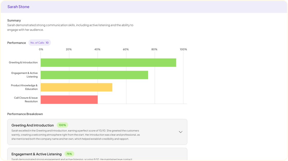
Generate Journey maps, Mind maps, Bar charts and more from your data in Minutes
Top Exit Interview Visualization Tools to Consider
When selecting exit interview visualization tools, it's essential to consider options that effectively translate qualitative insights into meaningful visuals. These tools not only enhance understanding of employee sentiments but also provide actionable data for organizational improvement. By visualizing feedback, you can quickly pinpoint trends and sentiments, facilitating meaningful analysis.
Several robust tools stand out in this space. Tableau offers interactive dashboards that can reveal intricate data patterns, allowing teams to explore various data points intuitively. Power BI brings a comprehensive analysis with easy integration of various data sources, making it suitable for detailed reporting. Google Data Studio enhances accessibility with its user-friendly interface, enabling teams to create clear reports that stakeholders can easily interpret. Lastly, Chart.js allows customization for visual charts, catering to specific presentation needs. Exploring these exit interview visualization tools can significantly transform how insights are gathered and utilized in decision-making processes.
Insight7: Leading the Way in Visualization
In today's fast-paced business environment, organizations are increasingly recognizing the importance of effective data visualization, particularly in exit interviews. Insight7 stands out by providing advanced Exit Interview Visualization Tools that transform raw feedback into actionable insights. The platform simplifies data analysis at scale, addressing common challenges associated with the manual processing of interview data, which can be time-consuming and inefficient.
These visualization tools help companies identify trends and patterns within exit interviews, allowing them to adapt strategies swiftly. By presenting data in a visually appealing manner, teams can collaborate effectively, leading to faster decision-making. Ultimately, Insight7's innovative approach to visualizing exit interview data not only enhances understanding but also empowers businesses to respond proactively to employee feedback, ensuring they remain competitive in a thriving market.
Features and Benefits of Using Insight7
Insight7 offers a range of powerful features that enhance the way organizations visualize exit interview data. One significant aspect is the platform's intuitive interface, allowing users to easily upload and process interview transcripts. This capability transforms raw data into visually appealing graphics that facilitate understanding and decision-making. Another key feature is real-time collaboration, which enables teams to engage with insights collectively, fostering a culture of shared knowledge and enhanced discussion.
Using exit interview visualization tools like Insight7 brings numerous benefits. Not only does it save time by automating the data analysis process, but it also uncovers actionable insights that can lead to improved employee retention strategies. Furthermore, the advanced analytics capabilities provide a deeper understanding of employee sentiment, allowing organizations to address potential issues proactively. This comprehensive approach ensures that businesses can enhance their workplace culture effectively and responsively.
How Insight7 Transforms Exit Interview Data
Insight7 offers a robust solution for transforming exit interview data into actionable insights, addressing various challenges faced by organizations. By streamlining data analysis, it allows businesses to efficiently process numerous conversation records. This self-service platform provides tools to make sense of customer conversations at scale, a crucial aspect that traditional methods often struggle to handle.
Furthermore, the visualization capabilities empower teams to identify key trends and insights effectively. By organizing data clearly and presenting it visually, it enables collaborative discussions and prompt decision-making. The platform also addresses the inefficiencies of scattered insights, centralizing findings that facilitate strategic planning. As a result, organizations can utilize these visualizations to inform business actions and ultimately enhance their competitive edge in a fast-moving market.
Additional Powerful Visualization Tools
When exploring additional powerful visualization tools, several options stand out for enhancing the analysis of exit interviews. Tableau is one such tool known for its ability to create interactive dashboards that provide dynamic visual insights. Users can seamlessly blend data from various sources, making it easier to identify trends in employee feedback over time. This flexibility allows organizations to craft narratives from the data, highlighting key themes and sentiments.
Another valuable tool is Power BI, which excels in delivering comprehensive analyses. Its capabilities include integration with existing databases, enabling users to visualize complex data sets effortlessly. Google Data Studio offers an accessible reporting solution, allowing teams to create informative reports without extensive technical knowledge. Lastly, Chart.js allows for the generation of custom visual charts for tailored presentations, making data storytelling more impactful. Each of these exit interview visualization tools can significantly enhance the understanding of qualitative insights, guiding strategic decisions effectively.
Tableau for Interactive Dashboards
Tableau for Interactive Dashboards is a pivotal tool when visualizing insights from exit interviews. It offers a dynamic platform where users can interactively explore data, turning raw feedback into actionable insights. The ability to create sophisticated, customized dashboards allows organizations to highlight key themes emerging from exit interviews, enhancing the overall understanding of employee experiences.
With Tableau, users can easily connect various data sources, streamline reporting processes, and visualize complex information effortlessly. Key features include drag-and-drop functionality, real-time collaboration, and diverse visualization types, which cater to different analytical needs. As organizations invest in Exit Interview Visualization Tools, adopting Tableau for its intuitive interface and powerful analytics capabilities proves beneficial. The result is a deeper understanding of workforce sentiments, enabling HR teams to make informed decisions that drive organizational improvements.
Power BI for Comprehensive Analyses
Power BI enhances the analytical capabilities of exit interview visualization tools by transforming complex data into comprehensible visual formats. Users can effortlessly create dashboards that depict trends and insights drawn from exit interviews. This functionality makes it easier for organizations to identify the reasons behind employee departures, leading to actionable strategies that can improve retention rates.
Another key aspect of Power BI is its integration capabilities, allowing users to combine data from multiple sources. This enables a comprehensive analysis, ensuring that all relevant factors influencing employee experiences are considered. It also supports real-time analytics, helping organizations react promptly to feedback and trends identified in exit interviews. By employing Power BI for visualizations, organizations can foster a deeper understanding of employee sentiments, ultimately promoting a healthier workplace culture.
Google Data Studio for Accessible Reporting
Google Data Studio is an exceptional option for creating accessible reports from exit interview data. It transforms complex datasets into visually appealing and easy-to-understand reports that engage stakeholders effectively. This tool stands out for its user-friendly interface, allowing anyone—regardless of technical expertise—to create informative dashboards with just a few clicks.
Firstly, Google Data Studio supports real-time data integration, enabling immediate updates as exit interview results come in. Secondly, its customizable visualization options facilitate the display of key insights tailored to specific audience needs. Thirdly, the sharing and collaboration features let teams work together seamlessly, enhancing communication across departments. Ultimately, Google Data Studio serves as a valuable resource for organizations seeking reliable Exit Interview Visualization Tools that can cater to diverse reporting preferences, making it simpler to analyze and communicate findings efficiently.
Chart.js for Custom Visual Charts
Chart.js offers a powerful means to create custom visualizations from exit interview data, allowing users to transform qualitative insights into comprehensive visuals. This library not only caters to developers but also enables analysts to present findings in an engaging manner. With its flexibility, Chart.js supports various chart types, helping teams to visualize trends effectively and convey critical information.
When utilizing Chart.js as part of your exit interview visualization tools, consider the following key aspects. First, leverage the extensive customization options to tailor charts according to specific data sets and audience needs. Second, ensure that the data is clean and organized, as this will enhance the visual representation and clarity. Third, seek to integrate Chart.js with other tools and platforms for a more unified analysis experience. Together, these strategies can significantly bolster your approach to visualizing exit interviews, leading to actionable insights and informed decision-making.
Conclusion on Choosing the Right Exit Interview Visualization Tools
Selecting the right exit interview visualization tools can significantly impact how organizations interpret feedback from departing employees. It is essential to evaluate tools based on their ability to convert qualitative insights into actionable visual formats. Look for software that not only provides clear visualizations but also enables easy querying capabilities to extract specific patterns from the data.
Consider the unique needs of your team when choosing these tools. Factors like scalability, ease of use, and integration with existing workflows should influence your decision. Ultimately, the right exit interview visualization tools can transform raw data into strategic insights that drive organizational improvement and enhance employee retention strategies.


