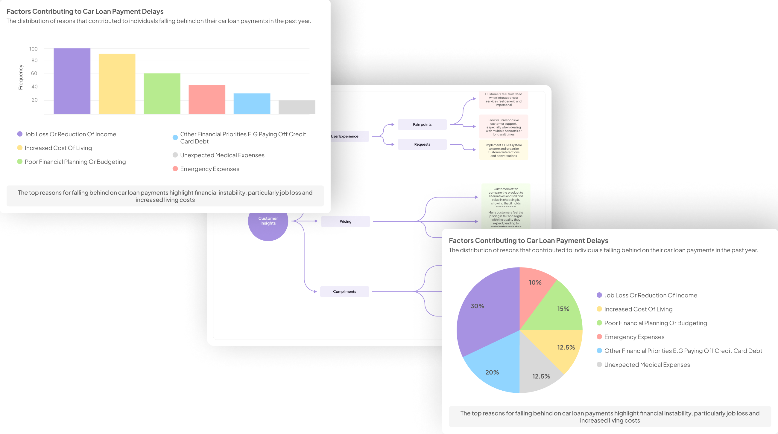
Cultural Insights Visualization is a vital approach for interpreting and presenting findings from culture interviews. By transforming qualitative data into accessible visuals, you can extract meaningful patterns and insights that may not be immediately apparent. This method enables organizations to better understand diverse perspectives and make informed decisions based on real cultural feedback.
In this section, we will explore the techniques and tools available for effectively visualizing cultural insights. From identifying key themes to selecting appropriate visualization methods, each step contributes to revealing deeper understanding. Embracing these strategies ensures that valuable insights emerge, empowering stakeholders to respond thoughtfully to cultural dynamics and enhance their initiatives.
Generate visualizations from your qualitative data. At Scale.

Step-by-Step Guide to Visualizing Culture Interview Insights
Cultural Insights Visualization begins by gathering and organizing your data from culture interviews. This step is vital, as it sets the stage for effective analysis. Once your data is compiled, identifying key themes and patterns becomes the focus. Look for recurring ideas, values, or experiences that resonate across different interviews to highlight significant insights.
Next, select the right visualization method to present your findings effectively. Various techniques, such as charts, graphs, and infographics, can communicate your insights clearly. Finally, refine your visuals for clarity and impact before presenting them to stakeholders. Clear presentation enhances understanding and encourages engagement with your findings. This structured approach ensures that your cultural insights are not just seen but truly understood, driving actionable outcomes in your work.
Techniques for Effective Cultural Insights Visualization
To effectively visualize cultural insights, it is essential to start by gathering and organizing your data. This initial step allows for a clear overview of the information collected from cultural interviews. Ensuring that your data is structured properly can lead to more intuitive analysis and deeper understanding of the insights gained. Once the data is organized, identifying key themes and patterns becomes easier, allowing you to focus on significant findings.
Choosing the right visualization method is crucial for presenting insights clearly. Techniques such as charts, graphs, and infographics can transform complex data into easily digestible formats. Furthermore, refining your visuals based on audience needs enhances communication effectiveness. Fully grasping cultural insights visualization involves iterating on your designs and tailoring them to emphasize the most impactful information, ensuring that your insights resonate with your audience.
Step-by-Step Guide to Visualizing Culture Interview Insights
To effectively visualize culture interview insights, follow a structured approach. Begin by gathering and organizing your qualitative data from interviews. Document the conversations while ensuring the context is maintained and metadata is captured, as this forms the foundation for effective Cultural Insights Visualization. Once you have consolidated your data, it becomes easier to identify key themes and patterns. This step allows you to see the bigger picture and recognize recurring sentiments or feedback among interviewees.
Next, select the most appropriate visualization methods to convey these insights. Depending on your audience and objectives, you might consider charts, graphs, or even infographics. After creating your initial visuals, it’s crucial to refine them, ensuring clarity and engagement. By presenting your findings in a visually appealing manner, you enhance comprehension and decision-making potential. Ultimately, this step-by-step guide empowers you to transform raw qualitative data into meaningful visual narratives that can drive understanding and strategic directions.
- Step 1: Gather and Organize Your Data
Gathering and organizing your data is the crucial first step in cultural insights visualization. Start by collecting all relevant transcripts and recordings from your culture interviews. Creating a dedicated project for these materials helps you to streamline your analysis process. Delve into each interview, extracting key insights and responses that resonate across conversations. This will enable you to identify patterns and quantitative trends that may emerge from the qualitative data.
Next, adopt a systematic approach to categorize your data. For instance, you might categorize responses by themes such as pain points and customer feedback. Implementing a matrix that pulls out specific responses makes it easier to summarize findings. As you sift through the data, remember to keep an eye on notable statistics—such as the percentage of respondents mentioning specific issues. This organized structure will form the foundation for deeper analysis in subsequent steps, ultimately enhancing your ability to visualize valuable cultural insights.
- Step 2: Identify Key Themes and Patterns
Identifying key themes and patterns is a crucial step in the cultural insights visualization process. After gathering your interview data, it’s essential to analyze it for recurrent ideas and sentiments. Begin by organizing your transcripts and identifying common pain points or unique perspectives that emerge across multiple interviews. This will create a foundation for understanding the bigger picture within your data.
Next, categorize these themes and patterns. For instance, if several participants express concerns about resource allocation, this becomes a key theme during your analysis. Documenting these insights allows for a comprehensive view of cultural sentiments prevalent among your respondents. Consequently, this structured approach enriches your ability to visualize insights effectively. By focusing on key themes and patterns, you can produce meaningful reports and visualizations that highlight the core ideas from your culture interviews, enabling deeper understanding and strategic decision-making.
- Step 3: Choose the Right Visualization Method
Selecting the appropriate visualization method is crucial for effectively presenting cultural insights. Each insight gathered from interviews can take on different meanings when illustrated in various formats. Consider the narrative behind your data; it might be best suited to a bar graph, line chart, or word cloud. Each method highlights specific aspects of the data, allowing for a clearer understanding of themes and sentiments expressed during interviews.
Begin by considering your audience and what you want them to grasp from the visualizations. You should also evaluate the types of insights you have—are they quantitative, qualitative, or a mix of both? Utilize pie charts for proportionate data, while scatter plots are ideal for displaying relationships between variables. To enrich your Cultural Insights Visualization, integrate color coding or annotations that provide context. Ultimately, the right visualization method can transform complex insights into accessible, actionable knowledge.
- Step 4: Refine and Present Your Visuals
Once you have created your visuals, it's essential to refine and present them effectively. Start by reviewing your visuals to ensure they accurately represent the insights gathered from your cultural interviews. Minor adjustments in color, layout, and labels can significantly enhance clarity and appeal. Make sure each visual communicates a specific insight, guiding your audience through the data in a meaningful way.
Next, consider your audience and tailor the presentation of your visuals accordingly. Utilize engaging storytelling techniques, such as incorporating anecdotes from the interviews to illustrate the data. This approach will not only help to maintain your audience’s interest but also foster a deeper understanding of the insights. Remember, clear and compelling presentations of cultural insights visualization are key to ensuring your findings resonate with stakeholders and drive informed decisions.
Evaluate Performance on Customer Calls for Quality Assurance.
Tools for Cultural Insights Visualization
Visualizing cultural insights requires the right tools to interpret and present data effectively. Each tool serves unique purposes, catering to various needs in data representation. Software options like Power BI and Tableau are powerful for building dynamic visuals that showcase trends and patterns in interview data. Both platforms allow users to create interactive dashboards, making it easier to communicate findings to stakeholders.
Google Data Studio can be a great choice for collaborative projects, enabling teams to share insights seamlessly. For those comfortable with coding, D3.js offers customization capabilities that can produce complex, tailor-made visualizations. Understanding which tool aligns best with your project’s goals can significantly enhance the cultural insights visualization process and foster better decision-making. By utilizing these tools, you can transform qualitative data from culture interviews into engaging visual narratives, facilitating more profound understanding and actionable insights.
- insight7
To visualize cultural insights effectively, it's vital first to gather and organize your data systematically. This initial step involves consolidating all interview transcripts, notes, and recordings, ensuring that you have a comprehensive collection of customer conversations. With this foundation, you can start spotting key themes and patterns, revealing the underlying narratives present within your data.
Once you identify these themes, selecting the appropriate visualization method becomes crucial. Options such as bar charts, word clouds, or concept maps enable you to convey complex information in an accessible format. After creating your visuals, refine them to enhance clarity and impact. Presenting these insights is not just about showcasing data; it is about telling a story that speaks to your audience's needs. By faithfully translating cultural insights into clear visuals, you foster deeper understanding and facilitate purposeful discussions that can drive strategic actions within your organization.
- Power BI
Power BI is a powerful tool that excels in visualizing insights from cultural interviews. It allows users to transform raw data into engaging visuals, making the process more intuitive. Through its extensive dashboard capabilities, you can connect multiple data sources to create comprehensive views of key insights.
With Power BI, cultural insights visualization becomes efficient, showcasing patterns and trends from interviews in a matter of clicks. For instance, you can categorize responses by themes and easily generate reports that summarize customer pain points. This feature proves especially beneficial in identifying recurring issues that need addressing. Moreover, the ability to present these findings in a visually appealing manner enhances communication with stakeholders, facilitating informed decision-making based on real-time data trends.
- Tableau
Tableau stands out as a powerful tool for Cultural Insights Visualization, allowing users to transform complex interview data into engaging visuals. By integrating diverse data sources, Tableau enables the extraction of key themes and insights from cultural interviews. Users can create dynamic dashboards and visually analyze trends, making it easier to identify patterns across the collected data.
When utilizing Tableau for this purpose, several features enhance the visualization process. First, users can easily drag and drop data points to create impactful charts. Second, Tableau supports various visualization formats, such as heat maps and scatter plots, to suit specific analysis needs. Third, it offers real-time collaboration, enabling teams to share findings efficiently and discuss insights collectively. Ultimately, Tableau empowers organizations to derive actionable insights from cultural interviews, leading to informed decisions that resonate with their audience.
- Google Data Studio
Google Data Studio serves as a powerful tool for Cultural Insights Visualization, enabling efficient and dynamic presentation of qualitative data. By allowing users to connect various data sources, it empowers teams to create comprehensive dashboards and reports. This visual representation helps highlight key insights derived from culture interviews, making complex information easily digestible.
Employing Google Data Studio, you can streamline the analytical process by uploading call transcripts and interview data. This tool enables the identification of recurring themes and sentiments with just a few clicks. Its interactive features allow stakeholders to explore insights in real time, ensuring that decisions are based on concrete data.
To maximize the effectiveness of Google Data Studio, consider the following aspects:
- Data Integration: Connect various sources for a holistic view of insights.
- Customization: Tailor your dashboards to suit your audience's needs.
- Collaboration: Share visual reports with team members to foster collaboration.
By harnessing these capabilities, your team can significantly enhance the visualization of cultural insights, leading to more informed decisions.
- D3.js
In the realm of Cultural Insights Visualization, D3.js stands out as a powerful tool for turning raw data into interactive visuals. This JavaScript library allows users to create dynamic graphics that can transform complex dataset findings into easily comprehensible formats, enhancing the viewer's understanding. By enabling the integration of animations and interactions, D3.js helps users explore insights from culture interviews more engagingly and intuitively.
To harness D3.js effectively, users can follow several key steps. First, they should familiarize themselves with the library's documentation and examples, which showcase its capabilities. Next, gathering and structuring the interview data is essential for ensuring meaningful visualizations. Then, selecting appropriate visualization types — such as bar charts, scatter plots, or geographic maps — will highlight the most relevant insights derived from the interviews. Finally, refining these visuals and ensuring they are user-friendly will amplify the impact of the Cultural Insights Visualization, allowing stakeholders to draw actionable conclusions from their analyses.
Conclusion: Mastering Cultural Insights Visualization
Mastering Cultural Insights Visualization requires a strategic approach to interpreting and presenting the rich data gathered from culture interviews. By synthesizing insights into compelling visuals, organizations can more effectively communicate the underlying themes, emotions, and nuances that emerge from these discussions. This not only aids in understanding diverse perspectives but also informs decision-making processes aligned with cultural dynamics.
Effective visualization transcends mere data presentation; it transforms insights into actionable narratives. By engaging stakeholders with well-crafted visuals, organizations can foster deeper connections and drive meaningful initiatives rooted in cultural understanding. Ultimately, mastering this skill empowers teams to harness the full potential of their cultural insights visualization efforts.


